MEMPHIS, Tenn. — Side-by-side pictures from NASA's 32-year-old Hubble Space Telescope and the brand-new James Webb Space Telescope may draw oohs and ahhs, but they don't give you a full sense of just how much more astronomers are getting from the new kid on the cosmic block.
Fortunately, new tools for data visualization can get you closer to the sense of wonder those astronomers are feeling.
"The public is just presented with these beautiful pictures, and they think, 'Oh, wow, that's great,'" says Harvard astronomer Alyssa Goodman. "But in my opinion, they could learn a lot more from these images."
Goodman laid out strategies for getting a better appreciation of JWST — and a better appreciation of the technologies that are transforming modern astronomy — this week at the ScienceWriters 2022 conference in Memphis.
Loading tweet...
— View on Twitter
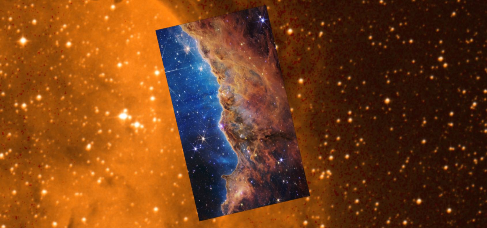
Goodman was struck by the difference between the public perception and the astronomers' appreciation when the very first JWST image was unveiled at the White House in July. President Joe Biden and other administration officials were wowed by the glittering galaxies in the telescope's first ultra-deep field image. But Goodman couldn't help thinking of data visualization guru Edward Tufte's caveat about quantitative evaluations: "Compared to what?"
To bring the comparison home, Goodman tweeted out what she called "possibly the worst video that I've made in 10 years," in which she compared the JWST image to other pictures accessible through the interactive AAS WorldWide Telescope database. "Let's just zoom in again, take a look around at the in- cred -ible detail, and then zoom way out to give you some picture of what a teeny piece of the sky that really is. But my, what an awesome, awesome image," she said in the video, using a tone reminiscent of
The quick Twitter clip attracted 1.5 million views — which is not bad for a video that Goodman intended only to share with her friends. That suggests there's a big audience for deep dives into data visualization, especially if it has to do with the frontiers of the universe. "You can't really appreciate how great it is until you start changing the background layer to whatever you'd like," Goodman said.
And you don't have to take her word for it: There's a page on the WorldWide Telescope's website that makes it possible for you to zoom and scan around the first set of JWST images for yourself.
Another example involves one of Hubble's most famous images: the Pillars of Creation, a star-forming region that's part of the Eagle Nebula. Last week, NASA released JWST's version of the same picture, sparking a fresh round of oohs and ahhs. Once again, Goodman answered the "Compared to What" question.
"If you look very carefully, you can see differences," she said. "I actually find this visually striking, but as an astronomer, kind of annoying, OK? Because again, it doesn't show you what's important."
Goodman pointed to an opening in the nebula's clouds of dust that was much clearer in the JWST view.
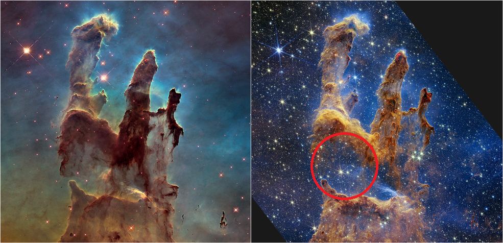
"The idea is that in the infrared ... how important it is that you can see through the dust, the small solid particles and interstellar medium that are floating out there between the stars, that obscure our background view of so many things, including the early universe," she said.
Visualizing in 3-D adds another dimension to our appreciation of astronomical imagery. A 3-D map of the region around our sun, based on data from the European Space Agency's Gaia telescope, helped Goodman and her colleagues figure out that a wave of star formation is being driven by an expanding bubble of interstellar gas from supernova explosions.
"It was just us messing around with the data in three dimensions, and then later making a very detailed physical model of the motions of stars and the explosion of supernovae," she said. "It looks like we had this all figured out, but the truth is, it was a lot of data exploration."
Exploring computer-generated models in 3-D led not only to the "local bubble" discovery, but also to the discovery of the Radcliffe Wave, an undulating structure of dust and gas in our Milky Way galaxy.
Goodman said that computer simulations have become so useful that you could think of them as a third component of the discovery process, alongside theory and observations. She pointed to a research paper titled "AI-Assisted Super-Resolution Cosmological Simulations" as an example.
"There are several papers like this," she said. "This is probably the most expanding field of cosmology at the moment."
And perhaps the most exciting aspect of astronomical simulations is that they can be shared with the public. "It's gotten to the point where if you're careful about it, the same software that's used to discover things can be made available to the public and can be published along with the results," Goodman said.
To facilitate that sharing, Goodman is part of a team working on an open-source data visualization package called "glue." Glue is being optimized for analysis of JWST data, and the team expects to make the Python-based package easier to use by incorporating it into a widely used interactive computing platform known as Jupyter (resulting in a hybrid nicknamed "glupyter"). Such tools could be used not only for visualizing astronomical data, but also for analyzing geospatial data, brain scans or genetic code.
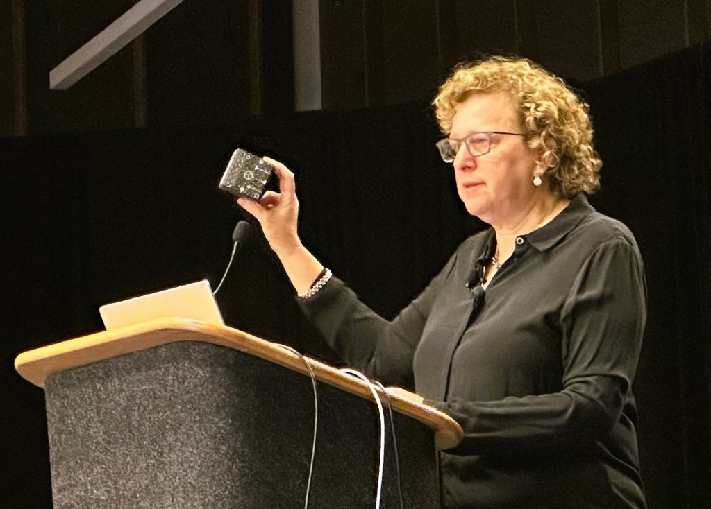
Goodman demonstrated how a 3-D data visualization could be held in the palm of your hand, using a specially printed cube and an augmented-reality app. When you point your smartphone at the cube, you can see what appears to be a 3-D view of molecular clouds in our corner of the Milky Way. Twist around the cube, and the 3-D model twists around as well.
Will it someday be possible to juggle computer models of planetary systems, galaxies and the entire universe in augmented reality, fueled by JWST data? For astronomers, that "someday" is already here — and it's coming soon for the rest of us.
Goodman's Patrusky Lecture presentation, "The New Universe," was part of this week's ScienceWriters 2022 conference in Memphis, which was organized by the Council for the Advancement of Science Writing and the National Association of Science Writers and hosted by St. Jude Children's Research Hospital. Alan Boyle is a volunteer member of CASW's board. Check out this page on Harvard University's website for additional resources, including presentation slides and links to Seamless Astronomy and Dimensions of Discovery.