How to See the Bigger Picture From NASA’s Webb Space Telescope

JWST and DSS views of Carina Nebula
The James Webb Space Telescope's infrared image of the Carina Nebula is embedded within a wider optical-wavelength view from the Terapixel Digitized Sky Survey. (JWST / DSS via AAS WorldWide Telescope)

MEMPHIS, Tenn. — Side-by-side pictures from NASA’s 32-year-old Hubble Space Telescope and the brand-new James Webb Space Telescope may draw oohs and ahhs, but they don’t give you a full sense of just how much more astronomers are getting from the new kid on the cosmic block.

Fortunately, new tools for data visualization can get you closer to the sense of wonder those astronomers are feeling.

“The public is just presented with these beautiful pictures, and they think, ‘Oh, wow, that’s great,'” says Harvard astronomer Alyssa Goodman. “But in my opinion, they could learn a lot more from these images.”

Goodman laid out strategies for getting a better appreciation of JWST — and a better appreciation of the technologies that are transforming modern astronomy — this week at the ScienceWriters 2022 conference in Memphis.

Continue reading “How to See the Bigger Picture From NASA’s Webb Space Telescope”

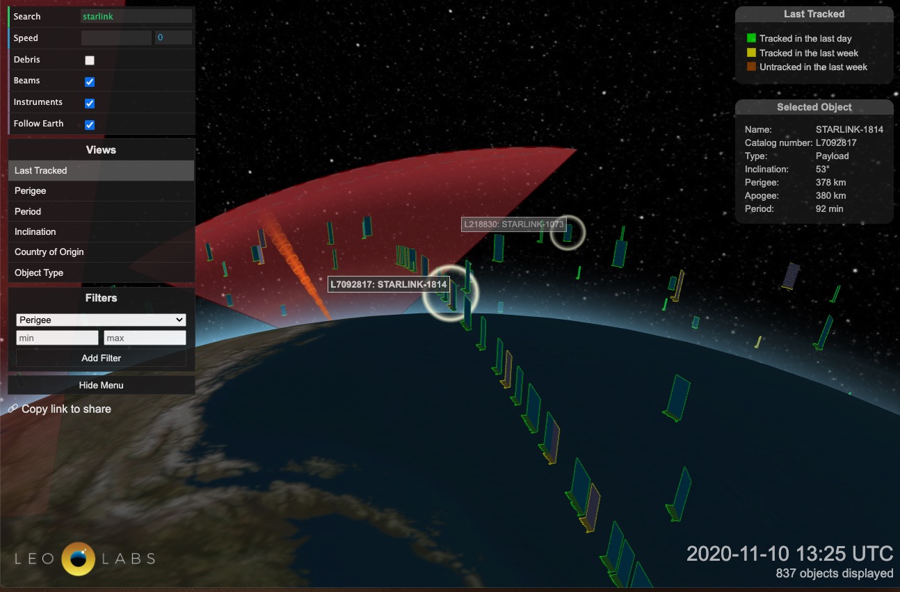
Terrify yourself with LeoLabs’ visualization of satellites and space debris around Earth

Founded in 2016, Menlo Park, California-based LeoLabs, is a mind-blowing company. They have built, and continue to expand, a network of ground-based, phased array radars worldwide to keep track of the thousands of operational satellites, defunct satellites, spent rocket bodies, and pieces of debris in orbit around the Earth. Not only is their radar technology ground-breaking, but they have built a spectacular, if not a little terrifying, digital visualization of the traffic in space that is free for the public to explore.

Continue reading “Terrify yourself with LeoLabs’ visualization of satellites and space debris around Earth”

Check Out How Big the Planets and the Moon Will be in Our Sky Over the Next Two Years

This is a screenshot of a data visualization video. It shows the apparent sizes of Solar System objects from our Earthly vantage point. Image Credit: James O'Donoghue

Everything in space is moving. Galaxies collide and merge, massive clouds of gas migrate, and asteroids, comets, and rogue planets zip around and between it all. And in our own Solar System, the planets follow their ancient orbits.

Now a new data visualization shows us just how much our view from Earth changes in two years, as the orbits of the planets change the distance between us and our neighbours.

Continue reading “Check Out How Big the Planets and the Moon Will be in Our Sky Over the Next Two Years”

Weekly Space Hangout: April 18, 2018: Kevin Gill: Art and Science from Juno and MRO

Hosts:
Fraser Cain (universetoday.com / @fcain)
Dr. Paul M. Sutter (pmsutter.com / @PaulMattSutter)
Dr. Kimberly Cartier (KimberlyCartier.org / @AstroKimCartier )
Dr. Morgan Rehnberg (MorganRehnberg.com / @MorganRehnberg & ChartYourWorld.org)

Special Guests:
Kevin Gill is a software engineer, planetary and climate data wrangler, and a science data visualization artist. Kevin will be discussing his work with Juno and MRO images. Check out his work at his Flickr page: https://www.flickr.com/photos/kevinmgill/ and his tech blog Apoapsys: http://www.wthr.us/ Follow Kevin on Twitter at: https://twitter.com/kevinmgill and Instagram here: https://www.instagram.com/apoapsys/

Announcements:
If you would like to join the Weekly Space Hangout Crew, visit their site here and sign up. They’re a great team who can help you join our online discussions!

We record the Weekly Space Hangout every Wednesday at 5:00 pm Pacific / 8:00 pm Eastern. You can watch us live on Universe Today, or the Weekly Space Hangout YouTube page – Please subscribe!