If you want to know what a talent for scientific visualizations looks like, check out Eleanor Lutz. She's a PhD student in biology at the University of Washington, and at her website Tabletop Whale, you can see her amazing work on full display.
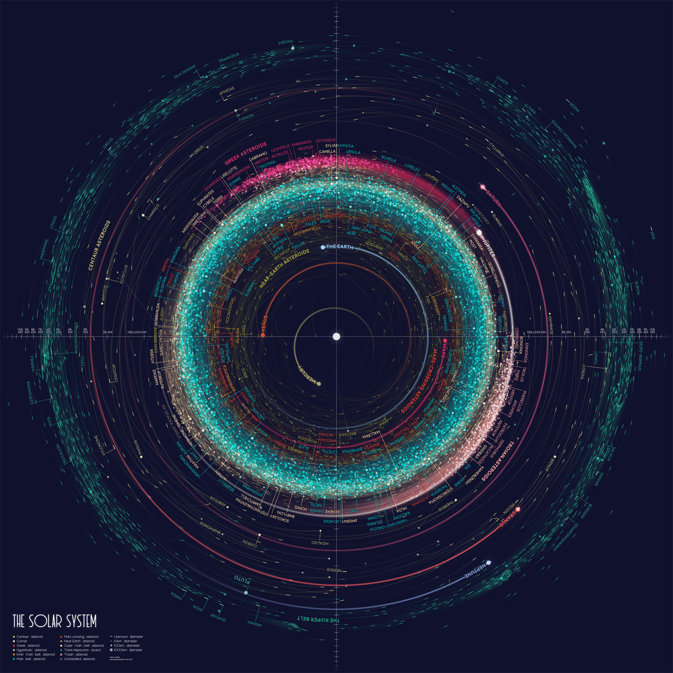
Her latest piece is a map showing all the orbits of over 18,000 asteroids in the Solar System. It includes 10,000 asteroids that are over 10km in diameter, and about 8,000 objects of unknown size.
As the tagline at her website says, she produces "Charts, infographics, and animations about any and all things science." This includes things like a " Visual Compendium of Glowing Creatures," " All the Stars You Can See From Earth," and a beautiful topographic map of Mercury.
But it's her newest project that is garnering her a lot of attention in the space community. Lutz is working on an Atlas of Space, and has been for the last year and a half. It's a collection of ten visualizations including planets, moons, and outer space. As she says on her website, "I've made an animated map of the seasons on Earth, a map of Mars geology, and a map of everything in the solar system bigger than 10km." It's that map of objects larger than 10km that is generating buzz.
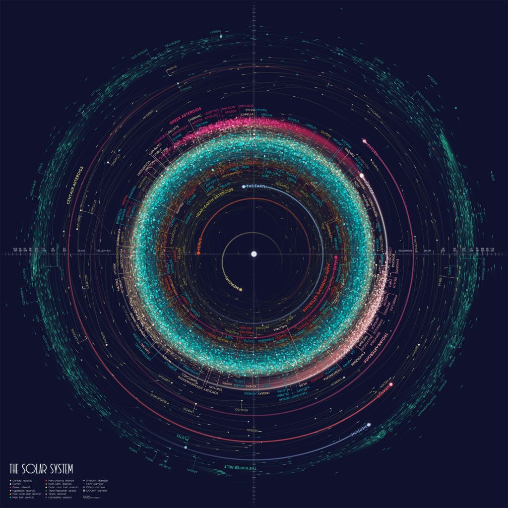
All of the data for Lutz's Atlas of Space is public data, freely available. She gets if from sources like NASA and the US Geological Survey. Part of what drives her is that even though the data is public and freely available, it's raw. And taking that raw data and turning it into a helpful, and even beautiful, visualization, takes a lot of work.
In an interview with Wired, Lutz said, "I really like that all this data is accessible, but it's very difficult to visualize. It's really awesome science, and I wanted everyone to be able to see it in a way that makes sense."
Lutz shared some of her yet-to-be published work with Universe Today, including this awesome gif of Earth's seasons.
https://gfycat.com/littlespicyamericanblackvulture
Lutz's work is really more than data visualizations. She has a designer's eye, and some of her work is very artful. But being a scientist, she's inspired to share the data and the methods she used to create her work. She plans to publish the open source code for each of her pieces, and also tutorials for how to create them yourself.
It's difficult to understand our world, or anything in nature really, without engaging with science. Without science, all we have is anecdote and opinion. But science is all about data, and dense data is not everyone's cup of tea. It's taxing and time-consuming to understand.
Lutz's work is making it easier. In an interview with Wired, she said, "There's a knowledge barrier to accessing some of the interesting, awesome things about science. There are so many facts and equations, and I want those cool ideas to be accessible."
To access some of those cool ideas she's talking about, visit her website, tabletopwhale.com, where you can explore her work and her methods. You can also purchase prints there.
More:
- Eleanor Lutz's website: Tabletop Whale
- Eleanor Lutz's interview with WIRED