Oh, the Places We’ve Been: 21 Spacecraft Trajectories Plotted in One Picture
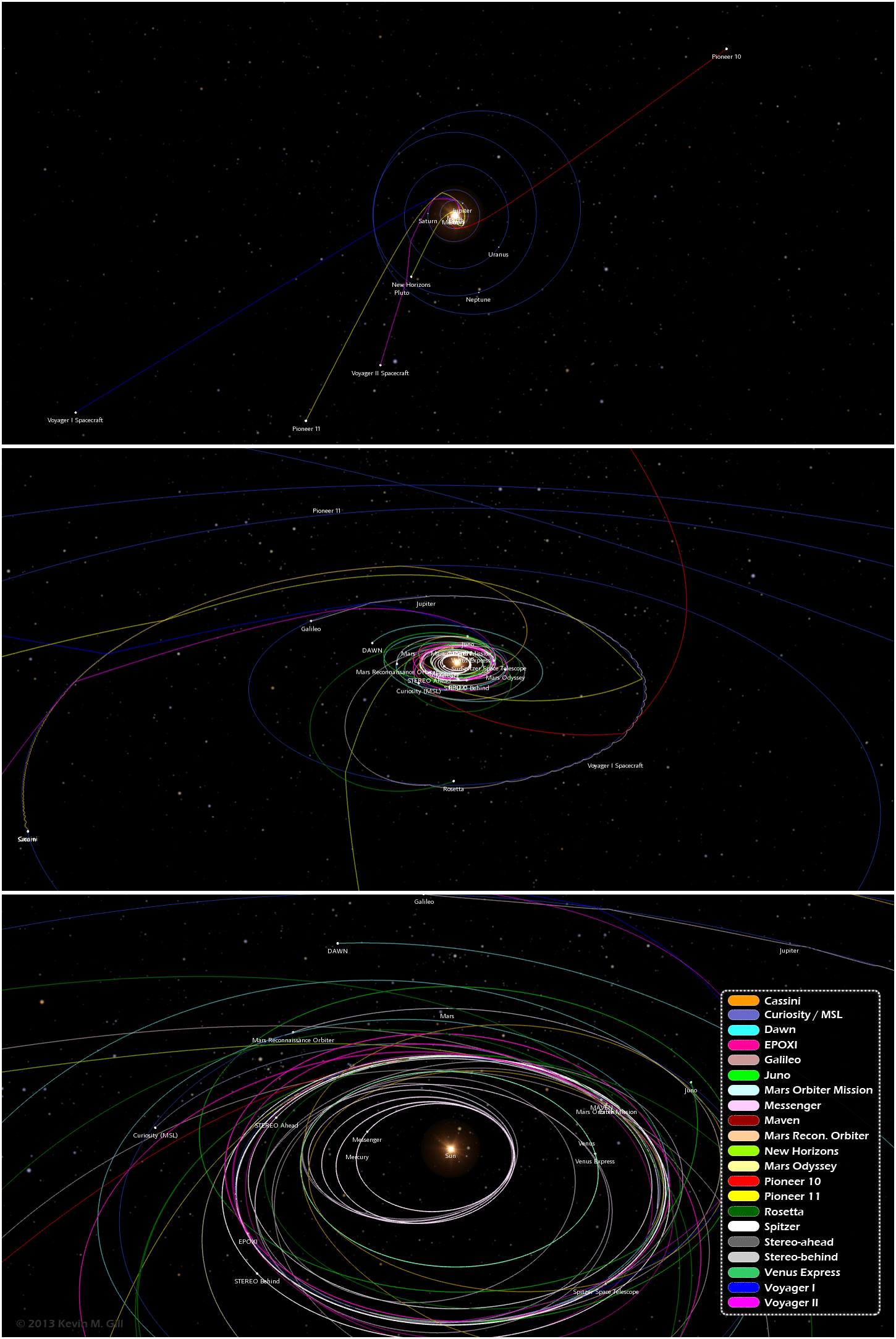
One image from an infographic showing trajectories of 21 different unmanned spacecraft. Click for full image. Credit: Kevin Gill.
Want to know the orbital paths where different spacecraft have traveled and where they are now? A great new infographic put together by Kevin Gill is a visualization of where 21 different unmanned spacecraft have traveled through the Solar System. “The spacecraft data and planet orbital data is derived from NASA/JPL Horizons ephemeris,” said Gill on G+. “The image was rendered using a modified version of my Orbit Viewer WebGL application and put into infographic form using Photoshop. Body and spacecraft positions are as of December 15, 2013.”
By the way, Kevin’s orbit viewer is really fun to play with!
See the full infographic below or on Kevin’s website here:
Paths range from the earliest vector data available, typically just following launch, to either the latest data available or December 15, 2013, whichever is earlier.
“Originally intended as an animation, my browser was not too amused with the quantity of data being thrown at it,” Kevin said via G+. “In the new year, given sufficient demand, I may optimize the modeling and animation algorithms and either produce the animation or release it as a distinct WebGL visualization.”
We certainly look forward to that!
Recent Posts
A New Way to Measure the Rotation of Black Holes
Sometimes, astronomers get lucky and catch an event they can watch to see how the…
Could Martian atmospheric samples teach us more about the Red Planet than surface samples?
NASA is actively working to return surface samples from Mars in the next few years,…

Black Holes are Firing Beams of Particles, Changing Targets Over Time
Black holes seem to provide endless fascination to astronomers. This is at least partly due…
Another Giant Antarctic Iceberg Breaks Free
On May 20th, 2024, an iceberg measuring 380 square kilometers (~147 mi2) broke off the…
Fish are Adapting to Weightlessness on the Chinese Space Station
Four zebrafish are alive and well after nearly a month in space aboard China's Tiangong…
Marvel at the Variety of Planets Found by TESS Already
The hunt for new exoplanets continues. On May 23rd, an international collaboration of scientists published…