Oh, the Places We’ve Been: 21 Spacecraft Trajectories Plotted in One Picture
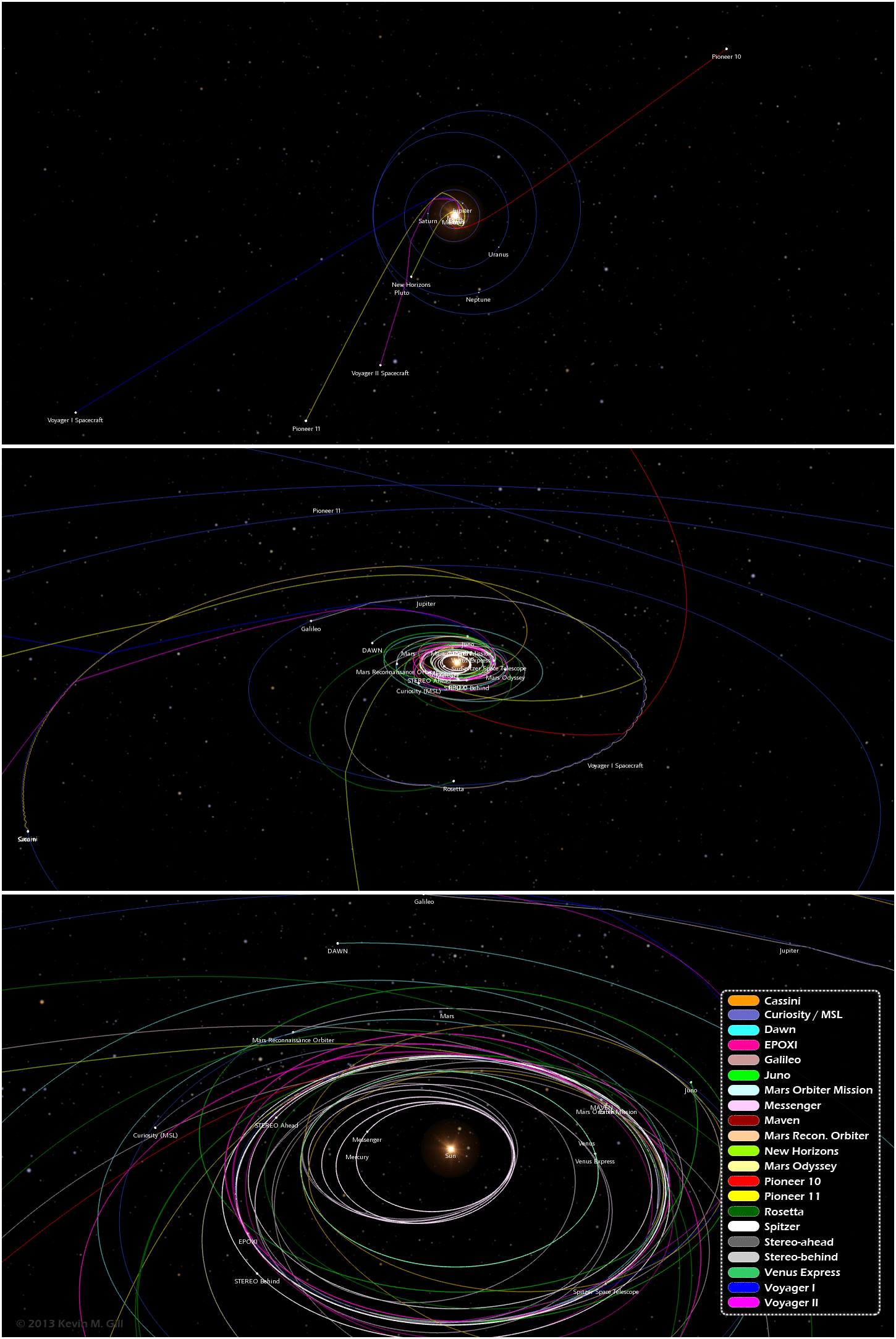
One image from an infographic showing trajectories of 21 different unmanned spacecraft. Click for full image. Credit: Kevin Gill.
Want to know the orbital paths where different spacecraft have traveled and where they are now? A great new infographic put together by Kevin Gill is a visualization of where 21 different unmanned spacecraft have traveled through the Solar System. “The spacecraft data and planet orbital data is derived from NASA/JPL Horizons ephemeris,” said Gill on G+. “The image was rendered using a modified version of my Orbit Viewer WebGL application and put into infographic form using Photoshop. Body and spacecraft positions are as of December 15, 2013.”
By the way, Kevin’s orbit viewer is really fun to play with!
See the full infographic below or on Kevin’s website here:
Paths range from the earliest vector data available, typically just following launch, to either the latest data available or December 15, 2013, whichever is earlier.
“Originally intended as an animation, my browser was not too amused with the quantity of data being thrown at it,” Kevin said via G+. “In the new year, given sufficient demand, I may optimize the modeling and animation algorithms and either produce the animation or release it as a distinct WebGL visualization.”
We certainly look forward to that!
Recent Posts
Dinkinesh's Moonlet is Only 2-3 Million Years Old
Last November, NASA's Lucy mission conducted a flyby of the asteroid Dinkinish, one of the…
The Universe Could Be Filled With Ultralight Black Holes That Can't Die
Steven Hawking famously calculated that black holes should evaporate, converting into particles and energy over…

Starlink on Mars? NASA Is Paying SpaceX to Look Into the Idea
NASA has given the go-ahead for SpaceX to work out a plan to adapt its…
Did You Hear Webb Found Life on an Exoplanet? Not so Fast…
The JWST is astronomers' best tool for probing exoplanet atmospheres. Its capable instruments can dissect…
Vera Rubin’s Primary Mirror Gets its First Reflective Coating
First light for the Vera Rubin Observatory (VRO) is quickly approaching and the telescope is…
Two Stars in a Binary System are Very Different. It's Because There Used to be Three
A beautiful nebula in the southern hemisphere with a binary star at it's center seems…