Oh, the Places We’ve Been: 21 Spacecraft Trajectories Plotted in One Picture
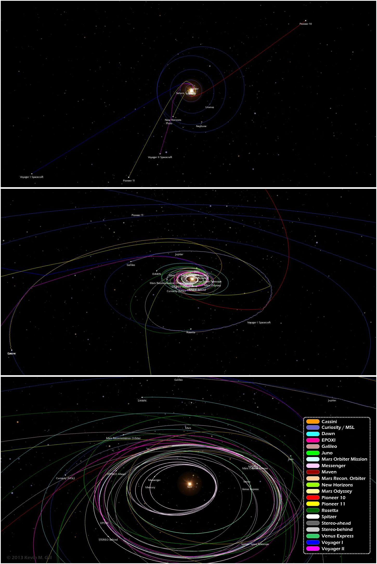
One image from an infographic showing trajectories of 21 different unmanned spacecraft. Click for full image. Credit: Kevin Gill.
Want to know the orbital paths where different spacecraft have traveled and where they are now? A great new infographic put together by Kevin Gill is a visualization of where 21 different unmanned spacecraft have traveled through the Solar System. “The spacecraft data and planet orbital data is derived from NASA/JPL Horizons ephemeris,” said Gill on G+. “The image was rendered using a modified version of my Orbit Viewer WebGL application and put into infographic form using Photoshop. Body and spacecraft positions are as of December 15, 2013.”
By the way, Kevin’s orbit viewer is really fun to play with!
See the full infographic below or on Kevin’s website here:
Paths range from the earliest vector data available, typically just following launch, to either the latest data available or December 15, 2013, whichever is earlier.
“Originally intended as an animation, my browser was not too amused with the quantity of data being thrown at it,” Kevin said via G+. “In the new year, given sufficient demand, I may optimize the modeling and animation algorithms and either produce the animation or release it as a distinct WebGL visualization.”
We certainly look forward to that!
Recent Posts
Uh oh. Hubble's Having Gyro Problems Again
The Hubble Space Telescope has gone through its share of gyroscopes in its 34-year history…
Astronomers Will Get Gravitational Wave Alerts Within 30 Seconds
Any event in the cosmos generates gravitational waves, the bigger the event, the more disturbance.…

Next Generation Ion Engines Will Be Extremely Powerful
During the Space Race, scientists in both the United States and the Soviet Union investigated…
Neutron Stars Could be Capturing Primordial Black Holes
The Milky Way has a missing pulsar problem in its core. Astronomers have tried to…
Japan’s Lunar Lander Survives its Third Lunar Night
Space travel and exploration was never going to be easy. Failures are sadly all too…
Black Holes Can Halt Star Formation in Massive Galaxies
It’s difficult to actually visualise a universe that is changing. Things tend to happen at…