Space Station to Get a ‘Laser Cannon’

CATS in the laboratory. Credit: NASA/GSFC.

What’s a space station without a laser cannon?

The International Space Station will be getting its very own laser at the end of 2014. And unlike the planet-smashing capabilities of the Death Star of Star Wars fame, this laser will to be enlisted for the purpose of science.

It’s called CATS, and no, it isn’t the latest attempt to put feline astronauts in space. CATS stands for the Cloud Aerosol Transport System. The goal of CATS is to study the distribution of tiny particles of dust and air contaminants known as aerosols.

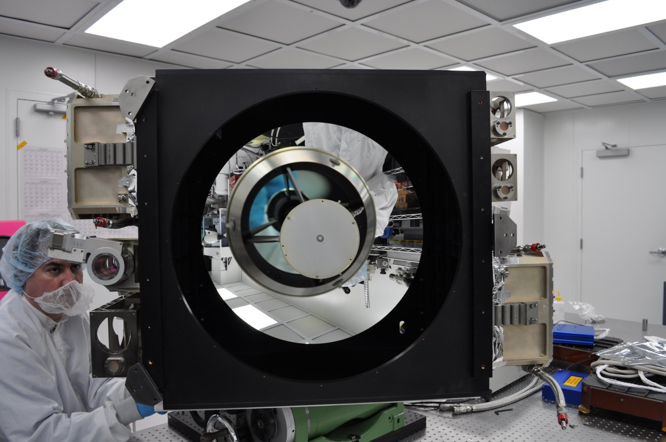
Developed by research scientist Matt McGill at NASA’s Goddard Space Flight Center in Greenbelt Maryland, CATS is slated to head to the International Space Station later this year on September 12th aboard SpaceX’s CRS-5 flight of the Dragon spacecraft. CATS will be installed on the Japanese Experiment Module-Exposed Facility (JEM-EF) and will demonstrate the utility of state-of-the-art multi-wavelength laser technology to study aerosol distribution and transport in the atmosphere.

Such knowledge is critical in understanding the path and circulation of aerosols and pollutants worldwide. When the Eyjafjallajökull volcano erupted in Iceland back in 2010, many trans-Atlantic flights were grounded as a precaution. These measures are necessary as several flights have suffered engine failures in the past due to encounters with volcanic ash clouds, such as the four engine failure of KLM Fight 867 in 1989 and the British Airways Flight 9 incident over Southeast Asia in 1982. Knowing where these dangerous ash clouds are is crucial to the safety of air travel.

The expanding ash cloud spewing from Iceland's Eyjafjallajökull volcano as seen from space in 2010. Credit: NASA.
The expanding ash cloud spewing from Iceland’s Eyjafjallajökull volcano as seen from space in 2010. Credit: NASA.

To accomplish this, CATS will emit 5,000 1 milliJoule laser pulses a second at the 1064, 532 and 355 nanometer wavelengths.  This represents a vast improvement in power requirements and thermal capabilities over a similar instrument currently in service aboard the Cloud-Aerosol Lidar and Infrared Pathfinder Satellite Observations (CALIPSO) Earth remote sensing spacecraft.

And it’s that third 355 nanometer wavelength that will make CATS stand out from CALIPSO. This will also allow researchers to differentiate between particle size and measure the horizontal and vertical distribution of aerosol particles in the atmosphere. CATS will also be capable of measuring the number of individual photons being reflected back at it, which will provide a much better resolution and understanding of current atmospheric activity.

“You get better data quality because you make fewer assumptions, and you get, presumably, a more accurate determination of what kind of particles you’re seeing in the atmosphere,” McGill said in a recent press release.

The International Space Station also provides a unique vantage point for CATS. In a highly inclined 51.7 degree orbit, the station passes over a good swath of the planet on 16 orbits daily on a westward moving ground track that repeats roughly every three days. This will assure CATS has coverage over a large percentage of the planet, including known pollutant transport routes across the northern Pacific and down from Canada over the U.S. Great Lakes region.

While the first two lasers will operate in the infrared and visual wavelengths, said third laser will work in the ultraviolet. And while this will give CATS an enhanced capability, engineers also worry that it may also be susceptible to contamination.  “If you get contamination on any of your outgoing optics, they can self-destruct, and then your system is dead. You end up with a very limited instrument lifetime,” McGill said.

Still, if CATS is successful, it may pave the way for larger, free-flying versions that will monitor long-range atmospheric patterns and shifts in climate due to natural and man-made activity. And the ISS makes a good platform to test pathfinder missions like CATS at low cost. “In our current budget-constrained environment, we need to use what we already have, such as the [station], to do more with less,” McGill said.

CALIPSO's LiDAR imaged from the ground by Gregg Hendry in 2008. Used with permission.
CALIPSO’s LiDAR imaged from the ground by Gregg Hendry in 2008. Used with permission.

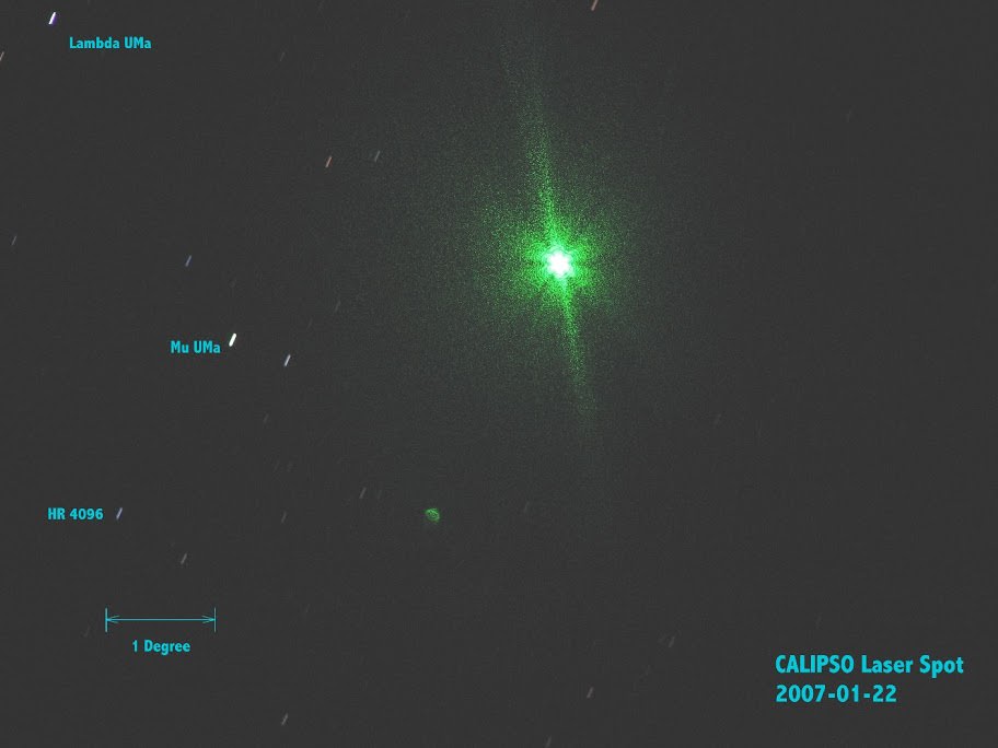
The advent of a LiDAR system aboard the ISS has also generated a spirited discussion in the satellite tracking community concerning prospects for spotting CATS in operation from the ground. The CALIPSO LiDAR has been captured by ground spotters in the past. However, CALIPSO fires a much more powerful 110 milliJoule pulse at a rate of 20 times a second. Still, the lower power CATS system will be firing at a much faster rate, delivering a cumulative 5,000 milliJoules a second.  CATS won’t be bright enough to show up on an illuminated pass of the ISS, but it just might be visible during darkened passes of the ISS through the Earth’s shadow. And, unlike CALLIPSO — which is part of the difficult to observe A-Train of Earth-observing satellites — the ISS passes in view of a majority of humanity. At very least, activity from CATS will be worth watching out for, and may well be seen either visually or photographically.

We’ll soon be adding CATS to the long list of outstanding science experiments being conducted aboard the International Space Station, and the sight of this “fully armed and operational battle station” may soon be coming to a dark sky site near you!

Global Warming Explained in 52 Seconds

Graphic from "How Global Warming Works."

We are awash in the unseen, the unknown and the unexplained. Our Universe is enshrouded in mystery. Even what we do know — the complex physical laws that describe the planets, stars and galaxies — can seem just beyond any normal human being’s grasp. We can’t all be Einsteins, after all.

But excluding string theory, dark energy and quantum field theory most of science is remarkably within our grasp. And in less than a minute, a concept as culturally conflicted and misunderstood as global warming, can be explained. See above.

The motivation behind this video is simple. Research shows that virtually no Americans — roughly 0 percent — can explain the physical mechanisms of global warming at even a basic level. So Berkeley Professor Michael Ranney and colleagues created a total of five videos (with the longest clocking in at 656 words in under five minutes) with the hope of elucidating the basics of global warming.

Their initial study, completed in 2011, surveyed 270 people in San Diego parks in order to assess how well the average American understands global warming. San Diego was chosen because it draws tourists from across the United States, and would thus create a better rounded sample.

“The main concept we were hoping people would tell us, which is at the heart of understanding global warming, is that there is an asymmetry between stuff that’s coming in to our planet and stuff that’s heading out,” Ranney told Universe Today.

This asymmetry explains why sunlight (in the form of visible light) may enter the atmosphere unhindered but is later impeded by greenhouse gases (because it is no longer in the form of visible light — it has been absorbed by the Earth and emitted in the form of infrared light). But not a single person could explain global warming at this basic level.

“We were shocked at how few people knew this” Ranney said. “I thought it was a moral imperative to get the word out as fast as possible.”

So Ranney and his colleagues set out with their work in front of them, creating the videos in order to increase the average American’s understanding of global warming. Their goal is that any one of the five videos will change the lives of seven billion viewers.

“We hope that a video of 400 words or even 35 words will allow people to have a moment in time to which they fix that they knew what the mechanism of climate change was,” Ranney told Universe Today. For that single moment “their knowledge was obvious, valid, understandable and available.”

In order to drive this point home, Ranney used an analogy that began like this: “So a climate change acceptor walks into a bar.” But all jokes aside, if one who accepts anthropogenic global warming tries to convince the man sitting next to him that global warming is real, but cannot explain the physical mechanism behind global warming, then he’s in trouble. He’s likely not only lost his bar mate but encouraged a life-time of global warming denial.

We cannot expect to increase the public’s awareness and acceptance of climate change without a huge increase in scientific literacy. Even if every viewer can’t recall the exact mechanistic details of global warming they can at least say to the man sitting next to them at the bar: “Look, I can’t regurgitate it now but I did understand it then.”

This graph from NOAA shows the annual trend in average global air temperature in degrees Celsius, through December 2012. For each year, the range of uncertainty is indicated by the gray vertical bars. The blue line tracks the changes in the trend over time. Click here or on the image to enlarge. (Image courtesy NOAA's National Climatic Data Center.)
This graph from NOAA shows the annual trend in average global air temperature in degrees Celsius, through December 2012. For each year, the range of uncertainty is indicated by the gray vertical bars. The blue line tracks the changes in the trend over time. Click here or on the image to enlarge. (Image courtesy NOAA’s National Climatic Data Center.)

A second study provided college students with an explanation akin to the one found in the five-minute video.  After reading it, the students not only understood global warming better but they were also more likely to accept global warming as a reality — suggesting these videos have the power to change people’s minds.

“Eventually people come to appreciate salient evidence,” Ranney told Universe Today. “Let’s say you think you’re in a fantastic monogamous relationship. If you come home and find your partner with someone else, it only takes that one moment in time to change your belief.”

Helping people to understand the basic physics behind global warming is a vital tool in convincing them that global warming is as real as it gets. Once someone clicks on the video, the next 52 seconds alone might leave a pretty big impact.

You can view all the videos on howglobalwarmingworks.org.

Ranney emphasized help from graduate student Lee Nevo Lamprey, undergraduate student Kimberly Le and other collaborators (including Dav Clark, Daniel Reinholz, Lloyd Goldwasser, Sarah Cohen and Rachel Ranney).

When Science is Art: a New Map of Wind Patterns

Blah.

A new map of wind patterns is so visually stunning it’s easily mistaken for art.

This interactive visualization of wind patterns — modeled from the U.S. National Weather Service’s Global Forecast System database — provides nearly current weather conditions on the global scale. And it’s beautiful.

In an interactive form, this data set allows the user to move the globe around (simply drag with your mouse) and zoom in and out (use your scroll wheel). After a few seconds the colors appear in snaking lines, depicting wind patterns at varying speeds. Gentle breezes are thin lines of green, strong winds are light streaks of yellow, and the strongest current are thick lines of red and purple.

A screenshot of the Earth's north pole at 5,500 meters.
A screen capture of the Earth’s north pole at 5,500 meters. The thick purple line is the polar jet stream.

Adjustable parameters also allow the user to view the wind patterns at various heights in the atmosphere, from 100 meters (noted as 1000 hPa in the program) to 26,500 meters (10 hPa) above the Earth’s surface. Simply click on the word “earth” in the lower left-hand corner of the web browser.

At the surface the map is a mirage of blue and green — with fairly gentle wind patterns in green. Circling patterns over the oceans are cyclones. They rotate clockwise over the southern Indian ocean and counter-clockwise over the northern Pacific ocean. If you turn your eyes toward land, you can compare the light summer winds across Australia with the swirling gusts off the northeast coast of Japan.

But you can also graze the jet streams, where thick bands of purple and red dance among the less violent green and yellow streaks. The wavy polar jet stream is entering the U.S. near Seattle, dropping southward near the Rocky Mountains, and then turning northward again just beyond the Great Lakes.  It creates a temperature boundary, where south of the jet stream is warm and north of the jet stream is cold.

Users can view seven different altitudes using eight different map projections. This surprising new look at our own world is stunning in its artistic and educative beauty.

Super-Typhoon Haiyan Causes Catastrophic Death & Destruction – Space Images from NASA, ISRO, Roscosmos & ISS

Super Typhoon Haiyan over the Philippines on November 9, 2013 as imaged from Earth orbit by NASA Astronaut Karen Nyberg aboard the International Space Station. Credit: NASA/Karen Nyberg

Super Typhoon Haiyan over the Philippines on November 9, 2013 as imaged from Earth orbit by NASA Astronaut Karen Nyberg aboard the International Space Station.Category 5 killer storm Haiyan stretches across the entire photo from about 250 miles (400 kilometer) altitude. Credit: NASA/Karen Nyberg
See more Super Typhoon Haiyan imagery and video below
[/caption]

NASA GODDARD SPACE FLIGHT CENTER, MARYLAND – Super Typhoon Haiyan smashed into the island nation of the Philippines, Friday, Nov. 8, with maximum sustained winds estimated at exceeding 195 MPH (315 kilometer per hour) by the U.S. Navy Joint Typhoon Warning Center – leaving an enormous region of catastrophic death and destruction in its terrible wake.

The Red Cross estimates over 1200 deaths so far. The final toll could be significantly higher. Local media reports today say bodies of men, women and children are now washing on shore.

The enormous scale of Super Typhoon Haiyan can be vividly seen in space imagery captured by NASA, ISRO and Russian satellites – as well as astronaut Karen Nyberg flying overhead on board the International Space Station (ISS); collected here.

As Super-Typhoon Haiyan moved over the central Philippines on Nov. 8 at 05:10 UTC/12:10 a.m. EDT, the MODIS instrument aboard NASA's Aqua satellite captured this visible image.   Credit: NASA Goddard MODIS Rapid Response Team
As Super-Typhoon Haiyan moved over the central Philippines on Nov. 8 at 05:10 UTC/12:10 a.m. EDT, the MODIS instrument aboard NASA’s Aqua satellite captured this visible image. Credit: NASA Goddard MODIS Rapid Response Team

Super Typhoon Haiyan is reported to be the largest and most powerful storm ever to make landfall in recorded human history.

Haiyan is classified as a Category 5 monster storm on the U.S. Saffir-Simpson scale.

It struck the central Philippines municipality of Guiuan at the southern tip of the province of Eastern Samar early Friday morning Nov. 8 at 20:45 UTC (4:45 am local time).

As Haiyan hit the central Philippines, NASA says wind gusts exceeded 235 mph (379 kilometers per hour).

The high resolution imagery and precise measurements provided by the worlds constellation of Earth observing space satellites (including NASA, Roscosmos, ISRO, ESA, JAXA) are absolutely essential to tracking killer storms and providing significant advance warning to evacuate residents in affected areas to help minimize the death toll and damage.

More than 800,000 people were evacuated. The storm surge caused waves exceeding 30 feet (10 meters), mudslides and flash flooding.

NASA’s Tropical Rainfall Measuring Mission (TRMM) satellite captured visible, microwave and infrared data on the storm just as it was crossing the island of Leyte in the central Philippines, reports NASA – see image below.

NASA's TRMM satellite data on Nov. 8 at 00:19 UTC showed Haiyan had a well-defined eye surrounded by a symmetric area of moderate rain (green ring with a blue center) with several rainbands wrapping in from the south (green arcs) while crossing the island of Leyte in the central Philippines.  Credit:  NASA/SSAI, Hal Pierce
NASA’s TRMM satellite data on Nov. 8 at 00:19 UTC showed Haiyan had a well-defined eye surrounded by a symmetric area of moderate rain (green ring with a blue center) with several rainbands wrapping in from the south (green arcs) while crossing the island of Leyte in the central Philippines. Credit: NASA/SSAI, Hal Pierce

TRMM data from rain rates are measured by the TRMM Precipitation Radar (PR) and TRMM Microwave Imager (TMI) and combined with infrared (IR) data from the TRMM Visible Infrared Scanner (VIRS) by science teams working at NASA’s Goddard Space Flight Center in Greenbelt, Md.

Coincidentally NASA Goddard has just completed assembly of the next generation weather satellite Global Precipitation Measurement (GPM) observatory that replaces TRMM – and where I inspected the GPM satellite inside the Goddard clean room on Friday.

“GPM is a direct follow-up to NASA’s currently orbiting TRMM satellite,” Art Azarbarzin, GPM project manager, told Universe Today during my exclusive clean room inspection of the huge GPM satellite.

NASA’s next generation Global Precipation Managemnet Measurement (GPM) observatory inside the clean room at NASA Goddard Space Flight Center. GPM is slated to launch In February 2014 and will provide global measurements of rain and snow every 3 hours - as a direct follow-up to NASA’s currently orbiting TRMM satellite; reaching the end of its usable lifetime. Credit: Ken Kremer/kenkremer.com
NASA’s next generation Global Precipitation Measurement (GPM) observatory inside the clean room at NASA Goddard Space Flight Center. GPM is slated to launch In February 2014 and will provide global measurements of rain and snow every 3 hours – as a direct follow-up to NASA’s currently orbiting TRMM satellite; reaching the end of its usable lifetime.
Credit: Ken Kremer/kenkremer.com

“TRMM is reaching the end of its usable lifetime. GPM launches in February 2014 and we hope it has some overlap with observations from TRMM.”

“The Global Precipitation Measurement (GPM) observatory will provide high resolution global measurements of rain and snow every 3 hours,” Dalia Kirschbaum, GPM research scientist, told me at Goddard.

GPM is equipped with advanced, higher resolution radar instruments. It is vital to continuing the TRMM measurements and will help provide improved forecasts and advance warning of extreme super storms like Hurricane Sandy and Super Typhoon Haiyan, Azarbarzin and Kirschbaum explained.

Video Caption: Super Typhoon Haiyan imaged on Nov 6 – 8, 2013 by the Russian Elektro-L satellite operating in geostationary orbit. Credit: Roscosmos via Vitaliy Egorov

The full magnitude of Haiyan’s destruction is just starting to be assessed as rescue teams reach the devastated areas where winds wantonly ripped apart homes, farms, factories, buildings and structures of every imaginable type vital to everyday human existence.

Typhoon Haiyan is moving westward and is expected to forcefully strike central Vietnam in a day or two. Mass evacuations are underway at this time

Ken Kremer

SuperTyphoon Haiyan imaged by the Russian Elektro-L satellite operating in geostationary orbit. Credit: Roscosmos via Vitaliy Egorov
Super Typhoon Haiyan imaged by the Russian Elektro-L satellite operating in geostationary orbit. Credit: Roscosmos via Vitaliy Egorov
Super Typhoon Haiyan's ocean surface winds were measured by the OSCAT radar scatterometer on the Indian Space Research Organization's (ISRO) OceanSAT-2 satellite at 5:30 p.m. PST on Nov. 6. The colors indicate wind speed and arrows indicate wind direction. Credit: ISRO/NASA/JPL-Caltech
Super Typhoon Haiyan’s ocean surface winds were measured by the OSCAT radar scatterometer on the Indian Space Research Organization’s (ISRO) OceanSAT-2 satellite at 5:30 p.m. PST on Nov. 6. The colors indicate wind speed and arrows indicate wind direction. Credit: ISRO/NASA/JPL-Caltech

These Antarctic Research Photos Look Like Exploration on Another Planet

Researchers work in the Antarctic polar night during a storm (Credit: Stefan Hendricks, Alfred Wegner Institute)

Some day, human explorers will land a spacecraft on the surface of Europa, Enceladus, Titan, or some other icy world and investigate first-hand the secrets hidden beneath its frozen surface. When that day comes — and it can’t come too soon for me! — it may look a lot like this.

One of a series of amazing photos by Stefan Hendricks taken during the Antarctic Winter Ecosystem & Climate Study (AWECS), a study of Antarctica’s sea ice conducted by the Alfred Wegener Institute in Germany, the image above shows researchers working on the Antarctic ice during a winter snowstorm. It’s easy to imagine them on the night-side surface of Europa, with the research vessel Polarstern standing in for a distant illuminated lander (albeit rather oversized).

Hey, one can dream!

One of the goals of the campaign, called CryoVex, was to look at how ESA’s CryoSat mission can be used to understand the thickness of sea ice in Antarctica. The extent of the Antarctic sea ice in winter is currently more than normal, which could be linked to changing atmospheric patterns.

Antarctica’s massive shelves of sea ice in winter are quite dramatic landscapes, and remind us that there are very alien places right here on our own planet.

See this and more photos from the mission on the ESA website (really, go check them out!)

Earth and Climate: Two Scenarios of Our Planet in 2100 AD

The Earth at night. What will it look like 100 years from now? Image credit: NASA-NOAA

The Earth is warming up.

Ocean temperatures are rising. Arctic sea ice is melting. Atmospheric carbon dioxide levels are growing. The oceans are becoming more acidic. The weather is already more extreme.

With the release of the fifth Assessment Report by the Intergovernmental Panel on Climate Change – a panel of more than 2,500 experts, more commonly known as the IPCC –  it’s clear that climate change is very real. But it’s especially clear that we are the cause. If we don’t act now by taking vigorous action to reduce emissions the results will be catastrophic.

Toward the end of this 900-page report, the IPCC looked toward our future, focusing on the climate after the year 2100. Here, Universe Today, explores two extreme scenarios for the Earth by 2100.

1.) Embracing the Challenges of Climate Change

The conclusions reached by climate scientists at the end of the 21st Century were undeniable. We embraced climate change by investing heavily in renewable energies. Both large-scale companies and individuals bought energy drawn from the sunlight, wind, and geothermal heat.

Homes across the world became more sustainable. Their total square feet shrunk, as home owners learned to live with less. It was not uncommon to dress a roof with plants or solar panels. Even the layout of homes changed. They rested partially underground, taking advantage of geothermal heat, and faced South (in the case of the Northern hemisphere) to take advantage of the warm sunlight.

We also embraced geoengineering technologies.  We added artificial clouds to our atmosphere, which reflected sunlight, and built towers to collect greenhouse gas emissions. The gases are now trapped deep underground. Our goal was not only to slow the process of climate change, but to stop it, and quite possibly reverse it.

We now eat far less meat than we did in the early 21st Century to cut the emissions generated from livestock farming. Pastures have been replaced with booming forests – helping to absorb CO2. We also eat more locally.

The world followed in China’s footsteps and restricted couples to a certain number of children, reducing our overall population.

We live in small compact cities where we drive hybrid cars and take public transport to work. Carbon offsets must be purchased when taking long trips. Most families vacation in their own backyard – exploring all that nature has to offer in the nearby vicinity.

We viewed climate change as an exciting opportunity to embrace the needs of our environment. We now live much simpler lives and the census shows that our overall intelligence and happiness is much higher than it was a century ago.

2.) The Point of No Return

We simply didn’t want to face the facts. We live in a global economy with a population that has increased significantly over the last century. Most of our energy still comes from fossil fuels. We never invested in renewable energies.

We measure our happiness based on the cars we drive, the number of material possessions we can cram into our large homes, and how often we travel the globe.

The world is, on average, 9 degrees warmer. The entire arctic has melted. Ocean levels have risen by over a meter – flooding coastal communities across the world. Millions have been left homeless.

Our weather is extreme. Hurricanes, tornadoes, fires, floods, draughts, and earthquakes kill hundreds of thousands per year.  Climate change has devastated food production and water supplies.

Air quality is much poorer across the world. Due to haze, it is perfectly safe to look at the sun directly. We can only see a third of the stars visible a century ago.

We have triggered various tipping points. The thawing of permafrost released further CO2 and methane. Large areas of the planet are becoming uninhabitable. Our efforts are working toward damage control only. We fear that it may be too late.

Climate change is still in our hands, but we have to act now.

The fifth Assessment Report by the IPCC may be found here. Emphasis in this article may be found in the long term climate change section, as well as descriptions published by the IPCC in 2000.

New U.S. Climate Map Shows Temperature Changes In HD. How To Prepare?

Average temperatures in the United States. Top, what they were in the 1950s. Bottom, the predictions for the 2090s. Credit: NASA

If you’re interested to see how warm your neighborhood will look like at 2090, here’s a chance. There’s new data available that has monthly climate projections for the continental United States at the size of a neighborhood, or about a  half-mile (800 meters).

Readers who have moderate to advanced knowledge of how to manipulate datasets can see instructions for how to get the raw information here. As for everyone else, NASA briefly summarized how the information could be used for community planners to deal with the effects of climate change.

The map charts how rain and temperatures in the United States will be affected based on greenhouse gases. Because, of course, this is a projection, the researchers ran four different scenarios for the period between 1950 and 2099. Climate projections came from global climate models from the upcoming Inter-Governmental Panel on Climate Change 5th Assessment Report and historical surface observations.

The projections “may make it easier for resource managers to quantify anticipated climate change impacts on a wide range of conditions and resources important to local communities,” NASA stated.

The agency then provided a long list of research areas that would benefit, including “water supplies and winter snow packs, public health and the spread of insect-borne diseases, flood risk and potential impacts to critical urban infrastructure, wildfire frequency and severity, agricultural production, and wildlife and biodiversity.”

On this map of Nevada - northern California are superimposed graphics representing the average temperatures in the 1950s (top) and projected temperatures for the 2090s. Credit: NASA
On this map of Nevada – northern California are superimposed graphics representing the average temperatures in the 1950s (top) and projected temperatures for the 2090s. Credit: NASA

As you can see from the climate map above, Nevada and California are highly affected by the projections, and officials in the region are paying attention, according to NASA.

“We are using the 800-meter downscaled datasets for conservation planning and resource management in the San Francisco Bay Area,” stated Stuart Weiss, a researcher at the Terrestrial Biodiversity Climate Change Collaborative in the San Francisco Bay Area.

“They provide an indispensable, if necessarily hazy, crystal ball into hydrological and ecological responses through the 21st century.  It will be a very useful tool for climate change planning and adaptation that will be exported to the remainder of California and eventually the western United States.”

The data was crunched using supercomputers at NASA’s Ames Research Center, allowing the team to “produce the downscaled, high resolution climate dataset for the U.S. within months of release of the final global climate scenarios prepared for the next IPCC assessment report,” NASA added.

Source: NASA

Herbal Earth: Spectacular Vegetation Views of Our Home Planet and the Natural World of Living Green Life

Earth’s Vegetation. World map of vegetation created with Suomi NPP data. Credit: NASA/NOAA

Earth’s Vegetation from Suomi NPP satellite. World map of vegetation data collected by the Suomi NPP satellite (National Polar-orbiting Partnership) in a partnership between NASA and the National Oceanic and Atmospheric Administration (NOAA). Credit: NASA/NOAA
Photo and Video Gallery below[/caption]

Herbal Earth: that’s the title of a spectacular collection of vivid new views of the Earth’s vegetation captured over the past year by the Suomi NPP satellite.

NPP is short for National Polar-orbiting Partnership – an Earth science satellite partnership between NASA and the National Oceanic and Atmospheric Administration (NOAA).

Although it’s rather reminiscent of the manmade ‘World at Night’ – its actually the ‘Natural World of Living Green Life.’

The Suomi NPP satellite data were collected with the Visible-Infrared Imager/Radiometer Suite (VIIRS) instrument from April 2012 to April 2013 and used to generate this gallery of images and animations – released by NASA and NOAA on June 19.

Western Hemisphere -Vegetation on Our Planet. The darkest green areas are the lushest in vegetation, while the pale colors are sparse in vegetation cover either due to snow, drought, rock, or urban areas. Suomi NPP Satellite data from April 2012 to April 2013 was used to generate these images. Credit: NASA/NOAA

Suomi NPP was launched on October 28, 2011 by a Delta II rocket and placed into a sun-synchronous orbit 824 km (512 miles) above the Earth. It orbits Earth about 14 times daily.

The VIIRS instrument measures vegetation changes over time by looking at changes in the visible and near-infrared light reflected by vegetation. The 22-band radiometer sensor can detect subtle differences in greenness.

Nile Delta: July 9-15, 2012.  Amidst the deserts of Egypt, the Nile River provides life-sustaining water to the region. Also visible are the urbanized areas of northern Egypt. Credit: NOAA/NASA
Nile Delta: July 9-15, 2012. Amidst the deserts of Egypt, the Nile River provides life-sustaining water to the region. Also visible are the urbanized areas of northern Egypt. Credit: NASA/NOAA

The data are incorporated into the Normalized Difference Vegetation Index (NDVI) which represents the photosynthetic potential of vegetation.

The NVDI measures and monitors plant growth, vegetation cover and biomass production from the Suomi NPP satellite information.

The Florida Everglades: March 18-24, 2013. The "river of grass" extending south of Lake Okeechobee shows clear signs of its modified state with areas of dense agriculture, urban sprawl and water conservation areas delineated by a series of waterways that crisscross Southern Florida.  Credit: NOAA/NASA
The Florida Everglades: March 18-24, 2013. The “river of grass” extending south of Lake Okeechobee shows clear signs of its modified state with areas of dense agriculture, urban sprawl and water conservation areas delineated by a series of waterways that crisscross Southern Florida. Credit: NASA/NOAA

A quarter of the Earth’s surface is covered by some green vegetation, the remainder is the blue ocean.

Video: Green- Vegetation on Our Planet (Tour of Earth)

And don’t forget to “Send Your Name to Mars” aboard NASA’s MAVEN orbiter- details here. Deadline Very Soon: July 1, 2013. Launch: Nov. 18, 2013

Ken Kremer

…………….
Learn more about Earth, Mars, Curiosity, Opportunity, MAVEN, LADEE and NASA missions at Ken’s upcoming presentation

June 23: “Send your Name to Mars on MAVEN” and “CIBER Astro Sat, LADEE Lunar & Antares Rocket Launches from Virginia”; Rodeway Inn, Chincoteague, VA, 8 PM

Eastern Hemisphere -Vegetation on Our Planet. Credit: NASA/NOAA

An Early Start for Noctilucent Clouds

Noctilucent clouds photographed over Killygordon, Ireland on the morning of June 10. (© Brendan Alexander/Donegal Skies. All rights reserved.)

The season for noctilucent “night-shining” clouds is arriving in the northern hemisphere, when wispy, glowing tendrils of high-altitude ice crystals may be seen around the upper latitudes, shining long after the Sun has set. Found about 83 km (51 miles) up, noctilucent clouds (also called polar mesospheric clouds) are the highest cloud formations in the atmosphere. They’ve been associated with rocket launches and space shuttle re-entries and are now thought to also be associated with meteor activity… and for some reason, this year they showed up a week early.


Noctilucent clouds (NLCs) form between 76 to 85 kilometers (47 to 53 miles) above Earth’s surface when there is just enough water vapor to freeze into ice crystals. The icy clouds are illuminated by the Sun when it is just below the horizon, after darkness has fallen, giving them their night-shining properties. This year NASA’s AIM spacecraft, which is orbiting Earth on a mission to study high-altitude ice, started seeing noctilucent clouds on May 13th.

AIM map of noctilucent clouds over the north pole on June 8 (Credit: LASP/University of Colorado)
AIM map of noctilucent clouds over the north pole on June 8
(Credit: LASP/University of Colorado)

“The 2013 season is remarkable because it started in the northern hemisphere a week earlier than any other season that AIM has observed,” reports Cora Randall of the Laboratory for Atmospheric and Space Physics at the University of Colorado. “This is quite possibly earlier than ever before.”

The early start is extra-puzzling because of the solar cycle. Researchers have long known that NLCs tend to peak during solar minimum and bottom-out during solar maximum — a fairly strong anti-correlation. “If anything, we would have expected a later start this year because the solar cycle is near its maximum,” Randall says. “So much for expectations.”

Read more on the NASA AIM page here, and watch the Science@NASA video below for the full story. (Also, check out some very nice NLC photos taken last week in the UK by Stuart Atkinson at Cumbrian Sky.)

Source: NASA

What Does Antarctica Look Like Under the Ice?

New topography map of Antarctica by the British Antarctic Survey's Bedmap2 (NASA/GSFC)

Although it sits isolated at the “bottom of the world” Antarctica is one of the most influential continents on Earth, affecting weather, climate, and ocean current patterns over the entire planet. But Antarctica is also one of the most enigmatic landmasses too, incredibly remote, extremely harsh, and covered by a layer of ice over 2 km thick. And as Earth’s global temperature continues to climb steadily higher, the future of ice in Antarctica — a continent half again as large as the contiguous United States — is a big concern for scientists… but in order to know exactly how its ice will behave to changing conditions, they need to know what’s under it.

This is where the British Antarctic Survey — using data gathered by NASA’s ICESat and Operation IceBridge missions — comes in, giving us a better view of what lies beneath the southern continent’s frozen veil.

A new dataset called Bedmap2 gives a clearer picture of Antarctica from the ice surface down to the bedrock below. Bedmap2 is a significant improvement on the previous collection of Antarctic data — known as Bedmap — that was produced more than 10 years ago. The product was a result of work led by the British Antarctic Survey, where researchers compiled decades worth of geophysical measurements, such as surface elevation measurements from NASA’s Ice, Cloud and Land Elevation Satellite (ICESat) and ice thickness data collected by Operation IceBridge.

Bedmap2, like the original Bedmap, is a collection of three datasets—surface elevation, ice thickness and bedrock topography. Both Bedmap and Bedmap2 are laid out as grids covering the entire continent, but with a tighter grid spacing Bedmap2 includes many surface and sub-ice features too small to be seen in the previous dataset. Additionally, the extensive use of GPS data in more recent surveys improves the precision of the new dataset.

Improvements in resolution, coverage and precision will lead to more accurate calculations of ice volume and potential contribution to sea level rise.

Ice sheet researchers use computer models to simulate how ice sheets will respond to changes in ocean and air temperatures. An advantage of these simulations is that they allow testing of many different climate scenarios, but the models are limited by how accurate the data on ice volume and sub-ice terrain are.

Only the tips of many of Antarctica's mountains are visible above thousands of feet of ice. (Oct. 2012 IceBridge photo. Credit: NASA / Christy Hansen)
Only the tips of many of Antarctica’s mountains are visible above thousands of feet of ice. (Oct. 2012 IceBridge photo. Credit: NASA / Christy Hansen)

“In order to accurately simulate the dynamic response of ice sheets to changing environmental conditions, such as temperature and snow accumulation, we need to know the shape and structure of the bedrock below the ice sheets in great detail,” said Michael Studinger, IceBridge project scientist at NASA Goddard.

Knowing what the bedrock looks like is important for ice sheet modeling because features in the bed control the ice’s shape and affect how it moves. Ice will flow faster on a downhill slope, while an uphill slope or bumpy terrain can slow an ice sheet down or even hold it in place temporarily. “The shape of the bed is the most important unknown, and affect how ice can flow,” said Nowicki. “You can influence how honey spreads on your plate, by simply varying how you hold your plate.” The vastly improved bedrock data included in Bedmap2 should provide the level of detail needed for models to be realistic.

Bedmap2 data of Antarctica's bedrock. Verical elevation has been exaggerated by 17x. (NASA/GSFC)
Bedmap2 data of Antarctica’s bedrock. Verical elevation has been exaggerated by 17x. (NASA/GSFC)

“It will be an important resource for the next generation of ice sheet modelers, physical oceanographers and structural geologists,” said Peter Fretwell, BAS scientist and lead author.

The BAS’ work was published recently in the journal The Cryosphere. Read more on the original release by George Hale here.

Source: NASA Earth