Oh, the Places We’ve Been: 21 Spacecraft Trajectories Plotted in One Picture
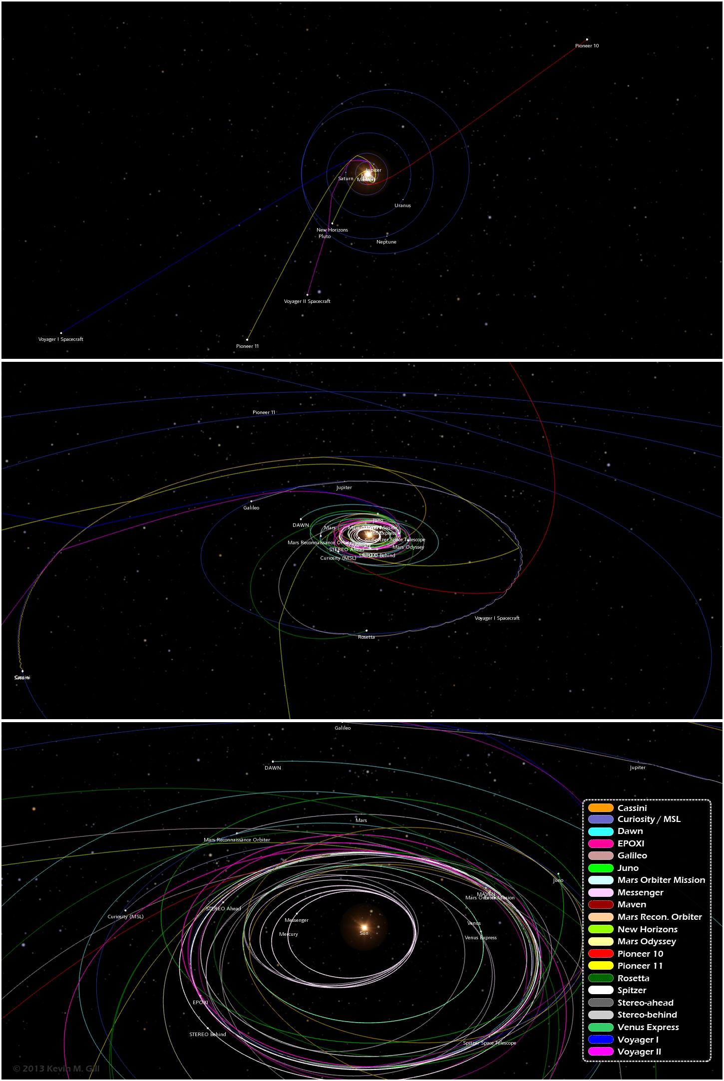
One image from an infographic showing trajectories of 21 different unmanned spacecraft. Click for full image. Credit: Kevin Gill.
Want to know the orbital paths where different spacecraft have traveled and where they are now? A great new infographic put together by Kevin Gill is a visualization of where 21 different unmanned spacecraft have traveled through the Solar System. “The spacecraft data and planet orbital data is derived from NASA/JPL Horizons ephemeris,” said Gill on G+. “The image was rendered using a modified version of my Orbit Viewer WebGL application and put into infographic form using Photoshop. Body and spacecraft positions are as of December 15, 2013.”
By the way, Kevin’s orbit viewer is really fun to play with!
See the full infographic below or on Kevin’s website here:
Paths range from the earliest vector data available, typically just following launch, to either the latest data available or December 15, 2013, whichever is earlier.
“Originally intended as an animation, my browser was not too amused with the quantity of data being thrown at it,” Kevin said via G+. “In the new year, given sufficient demand, I may optimize the modeling and animation algorithms and either produce the animation or release it as a distinct WebGL visualization.”
We certainly look forward to that!
Recent Posts
Solar Max is Coming. The Sun Just Released Three X-Class Flares
The Sun is increasing its intensity on schedule, continuing its approach to solar maximum. In…
New Evidence for Our Solar System’s Ghost: Planet Nine
Does another undetected planet languish in our Solar System's distant reaches? Does it follow a…

NASA Takes Six Advanced Tech Concepts to Phase II
It's that time again. NIAC (NASA Innovative Advanced Concepts) has announced six concepts that will…
China is Going Back to the Moon Again With Chang'e-6
On Friday, May 3rd, the sixth mission in the Chinese Lunar Exploration Program (Chang'e-6) launched…
What Can Early Earth Teach Us About the Search for Life?
Earth is the only life-supporting planet we know of, so it's tempting to use it…
China Creates a High-Resolution Atlas of the Moon
Multiple space agencies are looking to send crewed missions to the Moon's southern polar region…