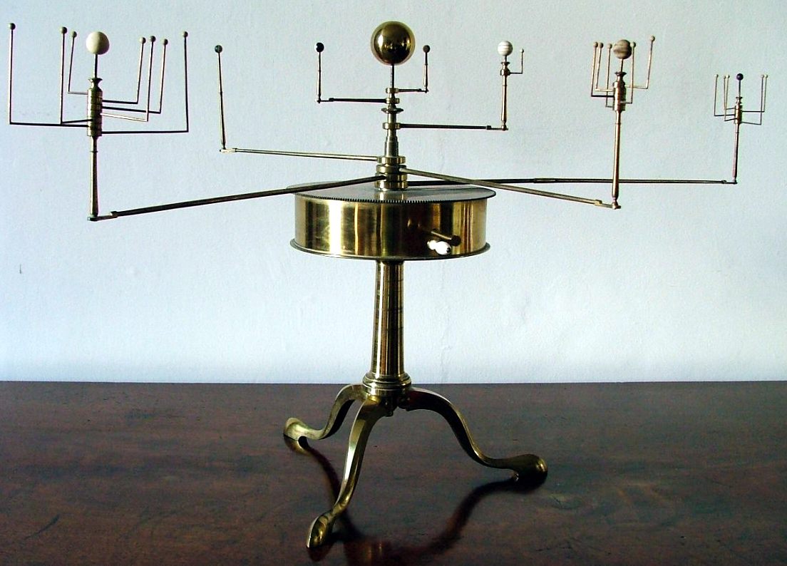
The past few years, Daniel Fabrycky from the Kepler spacecraft science team has put together some terrific orrery-type visualization of all the multiple-planet systems discovered by the Kepler spacecraft. An orrery, as you probably know, is a a mechanical model of a solar system, and the metal or plastic ones available these days usually show the relative positions and motions of our own Sun, Earth, Moon and other planets.
However, the Kepler version of the orreries that have been created are video visualizations of the planetary systems discovered by the Kepler mission that have more than one transiting object. This latest version was created by astronomy graduate student Ethan Kruse and it shows all of the Kepler multi-planet systems (1705 planets in 685 systems as of November 24, 2015) on the same scale as our own Solar System (the dashed lines on the right side of the video).
In the description of the video Kruse said the size of the orbits are all to scale, but the size of the planets are not. “For example, Jupiter is actually 11 times larger than Earth, but that scale makes Earth-size planets almost invisible (or Jupiters annoyingly large),” he explained. “The orbits are all synchronized such that Kepler observed a planet transit every time it hits an angle of 0 degrees (the 3 o’clock position on a clock).”
Additionally, planet colors are based on their approximate equilibrium temperatures, as shown in the legend.
If you think these orreries are pretty great, you can now try your hand at making your own. Kruse said he likes open source and that any software he writes will be available on GitHub. You can get the source code here.
Enjoy!

