Markus Pössel is a theoretical physicist turned astronomical outreach scientist. He is the managing scientist at the Centre for Astronomy Education and Outreach Haus der Astronomie in Heidelberg, Germany.
Soon, very soon, Thursday, February 11, at 10:30 Eastern time, we are likely to learn at any one of several press conferences – at the National Press Club in Washington, D.C., in Hannover, Germany, near Pisa in Italy and elswhere – that gravitational waves have been measured directly, for the first time. This would mean the first direct detection of minute distortions of spacetime, travelling at the speed of light, first postulated by Albert Einstein almost exactly 100 years ago.
The simplest situation that produces gravitational waves in the cosmos is almost ubiquitous: two or more objects orbiting around each other under their own gravity. The waves they generate are reminiscent to a very slow mixer in the middle of a pool of water: This is not something you would see, of course. The wave that is pictured here represents the strength of the minute changes in distance that would be caused by the gravitational wave, just as we’ve seen in Gravitational waves and how they distort space. The animation is courtesy of Sascha Husa of the Universitat de les Illes Balears.
Indirect evidence
Gravitational waves emitted by orbiting objects carry away energy. Elementary physics tells you that if you remove energy from an orbiting system, the distance between the orbiting objects will shrink, and they will orbit each other faster than before.
In fact, gravitational waves making a binary system of neutron stars speed up was the first evidence for the existence of gravitational waves. The binary neutron star was discovered by Hulse and Taylor in 1974, and the speed-up caused by gravitational waves published by Taylor and Weisberg in 1984, after a careful analysis of seven years’ worth of data. Hulse and Taylor were awarded the Nobel prize in physics in 1993 for their discovery.
Here, in an image from an article by Weisberg 2010, is the match between general relativistic prediction and observation in all its glory (or at least in all its glory up to 2005): As the two neutron stars speed up, they will reach the point of closest approach within their orbit earlier and earlier. How much earlier, in seconds, is plotted on the vertical axis, year of measurement on the horizontal axis.
A matter of frequency
Today’s ground-based detectors cannot detect gravitational waves from all kinds of bodies in mutual orbit. The bodies need to be massive, compact and, crucially, orbit each other quickly enough. For bodies orbiting each other less than a few times per second (very quick, if you are talking about astronomical bodies!), the frequency of the resulting gravitational wave will be too low for ground-based detectors to measure reliably. In the low-frequency regime, below 10–100 Hertz, disturbances caused by undulating motions of the Earth’s surface (“seismic noise”) are dominant, and drown out the minute effects of gravitational waves.
When it comes to gravitational waves from supermassive black holes, or from white dwarfs, we will have to wait for future space-based gravitational wave detectors.
The most promising gravitational wave sources go “chirp”
When an orbiting system emits gravitational waves, orbital motion speeds up. And when orbital motion speeds up, the system emits even more energy in form of gravitational wave. This runaway process ends only when the orbiting objects collide and merge.
The final phase is marked by a quick increase in orbital speed, corresponding to ever higher gravitational wave frequency, and ever higher intensity. Here’s what such a signal looks like (image and audio from “Chirping Neutron Stars” on Einstein Online): You can see how the frequency and intensity increase right up to time 0, when the two neutron stars collide and merge.
Colleagues at Cardiff University have made this into a nice online game: Black Hole Hunter. Head over there and see if you can hear the signal beneath the noise!
(And you can hear live chirps by various astrophysicists (and others) under the hashtag #chirpForLIGO on Twitter.)
This kind of signal, from merging stellar black holes or neutron stars (in any combination) is the most promising candidate signal for today’s detectors – and going by the rumors, that is indeed what LIGO appears to have found.
The final part of the signal is interesting for a particular reason: It doesn’t follow from any simple formulae, and can only be modelled with complex computer simulations of such situations known as numerical relativity. If the detectors get a good detection of this very last bit, that will be a good test for current numerical simulations of general relativity!
Other gravitational wave sources
Chirps are comparatively simple, and likely the first signals to be found.
Another kind of signal that could be found is periodic (or nearly so), and would be produced e.g. if rapidly rotating neutron stars are less than perfectly smooth. No such luck as of yet, though.
Next would come the gravitational wave sources that are somewhat less understood, such as the processes in the interior of supernova explosions. And finally, once numerous signals have been detected, showing the scientists that their detectors are indeed working as they should, there might be the detection of completely unexpected signals. Whenever astronomers have opened a new window to the cosmos – the radio window, infrared window, x-ray window – they have found something new and unexpected. Who can tell what opening the Einstein window, the window of gravitational waves, will teach us about the universe?
It’s official: this Thursday, February 11, at 10:30 EST, there will be parallel press conferences at the National Press Club in Washington, D.C., in Hannover, Germany, and near Pisa in Italy. Not officially confirmed, but highly probable, is that people running the LIGO gravitational wave detectors will announce the first direct detection of a gravitational wave. The first direct detection of minute distortions of spacetime, travelling at the speed of light, first postulated by Albert Einstein almost exactly 100 years ago. Nobel prize time.
Time to brush up on your gravitational wave basics, if you haven’t done so! In Gravitational waves and how they distort space, I had a look at what gravitational waves do. Now, on to the next step: How can we measure what they do? How do gravitational wave detectors such as LIGO work?
Recall that this is how a gravitational wave will change the distances between particles, floating freely in a circular formation in empty space: The wave is moving at right angles to the screen, towards you. I’ve greatly exaggerated the distance changes. For a realistic wave, even the giant distance between the Earth and the Sun would only change by a fraction of the diameter of a hydrogen atom. Tiny changes indeed.
How to detect something like this?
The first unsuccessful attempts to detect gravitational waves in the 1960s tried to measure how they make aluminum cylinders ring like a very soft bell. (Tragic story; Joe Weber [1919-2000], the pioneering physicist behind this, was sure he had detected gravitational waves in this way; after thorough analysis and replication attempts, community consensus emerged that he hadn’t.)
Afterwards, physicists came up with alternative scheme. Imagine that you are replacing the black point in the center of the previous animation with a detector, and the rightmost red particle with a laser light source. Now you send light pulses (represented here by fast red dots) from the light source to the detector; let’s first look at this with the gravitational wave switched off:
Every time a light pulse reaches the detector, an indicator light flashes yellow. The pulses are sent out regularly, they all travel at the same speed, hence they also reach the detector in regular intervals.
If a gravitational wave passes through this system, again from the back and coming towards you, distances will change. Let us keep our camera trained on the detector, so the detector remains where it is. The changing distance to the light source, and also the changing distances between the light pulses, and some of the changes in distance between light pulses and detector or source, are due to the gravitational wave. Here is what that would look like (again, hugely exaggerated):
Keep your eye on the blinking light, and you will see that its blinking is not so regular any more. Sometimes, the light blinks faster, sometimes slower. This is an effect of the gravitational wave. An effect by which we can hope to detect the gravitational wave.
“We” in this case are the radio astronomers working on what are known as Pulsar Timing Arrays. The sender of regular pulses are pulsars, rotating neutron stars sweeping a radio beam across our antennas like a cosmic lighthouse. The detectors are radio telescopes here on Earth. Detection is anything but easy. With a single pulsar, you’d need to track pulse arrival times with an accuracy of a few billionths of a second over half a year, and make sure you are not being fooled by various other sources of timing variations. So far, no gravitational waves have been detected in this way, although the radio astronomers are keeping at it.
To see how gravitational wave detectors like LIGO work, we need to make things a little more complex.
Interferometric gravitational wave detectors: the set-up
Here is the basic set-up: Two mirrors, a receiver (or “light detector”), a light source and what is known as a beamsplitter:
Light is sent into the detector from the (laser) light source LS to the beamsplitter B which, true to its name, sends half of the light on to the mirror M1 and lets the other half through to the mirror M2. At M1 and M2, respectively, the light is reflected back to the beam splitter. There, the light arriving from M1 (or M2) is split again, with half going towards the light detector LD, the other half back in the direction of the light source LS. We will ignore the latter half and pretend, for the sake of our simplified explanation, that all the light reaching B from M1 or M2 goes on to the light detector LD.
(To avoid confusion, I will always refer to LD as the “light detector” and take the unqualified word “detector” to mean the whole setup.)
This setup, by the way, is called a Michelson Interferometer. We’ll see below why it is a good setup for gravitational wave detectors.
In what follows, we will assume that the mirrors and the beam splitter, shown as being suspended, react to the gravitational wave in the same way freely floating particles would react. The key effects are between the mirrors and the beam splitter in what are called the two arms of the detector. Arm length is huge in today’s detectors, running to a few kilometers. In comparison, light source and light detector are very close to the beamsplitter; changes of the distances between these three do not signify.
Light pulses in a gravitational wave detector
Next, let us see how light pulses run through this detector. Here is the same setup, seen from above: Light source LS, the two mirrors M1 and M2, the beamsplitter B and the light detector LD: all present and accounted for.
Next, we let the light source emit light pulses. For greater clarity, I will make two artificial and unrealistic changes. I will send red and green pulses into the detector, representing the light that goes into the horizontal and the vertical arm, respectively. In reality, there is no distinction, just light apportioned at the beamsplitter. Light running towards M1 will be offset a little to the left, light coming back from M1 to the right, for better clarity. Same goes for M2. This, too, is different in a real detector. That said, here come the light pulses: Light starts at the light source to the left. Light that has left the source together, travels together (so green and red pulses are side by side) until the beam splitter. The beam splitter then sends the green pulses on their upward journey and lets the red pulses pass on their way towards the mirror on the right. All the particles that arrive back at the beamsplitter after reflection at M1 or M2. At the beamsplitter, they are directed towards the light detector at the bottom.
In this setup, the horizontal arm is slightly longer than the vertical arm. Red particles have to cover some extra distance. That is why they arrive at the detector a bit later, and we get an alternating rhythm: green, red, green, red, with equal distances in between. This will become important later on.
Here is a diagram, a kind of registration strip, which shows the arrival times for red and green pulses at the light detector (time is measured in “animation frames”): The pattern is clear: red and green pulses arrive evenly spaced, one after the other.
Bring on the gravitational wave!
Next, let’s switch on our standard gravitational wave (exaggerated, passing through the screen towards you, and so on). Here is the result: We have trained our camera on the beamsplitter (so in our image, the beamsplitter doesn’t move). We ignore any slight changes in distance between beamsplitter and light source/light detector. Instead, we focus on the mirrors M1 and M2, which change their distance from the beamsplitter just as we would expect from the earlier animations.
Look at the way the pulses arrive at our light detector: sometimes red and green are almost evenly spaced, sometimes they close together. That is caused by the gravitational wave. Without the wave, we had strict regularity.
Here is the corresponding “registration strip” diagram. You can see that at some times, the light pulses of each color are closer together, at others, farther apart:
At the time I have marked with a hand-drawn arrow, red and green pulses arrive almost in unison!
The pattern is markedly different from the scenario without a gravitational wave. Detect this change in the pattern, and you have detected the gravitational wave.
Running interference
If you’ve wondered why detectors like LIGO are called interferometric gravitational wave detectors, we will need to think about waves a bit more. If not, let me just state that detectors like LIGO use the wave properties of light to measure the changes in pulse arrival rate you have seen in the last animation. To skip the details, feel free to jump ahead to the last section, “…and now for something a thousand times more complicated.”
Light is a wave, with crests and troughs corresponding to maxima and minima of the electric and of the magnetic field. While the animations I have shown you track the propagation of light pulses, they can also be used to understand what happens to a light wave in the interferometer. Just assume that each of the moving red and green dots in the detector marks the position of a wave crest.
Particles just add up. Take 2 particle and add 2 particles, and you will end up with 4 particles. But if you add up (combine, superimpose) waves, it depends. Sometimes, one wave plus another wave is indeed a bigger wave. Sometimes, it’s a smaller wave, or no wave at all. And sometimes it’s complicated.
When two waves are in perfect sync, the crests of the one aligning with the crests of the other, and the troughs aligning, too, you indeed get a bigger wave. The following diagram shows at which times the different parts of two light waves arrive at the light detector, and how they add up. (I’ve placed a dot on top of each crest; that is what the dots where meant to signify, after all.) On top, the green wave, perfectly aligned with the red wave (which, for clarity, is shown directly below the green wave). Add the two waves up, and you will get the (markedly stronger) blue wave in the bottom panel.
Not so if the two waves are maximally misaligned, the crests of each aligned with the troughs of the other. A crest and a trough cancel each other out. The sum of a wave and a maximally misaligned wave of equal strength is: no wave at all. Here is the corresponding diagram: Recall that this was exactly the setup for our gravitational wave detector in the absence of gravitational waves: Red and green pulses with equal spacing; troughs of the one wave perfectly aligned with the crests of the other. The result: No light at the light detector. (For realistic gravitational wave detectors, that is almost true.)
When a gravitational wave passes through the detector, the situation changes. Here is the corresponding pattern of pulse/wave crest arrival times for the animation above: The blue pattern, which is the sum of the red and the green, is complex. But it is not a flat line. There is light at the light detector where there was no light before, and the cause of the change is the gravitational wave passing through.
All in all, this makes a (highly simplified) version of how gravitational wave detectors such as LIGO work. Whatever the scientists will report this Thursday, it is based on light signals at the exit of such an interferometric detector.
And now for something a thousand times more complicated
Real gravitational wave detectors are, of course, much more complicated than that. I haven’t even started talking about the many disturbances scientists need to take into account – and to suppress as far as possible. How do you suspend the mirrors so that (at least for certain gravitational waves) they will indeed be influenced as if they were freely floating particles? How do you prevent seismic noise, cars or trains in the wider neighborhood and so on from moving your mirrors a tiny little bit (either by vibrations or by their own gravity)? What about fluctuations of the laser light?
Gravitational wave hunting is largely a hunt for noise, and for ways of suppressing that noise. The LIGO gravitational wave detectors and their kin are highly complex machines, with hundreds of control circuits, highly elaborate mirror suspensions, the most stable lasers known to physics (and some of the most high-powered). The technology has been contributed by numerous group from all over the world.
But all this is taking us too far, and I refer you to the pages of the detectors and collaborations for additional information:
That's not a space worm. It's what a gravitational wave does to space according to Einstein's theory of general relativity.
It’s official: on February 11, 10:30 EST, there will be a big press conference about gravitational waves by the people running the gravitational wave detector LIGO. It’s a fair bet that they will announce the first direct detection of gravitational waves, predicted by Albert Einstein 100 years ago. If all goes as the scientists hope, this will be the kick-off for an era of gravitational wave astronomy: for learning about some of the most extreme and violent events in the cosmos by measuring the tiny ripples of space distortions that emanate from them.
Time to brush up on your gravitational wave knowledge, if you haven’t already done so! Here’s a visualization to help you – and we’ll go step by step to see what it means:
Einstein’s distorted spacetime
In the words of the eminent relativist John Wheeler, Einstein’s theory of general relativity can be summarized in two statements: Matter tells space and time how to curve. And (curved) space and time tell matter how to move. (Here is a slightly longer version on Einstein Online.)
Einstein published the final form of his theory in November 1915. By spring 1916, he had realized another consequence of distorting space and time: general relativity allows for gravitational waves, rhythmic distortions which propagate through space at the speed of light.
For quite some time, physicists weren’t sure whether these gravitational waves were real or a mathematical artifact within Einstein’s theory. (For more about this controversy, see Daniel Kennefick’s book “Traveling at the Speed of Thought and this article.) But since the 1980s, there has been indirect evidence for these waves (which earned its discoverers a Nobel prize, no less, in 1993).
Gravitational waves are emitted by orbiting bodies and certain other accelerated masses. Right now, major international efforts are underway to detect gravitational waves directly. Once detection is possible, the scientists hope to use gravitational waves to “listen” to some of the most violent processes in the universe: merging black holes and/or neutron stars, or the core region of supernova explosions.
Just as regular astronomy uses light and other forms of electromagnetic radiation to learn about distant objects, gravitational wave astronomy will decipher the information contained within gravitational waves. And if you go by recent rumors, gravitational wave astronomy might already have kicked off in mid-September 2015.
What do gravitational waves do?
But what do gravitational waves do? For that, let us look at a simplified, entirely hypothetical situation. (The following are variations on images and animations originally published here on Einstein Online.) Consider particles drifting in space, far from any sources of gravity. Imagine that the particles (red) are arranged in a circle around a center (marked in black):
If a simple gravitational wave were to pass through this image, coming directly at the reader, distances between these particles would change rhythmically as follows:
Note the distinctive pattern: When the circle is stretched in the vertical direction, it is compressed in the horizontal direction, and vice versa. That’s typical for gravitational waves (“quadrupole distortion”).
It’s important to keep in mind that this animation, and the ones that will follow, exaggerate the gravitational wave’s effect quite considerably. The gravitational waves detectors such as aLIGO hope to measure are much, much weaker. If our hypothetical circle of particles were as large as the Earth’s orbit around the Sun, a realistic gravitational wave would distort it by less than the diameter of a hydrogen atom.
Gravitational waves moving through space
The animation above shows what could be called a “gravitational oscillation.” To see the whole wave, we need to consider the third dimension.
We talk about a wave when oscillations propagate through space. Consider a water wave: At each point of the surface, we have an oscillation, with the surface rising and falling rhythmically. But it’s only the fact that this oscillation propagates, and that we can see a crest moving over the surface, that makes this into a wave.
It’s the same with gravitational waves. To see that, we will look not at a single circle of freely floating particles, but at many such circles, stacked one behind the other, forming the surface of a cylinder:
In this image, it’s hard to see which points are in front and which in the back. Let us join each particle to its nearest neighbors with a blue line, and let us also fill out the area between those lines. That way, the geometry is much more obvious:
Just remember that neither the lines nor the whitish surface is physical. On the contrary, if we want the particles to be maximally susceptible to the effect of the gravitational wave, we should make sure they are truly floating freely, and certainly they shouldn’t be linked in any way!
Now, let us see what the same gravitational wave we saw before does to this assembly of particles. From this perspective, the wave is passing from the right-hand side in the back towards the left-hand side on the front: As you can see, the wave is propagating through space. For instance, the point where the vertical distances within the circle of particles is maximal is moving towards the observer. The wave nature can be seen even more clearly if we look at this cylinder directly from the side:
What the animations show is just one kind of simple gravitational wave (“linearly polarized”). Here is another kind (“circularly polarized”):
This, then, is what the gravitational wave hunters are looking for. Except that they do not have particles floating in free space. Instead, their detectors contain test masses (notably large mirrors) elaborately suspended here on Earth, with laser light to detect the minute distance changes caused by gravitational waves.
More realistic gravitational wave signals, which contain information about merging black holes or the bulk motion of matter inside a supernova explosion, are more complicated still. They combine many simple waves of different frequencies, and the strength of such waves (their amplitude) will change over time in a characteristic fashion.
In these animations, gravitational waves look a bit like wriggling space worms. But these space worms could become the astronomers’ best friends, carrying information about the cosmos that is hard or even impossible to obtain in any other way.
On a hiking holiday in the Swiss Alps this summer, it struck me that an Alpine setting — or its equivalent in other countries – looking at kilometer-sized objects at distances up to a dozen or dozens of kilometers is probably the situation where we can best develop an intuition about just how large the nucleus of 67P/Churyumov–Gerasimenko is.
Today, I took the time to insert the nucleus in one of my holiday snaps, using one of the Rosetta Navcam images that ESA has just released under a Creative Commons license. My original image was taken from a hiking trail between the Swiss villages of Bettmeralp and Fiescheralp, looking South-East towards Italy. The first image, above, has the comet floating just behind the first mountain range in the Binntal valley.
This is a fairly big sucker, even compared with the mountains in front and behind. In this image, the cometary nucleus is at a distance of about 7.2 kilometers (4.3 miles) from the observer.
I’ve also set the nucleus a bit farther back: Just beyond the most distant mountain range dominating the center of the image, which includes Italy’s Mount Cervandone, 3210 meters (10,530 ft.) high. It’s sitting right beyond the most distant mountain range visible in the original image (at a distance of about 14 km [8.7 mi] from the observer), and still looks fairly impressive:
Image credit: M. Pössel/HdA using an image from ESA/Rosetta/NAVCAM. Released under CC BY-SA IGO 3.0
And this, I guess, makes a cometary nucleus a nice link between the terrestrial and the cosmic: It is comparable to the largest structures we can directly see here on Earth, and does not have the enormous (astronomical!) dimensions so often encountered in space, whose size we cannot directly imagine.
On November 12, we’ll hopefully have another comparison: How will the view transmitted by the Philae lander correspond to terrestrial landscapes? What impression of size will we get then? Good luck, Rosetta and Philae!
Production notes
The images were made from two images shot with a Canon 70D with the standard kit lens – one showing the landscape, and a separate one showing more suitable sky and clouds on a different day, in a different location. Using Gimp, I inserted a fairly well-known Navcam image from ESA’s Flickr collection. The image came with the information that its resolution was 5.3 m per pixel; I used this plus distance information from Google Maps and elevation information via Mapcoordinates, combined with a test image giving me my camera’s pixel scale, to estimate the appropriate size of the cometary nucleus in the image (no lens distortion; camera modeled as a simple pinhole camera).
Children enjoy a view through a telescope at an astronomy event in Rochester, Illinois. Photo by Nancy Atkinson.
Most children are naturally interested in science. And if you’ve ever heard a five-year-old recite complicated dinosaur names, or all the planets in the Solar System (possibly with a passionate plea on behalf of poor Pluto!), you will know that when it comes to children and science, dinosaurs and astronomy lead the field.
I don’t know about paleontologists, but astronomers are investing serious time and effort to build on children’s fascination with the universe. Probably the most successful program of this kind is “Universe Awareness” (UNAWE), aimed at bringing astronomy to children aged 4 to 10 – and in particular to children in underprivileged communities. To help teachers and educators bring astronomy to their kindergarten and elementary school classrooms, UNAWE created a teaching kit: “Universe in a Box,” with materials for over 40 age-appropriate astronomy-related activities.
UNAWE has built 1,000 of these boxes, subjected them to intensive field-testing in classrooms around the world, and have now begun a kickstarter campaign to raise (at least) $15,000 to ship many of the boxes to underprivileged communities around the world, and to provide training for teachers and educators on how to use the boxes to maximum effect. Here’s what they have to say:
I freely admit to being biased – I work at Haus der Astronomie, a center for astronomy education and outreach in Germany, where Cecilia Scorza and Natalie Fischer, two astronomers-turned-outreach-scientists, developed the precursor for “Universe in a box”, including many of the hands-on activities (in cooperation with the local volunteer association Astronomieschule e.V., to give credit where it’s due). And I’m proud that George Miley, Pedro Russo and the UNAWE team (which includes Cecilia and Natalie) have taken this idea and turned it into a truly global resource. I’ve seen the “Universe in a box” work its magic (pardon: its science) on numerous children who’ve come to visit our center – and have heard many good things from educators around the world who are using the box.
So please help the UNAWE team to get the boxes where they belong – out into the classrooms! Also, help them help teachers and educators to make optimal use of the boxes.
The kickstarter currently stands at a bit over $8,000 of their $15,000 goal. It runs until Tuesday, June 10, 2014, at 5 am EDT.
Like anyone else who’s ever looked up at the night sky in any but the smallest cities, I’ve seen light pollution first-hand. Like anyone else even marginally involved in amateur astronomy, I know about the fight against light pollution. And I know that, what with new LED lights and everything, it’s not going to be easy.
When, the other day, I was looking around for images demonstrating the effects of light pollution, it didn’t take me long to find some scary examples – the satellite images tracing human presence on Earth by its light pollution are rather unequivocal, and on Wikimedia Commons, there was an impressive image showing the same region of the night sky when viewed from a dark and from a lighter location:
The images were taken by Jeremy Stanley and are available via Wikimedia Commons under the CC BY 2.0 license. According to the author’s comment, he tried to match the two images’ sky brightness to his memory of how bright the sky appeared to his eyes.
What I didn’t find was an image showing a comparison of two images with the same specs (same camera and lens, same ISO, aperture and exposure time) under different viewing conditions. In the end, I found that I could produce such an example myself, using images I had taken during a trip to South Africa last spring.
During the first leg of our trip, we had visited South Africa’s national science festival, SciFest Africa, which is held annually in Grahamstown in the Eastern Cape Province. Grahamstown has a population of 70.000, and there is some visible light pollution. I took an image of the Milky Way, including the Southern Cross, from the reasonably well-lit courtyard of our hotel:
Some days later, we visited the Sutherland site of South Africa’s National Observatory SAAO, home, among other things, to the 10 m South African Large Telescope (SALT). In the small city of Sutherland, with a population of only about 3000, the observatory a mere 7 miles away and a spirit of cooperation with the astronomers’ needs, light pollution levels are low.
When we took some images of the sky from the backyard of our hotel, the biggest light pollution problem was the moon. Here’s an image that shows, among other objects, the Southern Cross, Alpha Centauri and Carina:
It was only much later that I realized that these images could be used for the light pollution comparison I was looking for. They were both taken with the same camera (Canon EOS 450D = EOS Rebel XSi), the same lens (Tokina 11-16 mm at 11 mm) with the same settings (ISO 1600, aperture 2.8, exposure time 10 seconds). Whatever difference you see is really due to the viewing conditions. To show what you can do with a dark, high-contrast sky, I added a third image. Its only difference to the second image is the exposure time (20 seconds to 10 seconds), which brings out the Milky Way much more strongly.
I combined the images, used GIMP to increase the contrast and saturation on the combined image (to make sure I treated all three images the same), and separated the images again. Here is the result:
The difference between the first two images is fairly drastic. And keep in mind that, as far as light pollution goes, Grahamstown is likely to be fairly harmless, compared with a big, brightly-lit city. (And yes, if I should get the chance, I’ll try to take an image with the same set-up in a larger city!)
This is just one of all too many examples. Through careless lighting, many of us are missing out on one of humanity’s most fundamental experiences: an unobstructed view of the enormity of what’s out there, far beyond space-ship Earth.
Two views of the brown dwarf map for Luhman 16B. Image credit: ESO/I. Crossfield
By now, you will probably have heard that astronomers have produced the first global weather map for a brown dwarf. (If you haven’t, you can find the story here.) May be you’ve even built the cube model or the origami balloon model of the surface of the brown dwarf Luhman 16B the researchers provided (here).
Since one of my hats is that of public information officer at the Max Planck Institute for Astronomy, where most of the map-making took place, I was involved in writing a press release about the result. But one aspect that I found particularly interesting didn’t get much coverage there. It’s that this particular bit of research is a good example of how fast-paced astronomy can be these days, and, more generally, it shows how astronomical research works. So here’s a behind-the-scenes look – a making-of, if you will – for the first brown dwarf surface map (see image on the right).
As in other sciences, if you want to be a successful astronomer, you need to do something new, and go beyond what’s been done before. That, after all, is what publishable new results are all about. Sometimes, such progress is driven by larger telescopes and more sensitive instruments becoming available. Sometimes, it’s about effort and patience, such as surveying a large number of objects and drawing conclusion from the data you’ve won.
Ingenuity plays a significant role. Think of the telescopes, instruments and analytical methods developed by astronomers as the tools in a constantly growing tool box. One way of obtaining new results is to combine these tools in new ways, or to apply them to new objects.
That’s why our opening scene is nothing special in astronomy: It shows Ian Crossfield, a post-doctoral researcher at the Max Planck Institute for Astronomy, and a number of colleagues (including institute director Thomas Henning) in early March 2013, discussing the possibility of applying one particular method of mapping stellar surfaces to a class of objects that had never been mapped in this way before.
The method is called Doppler imaging. It makes use of the fact that light from a rotating star is slightly shifted in frequency as the star rotates. As different parts of the stellar surfaces go by, whisked around by the star’s rotation, the frequency shifts vary slightly different depending on where the light-emitting region is located on the star. From these systematic variations, an approximate map of the stellar surface can be reconstructed, showing darker and brighter areas. Stars are much too distant for even the largest current telescopes to discern surface details, but in this way, a surface map can be reconstructed indirectly.
The method itself isn’t new. The basic concept was invented in the late 1950s, and the 1980s saw several applications to bright, slowly rotating stars, with astronomers using Doppler imaging to map those stars’ spots (dark patches on a stellar surface; the stellar analogue to Sun spots).
Crossfield and his colleagues were wondering: Could this method be applied to a brown dwarf – an intermediary between planet and star, more massive than a planet, but with insufficient mass for nuclear fusion to ignite in the object’s core, turning it into a star? Sadly, some quick calculations, taking into account what current telescopes and instruments can and cannot do as well as the properties of known brown dwarfs, showed that it wouldn’t work.
The available targets were too faint, and Doppler imaging needs lots of light: for one because you need to split the available light into the myriad colors of a spectrum, and also because you need to take many different rather short measurements – after all, you need to monitor how the subtle frequency shifts caused by the Doppler effect change over time.
So far, so ordinary. Most discussions of how to make observations of a completely new type probably come to the conclusion that it cannot be done – or cannot be done yet. But in this case, another driver of astronomical progress made an appearance: The discovery of new objects.
Kevin Luhman discovered the brown dwarf pair in data from NASA’s Wide-field Infrared Survey Explorer (WISE; artist’s impression). Image: NASA/JPL-Caltech
On March 11, Kevin Luhman, an astronomer at Penn State University, announced a momentous discovery: Using data from NASA’s Wide-field Infrared Survey Explorer (WISE), he had identified a system of two brown dwarfs orbiting each other. Remarkably, this system was at a distance of a mere 6.5 light-years from Earth. Only the Alpha Centauri star system and Barnard’s star are closer to Earth than that. In fact, Barnard’s star was the last time an object was discovered to be that close to our Solar system – and that discovery was made in 1916.
Modern astronomers are not known for coming up with snappy names, and the new object, which was designated WISE J104915.57-531906.1, was no exception. To be fair, this is not meant to be a real name; it’s a combination of the discovery instrument WISE with the system’s coordinates in the sky. Later, the alternative designation “Luhman 16AB” for the system was proposed, as this was the 16th binary system discovered by Kevin Luhman, with A and B denoting the binary system’s two components.
These days, the Internet gives the astronomical community immediate access to new discoveries as soon as they are announced. Many, probably most astronomers begin their working day by browsing recent submissions to astro-ph, the astrophysical section of the arXiv, an international repository of scientific papers. With a few exceptions – some journals insist on exclusive publication rights for at least a while –, this is where, in most cases, astronomers will get their first glimpse of their colleagues’ latest research papers.
Luhman posted his paper “Discovery of a Binary Brown Dwarf at 2 Parsecs from the Sun” on astro-ph on March 11. For Crossfield and his colleagues at MPIA, this was a game-changer. Suddenly, here was a brown dwarf for which Doppler imaging could conceivably work, and yield the first ever surface map of a brown dwarf.
However, it would still take the light-gathering power of one of the largest telescopes in the world to make this happen, and observation time on such telescopes is in high demand. Crossfield and his colleagues decided they needed to apply one more test before they would apply. Any object suitable for Doppler imaging will flicker ever so slightly, growing slightly brighter and darker in turn as brighter or darker surface areas rotate into view. Did Luhman 16A or 16B flicker – in astronomer-speak: did one of them, or perhaps both, show high variability?
Astronomy comes with its own time scales. Communication via the Internet is fast. But if you have a new idea, then ordinarily, you can’t just wait for night to fall and point your telescope accordingly. You need to get an observation proposal accepted, and this process takes time – typically between half a year and a year between your proposal and the actual observations. Also, applying is anything but a formality. Large facilities, like the European Southern Observatory’s Very Large Telescopes, or space telescopes like the Hubble, typically receive applications for more than 5 times the amount of observing time that is actually available.
But there’s a short-cut – a way for particularly promising or time-critical observing projects to be completed much faster. It’s known as “Director’s Discretionary Time”, as the observatory director – or a deputy – are entitled to distribute this chunk of observing time at their discretion.
To monitor Luhman 16A and B’s brightness flucutations, Beth Biller used the MPG/ESO 2.2. meter telescope at ESO’s La Silla Observatory. Image credit: ESO/José Francisco Salgado (josefrancisco.org)
On April 2, Beth Biller, another MPIA post-doc (she is now at the University of Edinburgh), applied for Director’s Discretionary Time on the MPG/ESO 2.2 m telescope at ESO’s La Silla observatory in Chile. The proposal was approved the same day.
Biller’s proposal was to study Luhman 16A and 16B with an instrument called GROND. The instrument had been developed to study the afterglows of powerful, distant explosions known as gamma ray bursts. With ordinary astronomical objects, astronomers can take their time. These objects will not change much over the few hours an astronomer makes observations, first using one filter to capture one range of wavelengths (think “light of one color”), then another filter for another wavelength range. (Astronomical images usually capture one range of wavelengths – one color – at a time. If you look at a color image, it’s usually the result of a series of observations, one color filter at a time.)
Gamma ray bursts and other transient phenomena are different. Their properties can change on a time scale of minutes, leaving no time for consecutive observations. That is why GROND allows for simultaneous observations of seven different colors.
Biller had proposed to use GROND’s unique capability for recording brightness variations for Luhman 16A and 16B in seven different colors simultaneously – a kind of measurement that had never been done before at this scale. The most simultaneous information researchers had gotten from a brown dwarf had been at two different wavelengths (work by Esther Buenzli, then at the University of Arizona’s Steward Observatory, and colleagues). Biller was going for seven. As slightly different wavelength regimes contain information about gas at slightly different colors, such measurements promised insight into the layer structure of these brown dwarfs – with different temperatures corresponding to different atmospheric layers at different heights.
For Crossfield and his colleagues – Biller among them –, such a measurement of brightness variations should also show whether or not one of the brown dwarfs was a good candidate for Doppler imaging.
The robotic telescope TRAPPIST, also at ESO’s La Silla observatory, was the first to find brightness fluctuations of the brown dwarf Luhman 16B.
As it turned out, they didn’t even have to wait that long. A group of astronomers around Michaël Gillon had pointed the small robotic telescope TRAPPIST, designed for detecting exoplanets by the brightness variations they cause when passing between their host star and an observer on Earth, to Luhman 16AB. The same day that Biller had applied for observing time, and her application been approved, the TRAPPIST group published a paper “Fast-evolving weather for the coolest of our two new substellar neighbours”, charting brightness variations for Luhman 16B.
This news caught Crossfield thousands of miles from home. Some astronomical observations do not require astronomers to leave their cozy offices – the proposal is sent to staff astronomers at one of the large telescopes, who make the observations once the conditions are right and send the data back via Internet. But other types of observations do require astronomers to travel to whatever telescope is being used – to Chile, say, to or to Hawaii.
When the brightness variations for Luhman 16B were announced, Crossfield was observing in Hawaii. He and his colleagues realized right away that, given the new results, Luhman 16B had moved from being a possible candidate for the Doppler imaging technique to being a promising one. On the flight from Hawaii back to Frankfurt, Crossfield quickly wrote an urgent observing proposal for Director’s Discretionary Time on CRIRES, a spectrograph installed on one of the 8 meter Very Large Telescopes (VLT) at ESO’s Paranal observatory in Chile, submitting his application on April 5. Five days later, the proposal was accepted.
Antu, the first of the four 8 meter Unit Telescopes (UTs) of the Very Large Telescope (VLT) shortly after installation in 2000. Image: ESO
On May 5, the giant 8 meter mirror of Antu, one of the four Unit Telescopes of the Very Large Telescope, turned towards the Southern constellation Vela (the “Sail of the Ship”). The light it collected was funneled into CRIRES, a high-resolution infrared spectrograph that is cooled down to about -200 degrees Celsius (-330 Fahrenheit) for better sensitivity.
Three and two weeks earlier, respectively, Biller’s observations had yielded rich data about the variability of both the brown dwarfs in the intended seven different wavelength bands.
At this point, no more than two months had passed between the original idea and the observations. But paraphrasing Edison’s famous quip, observational astronomy is 1% observation and 99% evaluation, as the raw data are analyzed, corrected, compared with models and inferences made about the properties of the observed objects.
For Beth Biller’s multi-wavelength monitoring of brightness variations, this took about five months. In early September, Biller and 17 coauthors, Crossfield and numerous other MPIA colleagues among them, submitted their article to the Astrophysical Journal Letters (ApJL) after some revisions, it was accepted on October 17. From October 18 onward, the results were accessible online at astro-ph, and a month later they were published on the ApJL website.
In late September, Crossfield and his colleagues had finished their Doppler imaging analysis of the CRIRES data. Results of such an analysis are never 100% certain, but the astronomers had found the most probable structure of the surface of Luhman 16B: a pattern of brighter and darker spots; clouds made of iron and other minerals drifting on hydrogen gas.
As is usual in the field, the text they submitted to the journal Nature was sent out to a referee – a scientist, who remains anonymous, and who gives recommendations to the journal’s editors whether or not a particular article should be published. Most of the time, even for an article the referee thinks should be published, he or she has some recommendations for improvement. After some revisions, Nature accepted the Crossfield et al. article in late December 2013.
With Nature, you are only allowed to publish the final, revised version on astro-ph or similar servers no less than 6 month after the publication in the journal. So while a number of colleagues will have heard about the brown dwarf map on January 9 at a session at the 223rd Meeting of the American Astronomical Society, in Washington, D.C., for the wider astronomical community, the online publication, on January 29, 2014, will have been the first glimpse of this new result. And you can bet that, seeing the brown dwarf map, a number of them will have started thinking about what else one could do. Stay tuned for the next generation of results.
And there you have it: 10 months of astronomical research, from idea to publication, resulting in the first surface map of a brown dwarf (Crossfield et al.) and the first seven-wavelength-bands-study of brightness variations of two brown dwarfs (Biller et al.). Taken together, the studies provide fascinating image of complex weather patterns on an object somewhere between a planet and a star the beginning of a new era for brown dwarf study, and an important step towards another goal: detailed surface maps of giant gas planets around other stars.
On a more personal note, this was my first ever press release to be picked up by the Weather Channel.
Will NASA's stellar education and outreach programs be cut?
The first Moon landing inspired a whole generation of scientists and engineers. And NASA, to its great credit, didn’t rest on those laurels: Outreach programs attached to the different NASA missions became a standard mode of operation. Some have reached legendary status. Without outreach, and the broad public support it engendered, the Hubble Space Telescope quite probably wouldn’t have had its faulty vision corrected.
And, not least thanks to the Internet, many NASA resources are available worldwide, and have a substantial impact on outreach efforts in other countries. (And in case you were wondering: yes, that’s the reason that I as a German am writing this blog post about NASA and, later on, about US policy. We profit from NASA resources – thanks! – and if NASA outreach loses, you lose, and we lose.)
One of the reasons science outreach by NASA and similar organizations is so powerful is the sheer fascination of black holes, distant galaxies, planets around distant stars, human space-travel, the big bang, or plucky little rovers exploring Mars. But there is another important factor, and that is the direct involvement of scientists and engineers who are immersed in, and passionate about, what they do. Quoting from a slightly different context:
“[The] ability to impart knowledge, it seems to me, has very little to do with technical method. […] It consists, first, of a natural talent for dealing with children, for getting into their minds, for putting things in a way that they can comprehend. And it consists, secondly, of a deep belief in the interest and importance of the thing taught, a concern about it amounting to a sort of passion.
A man who knows a subject thoroughly, a man so soaked in it that he eats it, sleeps it and dreams it—that man can always teach it with success, no matter how little he knows of technical pedagogy. That is because there is enthusiasm in him, and because enthusiasm is almost as contagious as fear of the barber’s itch. […] This passion, so unordered and yet so potent, explains the capacity for teaching that one frequently observes in scientific men of high attainments in their specialties […]”
We might not fear the barber’s itch quite as much as they did in the 1920s, when American journalist and essayist, H. L. Mencken, wrote those lines. But Mencken’s main message is as true now as it was back then. The best science outreach projects I’ve seen — and as managing scientist of a Center for Astronomy Education and Outreach I try to keep reasonably up to date — directly involve people whose enthusiasm for their subject is contagious — scientists communicating their own research, or outreach scientists and educators working closely with researchers.
That’s the reason why I’m worried about the future of NASA education and public outreach. There is, right now, a major effort by the Obama administration to restructure federal STEM education efforts (STEM being Science, Technology, Engineering, and Math). Apparently, the committee known as CoSTEM that is the driving force of this initiative didn’t do a very good job in engaging outreach practitioners in a dialogue about the changes, because the first thing many of those active in the field heard about the sweeping changes were ominous statements in the administration’s NASA Budget Proposal for Fiscal Year 2014, published on April 10 (PDF 34 MB).
NASA’s Leland Melvin talks with Tweet-up participants at the STS-133 launch in February, 2011. Credit: Nancy Atkinson.
The proposal is somewhat sketchy on the details, but what was there was worrying enough for a number stakeholders to speak up: Phil Plait, who used to be himself involved in mission-based outreach, has commented on the “bad news”, and Pamela Gay, whose group is responsible for CosmoQuest, among other projects, has weighed in (also here) — her group largely depends on the kind of NASA funding that could be eliminated in the restructuring. More recently, the American Astronomical Society has issued a Statement on Proposed Elimination of NASA Science Education & Public Outreach Programs.
On June 4, there was a hearing of the House Committee on Science, Space and Technology (the link has an archived webcast of the hearing, as well as some written statements). Judging by some of the answers at the hearing, the implementation of the restructuring hasn’t been fully worked out yet — but what information is out there is indeed somewhat worrying. It sounds like an efficiency-and-evaluation drive with little regard for the power of scientific passion.
The proposal calls for slashing NASA’s budget for education by almost a third. It promises that NASA’s “education efforts will be fundamentally restructured into a consolidated education program funded through the Office of Education, which will coordinate closely with the Department of Education, the National Science Foundation, and the Smithsonian Institution”. In particular, the consolidation concerns the outreach activities connected directly to the various missions: “mission-based K-12 education, public outreach, and engagement activities, traditionally funded within programmatic accounts, will be incorporated into the Administration’s new STEM education paradigm in order to reach an even wider range of students and educators”.
The Smithsonian Institution will take the lead on informal outreach and engagement. It’s not quite clear what that means, but they will get $25 million to do it. They have apparently promised to interact very closely with the mission agencies they would be “helping” in their role of “clearing house” for this kind of activity. Does that mean that they will become the main agency to develop outreach materials — will NASA missions have to provide them with information about their science, and receive custom-made (or not) outreach kits in return? Or will they have more of an advisory capacity — will they somehow assist NASA outreach units to develop material, and help with the distribution? Your guess is as good as mine.
A number of committee members expressed their concern in this direction, as well, asking about the role of their local institutions such as science museums, STEM initiatives and the like in the new scheme. The answers weren’t very encouraging. There was talk of strong partnerships being developed, but apparently the desire to build partnerships didn’t go as deep as actually trying to communicate with those stakeholders beforehand.
Committee member Elizabeth Esty (D-CT) actually raised the matter that is my main concern in this blog post: she talked about the importance of engaging science practitioners and engineers directly, having them interact with school students; she also talked about the excitement for science that NASA has been so good at generating.
Again, the answers weren’t very encouraging (this is around 1h 40m into the hearing). The NSF representative (Joan Ferrini-Mundy) talked about the increased reach the Department of Education could provide, and the NASA representative (Leland D. Melvin) went down the same road, praising how the Department of Education was helping NASA to make their hands-on activities available in more states than ever before. Neither appeared to have understood that the question was about something altogether different than mere efficiency in the distribution of educational materials.
Participation in classrooms from NASA personel might be a thing of the past. Here, Kristyn Damadeo from a project called SAGE III on ISS project reads to students during Earth Science Week. Credit: NASA
And while the inspiration by astronauts interacting with school students, or the excitement generated by the direct contact with researchers, was at least mentioned during the hearing, the role of outreach scientists — as mediators with a background in science and a job in science communication — was completely absent from the hearing and, incidentally, from the CoSTEM documents.
To me, all of this appears to add up to a move into precisely the wrong direction. For powerful science outreach, you want to channel the passion of the researchers/engineers through the educators and outreach scientists; to that end, you want the connections between those groups to be as close as possible.
A small-to-medium-size outreach team working directly with one or a few missions fits the bill. Replace local teams with large, centralized entities responsible for a much wider portfolio of activities and missions, and you are bound to lose those immediate connections. So, by all means, consolidate where consolidation makes sense — centralized distribution, centralized services such as graphics or video editing, web services, consultation with experienced educators, a school partnership network coordinated by the Department of Education, or what have you — but mission-based outreach scientists and educators do not fall into that category.
If the “new paradigm” widens the gap between the scientists and engineers on the one hand and the educators and outreach scientists on the other, that’s bad news for NASA outreach.
The good news is that the committee demonstrated considerable interest in the matter — and a healthy dose of skepticism. Several members talked about the questions they had received from constituents and stakeholders about the reform. Some remarked on having seldomly seen the meeting room as crowded.
After June 4, committee members apparently still have two weeks to submit their written questions to the witnesses: to presidential science advisor John Holdren, NSF assistant director in the Directorate for Education and Human Resources, Joan Ferrini-Mundy, and Leland D. Melvin, who’s the Associate Administrator for Education at NASA. And a number of committee members (watch the webcast!) seemed quite aware that there are open questions, reasons for skepticism, and room for discussion.
So there’s your chance to do something for NASA (and other agencies’) outreach:Here is a list of the committee members. Express your concern. Ask them what the changes will mean for existing programs (here is a complete list of the programs concerned). Remind them that this is not only about abstract numbers, but about people. The way things are organized right now, there are many individual outreach scientists, researchers, engineers, educators who’ve spent years gaining experience with, and coming up with innovative ideas for, communicating their science. That’s a considerable resource right there — so what will happen with those people and their expertise under the new scheme?
If you have a favourite mission, outreach program or activity (Chandra, CosmoQuest, Hubble, …), ask the committee members how it will be affected by the consolidation. What will happen to the people who made the program/activity what it is? And do so soon, so the committee members can pass their questions and concerns on to the people responsible for this restructuring. This restructuring seems to be something of a turning point for federally funded science outreach in the US (and, yes, for all of us in the rest of the world who profit from that outreach as well). If you or your children have profited from any of those outreach activities, here’s your chance to give something back.
When it comes to immediate and widespread appeal, astronomical diagrams have it tough. There’s a reason we have Most Awesome Space Images of 2012, but not “Astronomy’s coolest diagrams 2012.” But arguably, diagrams (more concretely: plots that help us visualize one or more physical quantities) are the key to understanding what’s up with all those objects whose colorful images we know and love.
To be sure, some diagrams have become quite famous. Take the Hubble diagram plotting galaxies’ redshifts against their distances: Its earliest version marks the discovery that we live in an expanding universe. A more recent incarnation, which shows how cosmic expansion is accelerating, won its creators the 2011 Nobel prize in physics.
Another famous diagram is the Hertzsprung-Russell diagram (HR diagram, for short, shown above.) A single star doesn’t tell you all that much about stars in general. But if you plot the brightnesses and colors of many stars, patterns begin to emerge – such as the distinctive broad band of the “main sequence” bisecting the HR diagram diagonally, the realm of the giants and supergiants to its upper right and the White Dwarfs below on the left.
When astronomers first recognized those patterns, they took the first steps towards our modern understanding of how stars evolve over time.
The first HR diagram was published by the US astronomer Henry Norris Russell in 1913 (or at least described in words, if you look at the article); Hubble’s first diagram in 1929. Off the top of my head, I cannot think of any famous astronomical plot with more recent roots.
But that doesn’t mean there aren’t some plots that by rights should be famous. Here’s my rendition of what, back in 2003, must have been one of the first comprehensive examples of its kind (from this article by Blanton et al. 2003). The diagram shows the colors of many different galaxies, and how frequently or less frequently one encounters galaxies with those particular colors:
If you’re not familiar with this type of plot, it’s best to think of the vertical lines as dividing the diagram into bins – think “glass cylinders you can put stuff in.” Next, obtain a sample of images of distant galaxies. Here are some that I retrieved with the Skyserver Tool kindly provided by the folks who produced the Sloan Digital Sky Survey (SDSS) — a huge survey that, in its latest data release, lists more than 1.4 million galaxies:
Galaxies from the Sloan Digital Sky Survey.
If these images are less detailed than what you’re used to, it’s because the galaxies are very far away even by extragalactic standards — their light takes almost 1.3 billion years to reach us. Even so, you can readily distinguish the galaxies’ different colors.
With that information, back to our (glass) bins. Think of the differently colored galaxies as differently colored marbles. Each bin accepts galaxies of one particular shade of color – so put each marble into the appropriate bin! As you do, some of the bins will fill up more, some less. The colored bars indicate each bin’s filling level. On the scale to the left, you can read off the corresponding numbers. For instance, the best-filled bin contains a little more than 5 percent of all the galaxy-marbles.
Now that you know how to read the diagram, let’s remove the extra vertical lines. In a paper published in an astronomical research journal, this is what a “histogram” of this kind would look like:
Galaxy distribution by color. Credit: Markus Pössel
I’ve left the coloring in even though you’d probably not find it in an astronomical paper. The astronomers’ own measure of color, denoted “g-r” on the horizontal axis, is a bit technical — let’s ignore those details and stick with the colors we see in the diagram.
To fill the bins in this particular diagram, the astronomers from the SDSS collaboration sorted 183,487 galaxies from their survey by color.
So what does the diagram tell us? Evidently, there are two peaks: one near the bluish end on the left, one near the reddish end on the right. That indicates two distinct types of galaxies. Galaxies of the first kind are, on average, of a bluish-white color, with some specimens a little more and some a little less blue (which is why the peak is a little broad). Galaxies of the other kind are, on average, much redder.
A galaxy’s color derives from its stars. A bluish galaxy is one with bluish stars. Bluish stars are hotter than reddish ones. (Think of heating metal: It starts out a dull red, becomes orange, then white-hot; if you could make metal even hotter, it would radiate bluish.) Hot stars are more massive than cooler stars, and they live fast and die young — the most massive ones die after much less than a million years, a fleeting moment compared with our Sun’s estimated lifetime of ten billion years. For a galaxy to glow an overall blue, it must have a steady supply of these short-lived bluish stars, producing new blue stars in sufficient quantities as the old ones burn out. So evidently, the galaxies of the bluish kind are continually producing new bluish stars. Since there is no known mechanism that makes a galaxy produce only bluish stars, we can drop the qualifier: these galaxies are continually producing new stars.
The reddish galaxies, on the other hand, produce hardly any new stars. If they did, then by all we know about star formation there should be sufficient bluish stars around to give these galaxies an overall bluish tint. Without any new stars, all that is left are long-lived, less massive stars, and those tend to be cooler and more reddish.
The existence of two distinct classes of galaxies — star-forming vs. “red and dead” — is a driving force behind current research on galaxy evolution in much the same way the HR diagram was for stellar evolution. Why are there two distinct kinds? What makes the bluish galaxies produce stars, and what prevents the reddish ones? Do galaxies move from one camp to the other over time? And if yes, how and in which direction? When you read an article like this about the care and feeding of teenage galaxies, or this one about galaxies recycling their gas, it’s all about astronomers trying to find pieces of the puzzle of why there are these two populations.
This diagram clearly deserves wider public recognition. And no doubt there are many other, equally under-appreciated astronomical plots. Please help me give them some of the recognition they deserve: Which diagrams have done the most to increase your understanding of what’s out there? Which have surprised you? Which have sent a thrill down your spine? Please post a link or a description, and let’s see if we can create a “Top 10” list of astronomical diagrams. And who knows: We might even try for an “Astronomy’s coolest diagrams 2013” at the end of the year.
__________________________________________
Additional information about how the two-peak galaxy diagram was made, including different versions for download and the python script that produced it, can be found here. If you do want to know about the technical details about the color: The values on the x axis correspond to g-r, where g is the star’s brightness (expressed in the usual astronomical magnitude system) through one particular greenish filter and r the brightness through one particular reddish filter. Details about the ugriz filter system used can be found on this SDSS page. And in case you’re worrying about the effect cosmic redshift might have had on the galaxies in the sample: the astronomers took care to compensate for that particular effect, correcting the colors to appear as they would if each of the galaxies were so far away that its light would take 1.29 billion years to reach us (that is, at a cosmic redshift of z=0.1).
Many thanks to Kate H.R. Rubin for pointing me to the galaxy diagram and for helpful discussions.
The Cosmic Energy Inventory chart by Markus Pössel. Click for larger version.
[/caption]
Now that the old year has drawn to a close, it’s traditional to take stock. And why not think big and take stock of everything there is?
Let’s base our inventory on energy. And as Einstein taught us that energy and mass are equivalent, that means automatically taking stock of all the mass that’s in the universe, as well – including all the different forms of matter we might be interested in.
Of course, since the universe might well be infinite in size, we can’t simply add up all the energy. What we’ll do instead is look at fractions: How much of the energy in the universe is in the form of planets? How much is in the form of stars? How much is plasma, or dark matter, or dark energy?
The chart above is a fairly detailed inventory of our universe. The numbers I’ve used are from the article The Cosmic Energy Inventory by Masataka Fukugita and Jim Peebles, published in 2004 in the Astrophysical Journal (vol. 616, p. 643ff.). The chart style is borrowed from Randall Munroe’s Radiation Dose Chart over at xkcd.
These fractions will have changed a lot over time, of course. Around 13.7 billion years ago, in the Big Bang phase, there would have been no stars at all. And the number of, say, neutron stars or stellar black holes will have grown continuously as more and more massive stars have ended their lives, producing these kinds of stellar remnants. For this chart, following Fukugita and Peebles, we’ll look at the present era. What is the current distribution of energy in the universe? Unsurprisingly, the values given in that article come with different uncertainties – after all, the authors are extrapolating to a pretty grand scale! The details can be found in Fukugita & Peebles’ article; for us, their most important conclusion is that the observational data and their theoretical bases are now indeed firm enough for an approximate, but differentiated and consistent picture of the cosmic inventory to emerge.
Let’s start with what’s closest to our own home. How much of the energy (equivalently, mass) is in the form of planets? As it turns out: not a lot. Based on extrapolations from what data we have about exoplanets (that is, planets orbiting stars other than the sun), just one part-per-million (1 ppm) of all energy is in the form of planets; in scientific notation: 10-6. Let’s take “1 ppm” as the basic unit for our first chart, and represent it by a small light-green square. (Fractions of 1 ppm will be represented by partially filled such squares.) Here is the first box (of three), listing planets and other contributions of about the same order of magnitude:
So what else is in that box? Other forms of condensed matter, mainly cosmic dust, account for 2.5 ppm, according to rough extrapolations based on observations within our home galaxy, the Milky Way. Among other things, this is the raw material for future planets!
For the next contribution, a jump in scale. To the best of our knowledge, pretty much every galaxy contains a supermassive black hole (SMBH) in its central region. Masses for these SMBHs vary between a hundred thousand times the mass of our Sun and several billion solar masses. Matter falling into such a black hole (and getting caught up, intermittently, in super-hot accretion disks swirling around the SMBHs) is responsible for some of the brightest phenomena in the universe: active galaxies, including ultra high-powered quasars. The contribution of matter caught up in SMBHs to our energy inventory is rather modest, though: about 4 ppm; possibly a bit more.
Who else is playing in the same league? The sum total of all electromagnetic radiation produced by stars and by active galaxies (to name the two most important sources) over the course of the last billions of years, to name one: 2 ppm. Also, neutrinos produced during supernova explosions (at the end of the life of massive stars), or in the formation of white dwarfs (remnants of lower-mass stars like our Sun), or simply as part of the ordinary fusion processes that power ordinary stars: 3.2 ppm all in all.
Then, there’s binding energy: If two components are bound together, you will need to invest energy in order to separate them. That’s why binding energy is negative – it’s an energy deficit you will need to overcome to pry the system’s components apart. Nuclear binding energy, from stars fusing together light elements to form heavier ones, accounts for -6.3 ppm in the present universe – and the total gravitational binding energy accumulated as stars, galaxies, galaxy clusters, other gravitationally bound objects and the large-scale structure of the universe have formed over the past 14 or so billion years, for an even larger -13.4 ppm. All in all, the negative contributions from binding energy more than cancel out all the positive contributions by planets, radiation, neutrinos etc. we’ve listed so far.
Which brings us to the next level. In order to visualize larger contributions, we need a change scale. In box 2, one square will represent a fraction of 1/20,000 or 0.00005. Put differently: Fifty of the little squares in the first box correspond to a single square in the second box:
So here, without further ado, is box 2 (including, in the upper right corner, a scale model of the first box):
Now we are in the realm of stars and related objects. By measuring the luminosity of galaxies, and using standard relations between the masses and luminosity of stars (“mass-to-light-ratio”), you can get a first estimate for the total mass (equivalently: energy) contained in stars. You’ll also need to use the empirical relation (“initial mass function”) for how this mass is distributed, though: How many massive stars should there be? How many lower-mass stars? Since different stars have different lifetimes (live massively, die young), this gives estimates for how many stars out there are still in the prime of life (“main sequence stars”) and how many have already died, leaving white dwarfs (from low-mass stars), neutron stars (from more massive stars) or stellar black holes (from even more massive stars) behind. The mass distribution also provides you with an estimate of how much mass there is in substellar objects such as brown dwarfs – objects which never had sufficient mass to make it to stardom in the first place.
Let’s start small with the neutron stars at 0.00005 (1 square, at our current scale) and the stellar black holes (0.00007). Interestingly, those are outweighed by brown dwarfs which, individually, have much less mass, but of which there are, apparently, really a lot (0.00014; this is typical of stellar mass distribution – lots of low-mass stars, much fewer massive ones.) Next come white dwarfs as the remnants of lower-mass stars like our Sun (0.00036). And then, much more than all the remnants or substellar objects combined, ordinary, main sequence stars like our Sun and its higher-mass and (mostly) lower-mass brethren (0.00205).
Interestingly enough, in this box, stars and related objects contribute about as much mass (or energy) as more undifferentiated types of matter: molecular gas (mostly hydrogen molecules, at 0.00016), hydrogen and helium atoms (HI and HeI, 0.00062) and, most notably, the plasma that fills the void between galaxies in large clusters (0.0018) add up to a whopping 0.00258. Stars, brown dwarfs and remnants add up to 0.00267.
Further contributions with about the same order of magnitude are survivors from our universe’s most distant past: The cosmic background radiation (CMB), remnant of the extremely hot radiation interacting with equally hot plasma in the big bang phase, contributes 0.00005; the lesser-known cosmic neutrino background, another remnant of that early equilibrium, contributes a remarkable 0.0013. The binding energy from the first primordial fusion events (formation of light elements within those famous “first three minutes”) gives another contribution in this range: -0.00008.
While, in the previous box, the matter we love, know and need was not dominant, it at least made a dent. This changes when we move on to box 3. In this box, one square corresponds to 0.005. In other words: 100 squares from box 2 add up to a single square in box 3:
Box 3 is the last box of our chart. Again, a scale model of box 2 is added for comparison: All that’s in box 2 corresponds to one-square-and-a-bit in box 3.
The first new contribution: warm intergalactic plasma. Its presence is deduced from the overall amount of ordinary matter (which follows from measurements of the cosmic background radiation, combined with data from surveys and measurements of the abundances of light elements) as compared with the ordinary matter that has actually been detected (as plasma, stars, e.g.). From models of large-scale structure formation, it follows that this missing matter should come in the shape (non-shape?) of a diffuse plasma, which isn’t dense (or hot) enough to allow for direct detection. This cosmic filler substance amounts to 0.04, or 85% of ordinary matter, showing just how much of a fringe phenomena those astronomical objects we usually hear and read about really are.
The final two (dominant) contributions come as no surprise for anyone keeping up with basic cosmology: dark matter at 23% is, according to simulations, the backbone of cosmic large-scale structure, with ordinary matter no more than icing on the cake. Last but not least, there’s dark energy with its contribution of 72%, responsible both for the cosmos’ accelerated expansion and for the 2011 physics Nobel Prize.
Minority inhabitants of a part-per-million type of object made of non-standard cosmic matter – that’s us. But at the same time, we are a species, that, its cosmic fringe position notwithstanding, has made remarkable strides in unravelling the big picture – including the cosmic inventory represented in this chart.
__________________________________________
Here is the full chart for you to download: the PNG version (1200×900 px, 233 kB) or the lovingly hand-crafted SVG version (29 kB).
The chart “The Cosmic Energy Inventory” is licensed under Creative Commons BY-NC-SA 3.0. In short: You’re free to use it non-commercially; you must add the proper credit line “Markus Pössel [www.haus-der-astronomie.de]”; if you adapt the work, the result must be available under this or a similar license.
Technical notes: As is common in astrophysics, Fukugita and Peebles give densities as fractions of the so-called critical density; in the usual cosmological models, that density, evaluated at any given time (in this case: the present), is critical for determining the geometry of the universe. Using very precise measurements of the cosmic background radiation, we know that the average density of the universe is indistinguishable from the critical density. For simplicity’s sake, I’m skipping this detour in the main text and quoting all of F & P’s numbers as “fractions of the universe’s total energy (density)”.
For the supermassive black hole contributions, I’ve neglected the fraction ?n in F & P’s article; that’s why I’m quoting a lower limit only. The real number could theoretically be twice the quoted value; it’s apparently more likely to be close to the value given here, though. For my gravitational binding energy, I’ve added F & P’s primeval gravitational binding energy (no. 4 in their list) and their binding energy from dissipative gravitational settling (no. 5).
The fact that the content of box 3 adds up not quite to 1, but to 0.997, is an artefact of rounding not quite consistently when going from box 2 to box 3. I wanted to keep the sum of all that’s in box 2 at the precision level of that box.

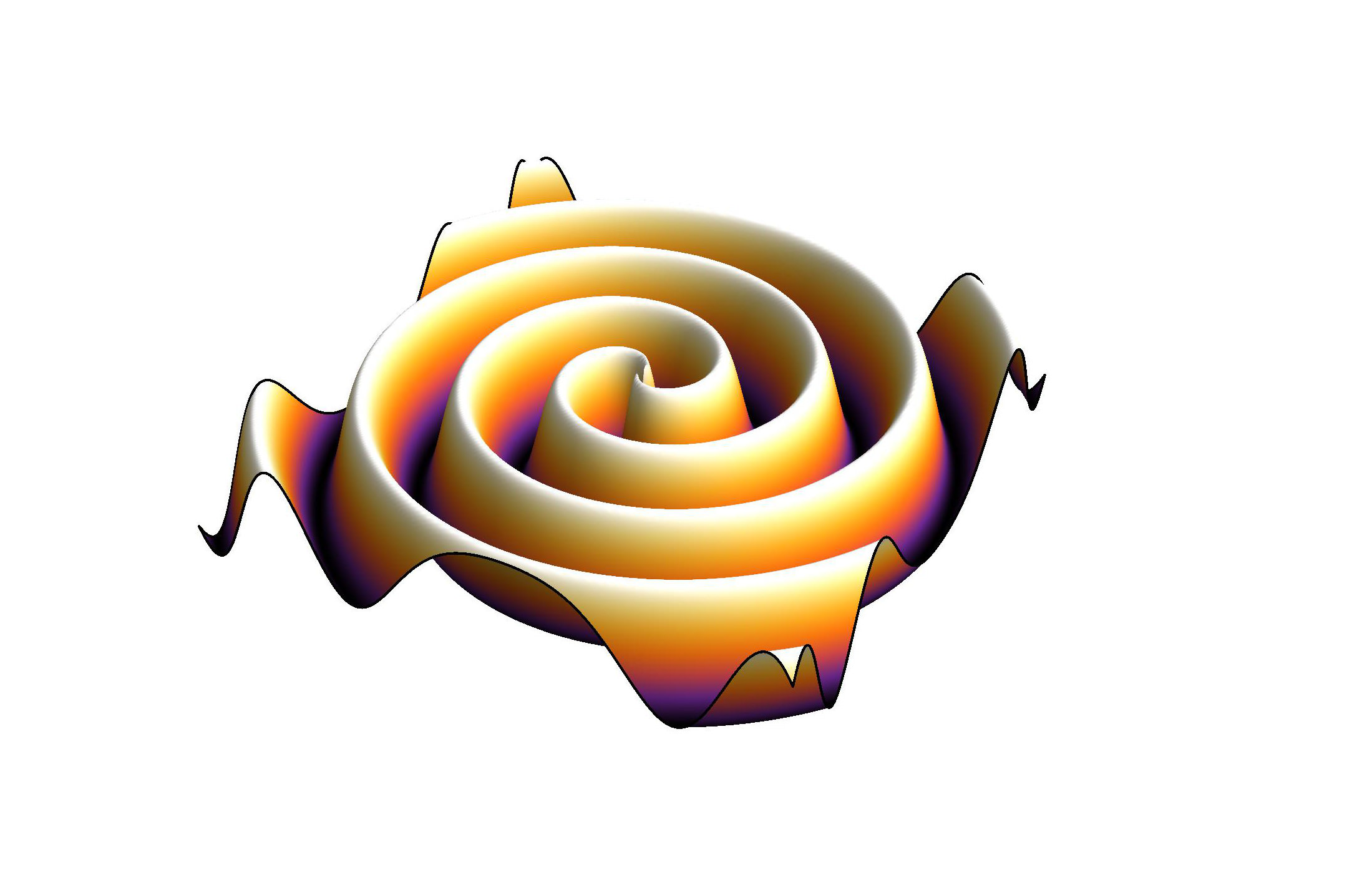
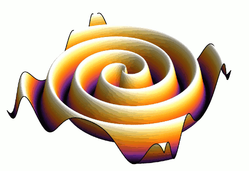 This is not something you would see, of course. The wave that is pictured here represents the strength of the minute changes in distance that would be caused by the gravitational wave, just as we’ve seen in Gravitational waves and how they distort space. The animation is courtesy of Sascha Husa of the Universitat de les Illes Balears.
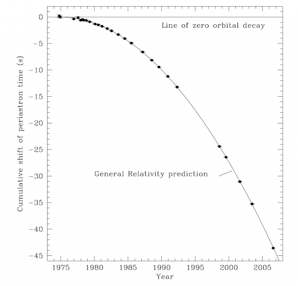 As the two neutron stars speed up, they will reach the point of closest approach within their orbit earlier and earlier. How much earlier, in seconds, is plotted on the vertical axis, year of measurement on the horizontal axis.
 You can see how the frequency and intensity increase right up to time 0, when the two neutron stars collide and merge.
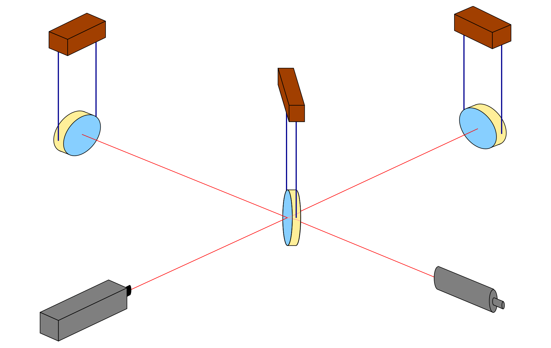
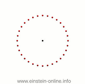 The wave is moving at right angles to the screen, towards you. I’ve greatly exaggerated the distance changes. For a realistic wave, even the giant distance between the Earth and the Sun would only change by a fraction of the diameter of a hydrogen atom. Tiny changes indeed.

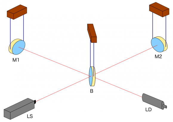
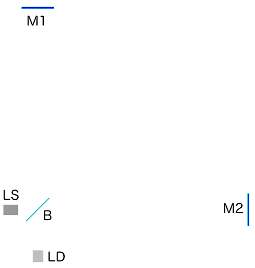 Light source LS, the two mirrors M1 and M2, the beamsplitter B and the light detector LD: all present and accounted for.
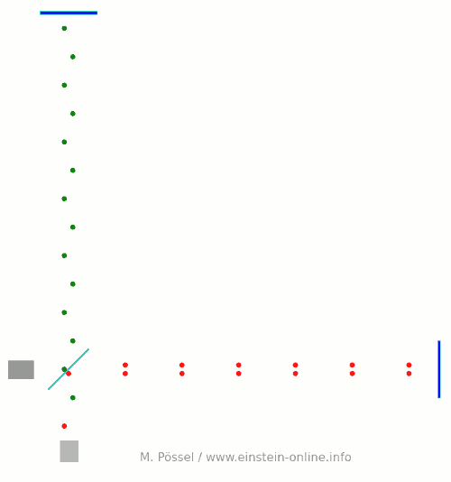 Light starts at the light source to the left. Light that has left the source together, travels together (so green and red pulses are side by side) until the beam splitter. The beam splitter then sends the green pulses on their upward journey and lets the red pulses pass on their way towards the mirror on the right. All the particles that arrive back at the beamsplitter after reflection at M1 or M2. At the beamsplitter, they are directed towards the light detector at the bottom.
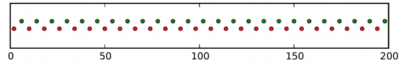 The pattern is clear: red and green pulses arrive evenly spaced, one after the other.
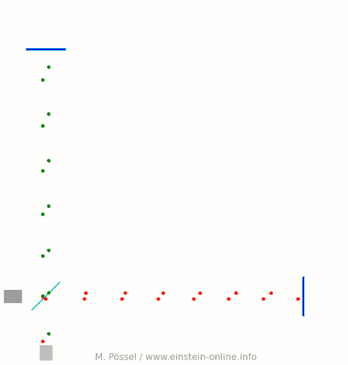 We have trained our camera on the beamsplitter (so in our image, the beamsplitter doesn’t move). We ignore any slight changes in distance between beamsplitter and light source/light detector. Instead, we focus on the mirrors M1 and M2, which change their distance from the beamsplitter just as we would expect from the earlier animations.
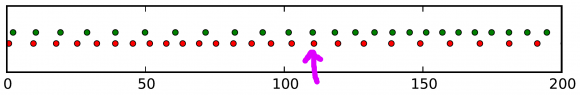
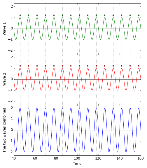 On top, the green wave, perfectly aligned with the red wave (which, for clarity, is shown directly below the green wave). Add the two waves up, and you will get the (markedly stronger) blue wave in the bottom panel.
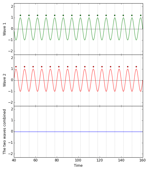 Recall that this was exactly the setup for our gravitational wave detector in the absence of gravitational waves: Red and green pulses with equal spacing; troughs of the one wave perfectly aligned with the crests of the other. The result: No light at the light detector. (For realistic gravitational wave detectors, that is almost true.)
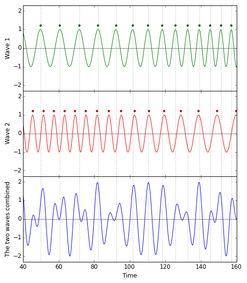 The blue pattern, which is the sum of the red and the green, is complex. But it is not a flat line. There is light at the light detector where there was no light before, and the cause of the change is the gravitational wave passing through.
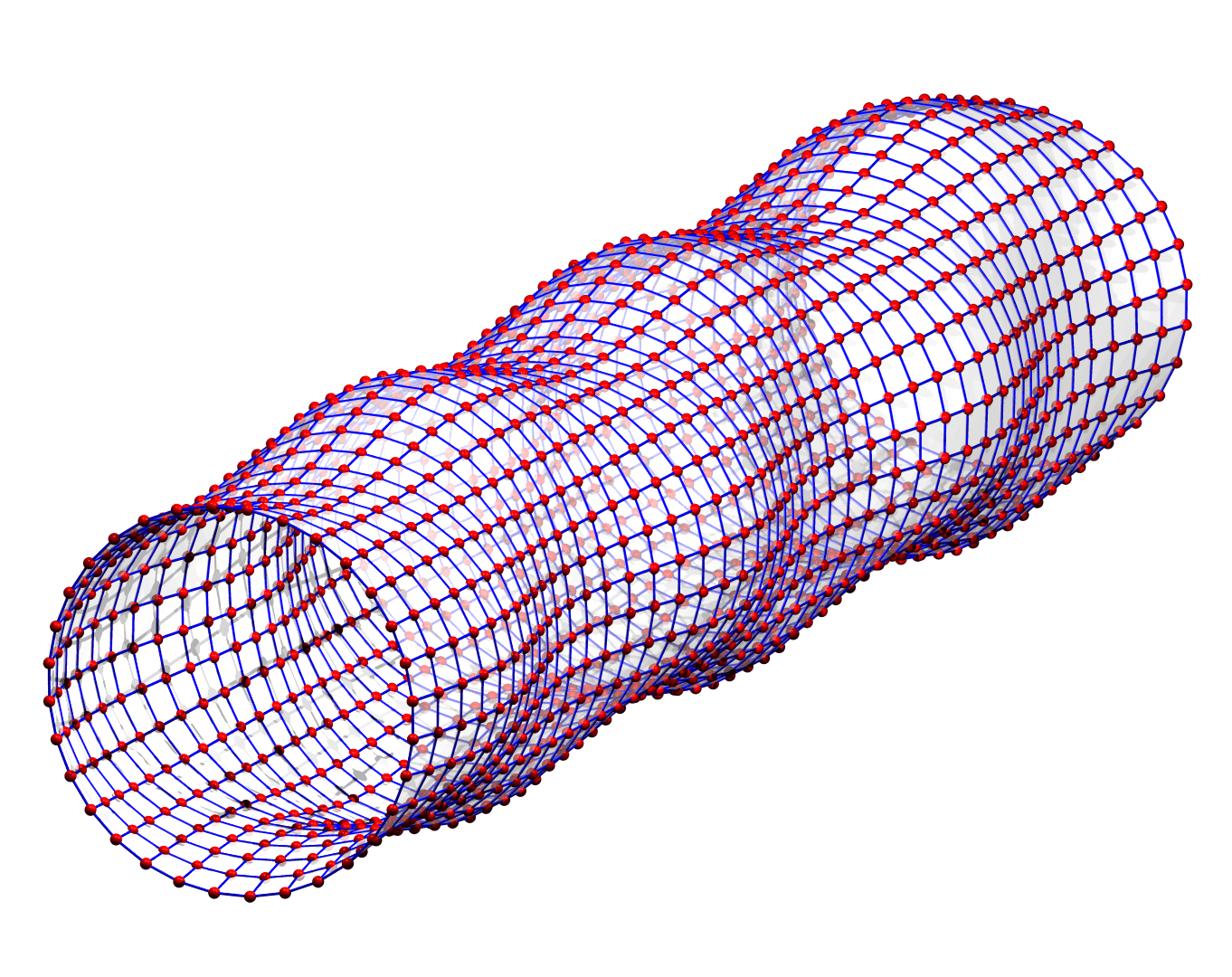

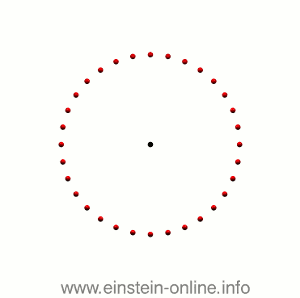
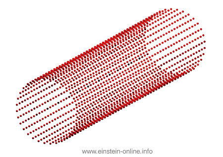
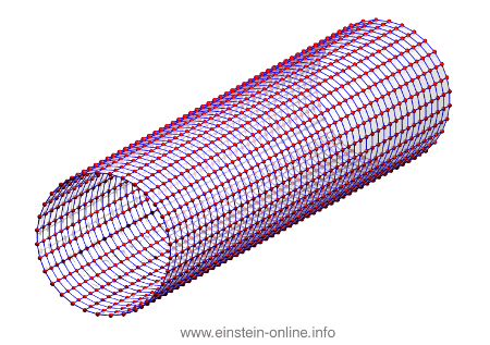
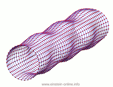 As you can see, the wave is propagating through space. For instance, the point where the vertical distances within the circle of particles is maximal is moving towards the observer. The wave nature can be seen even more clearly if we look at this cylinder directly from the side:
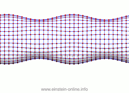
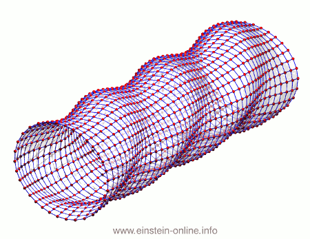
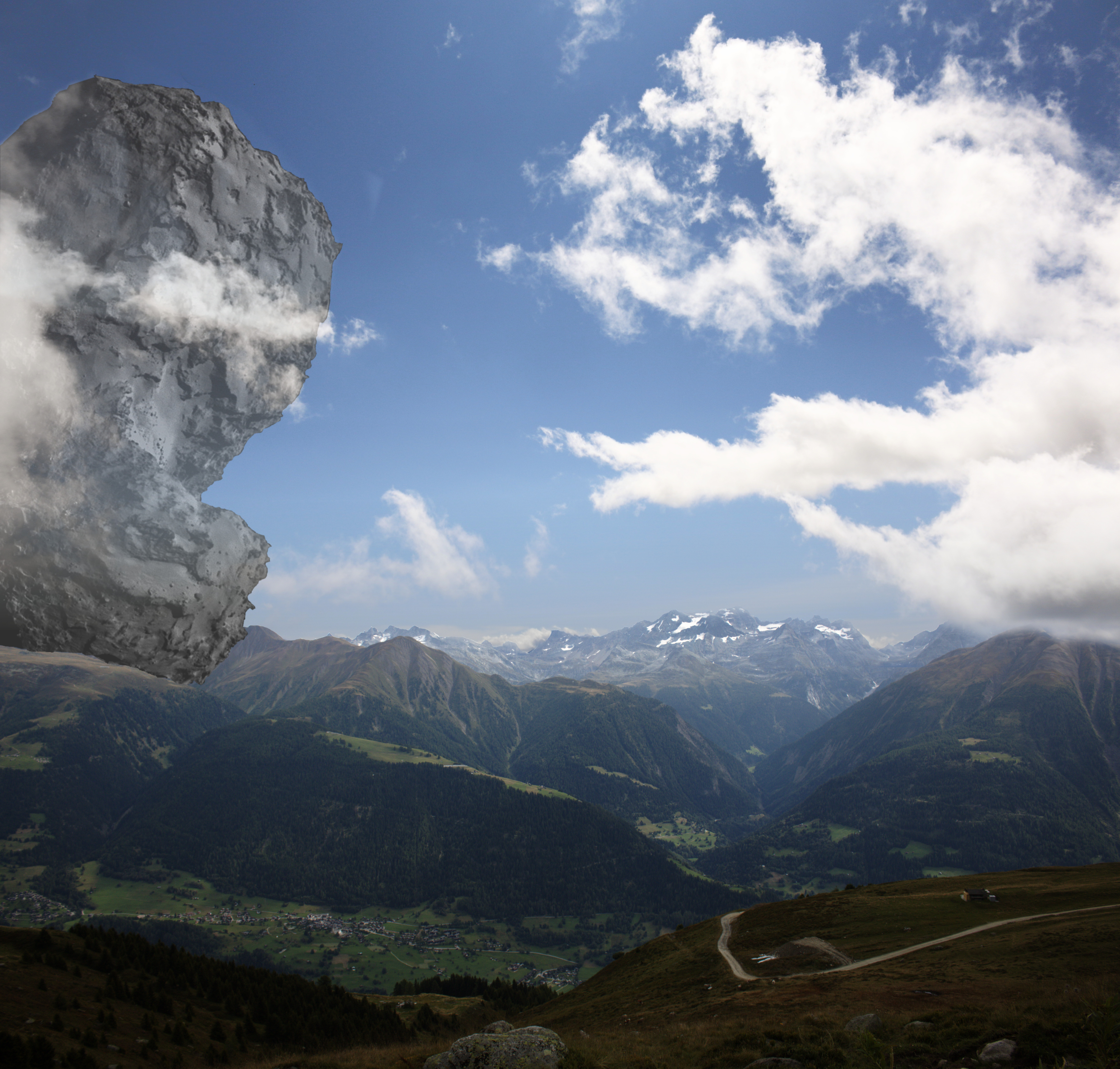
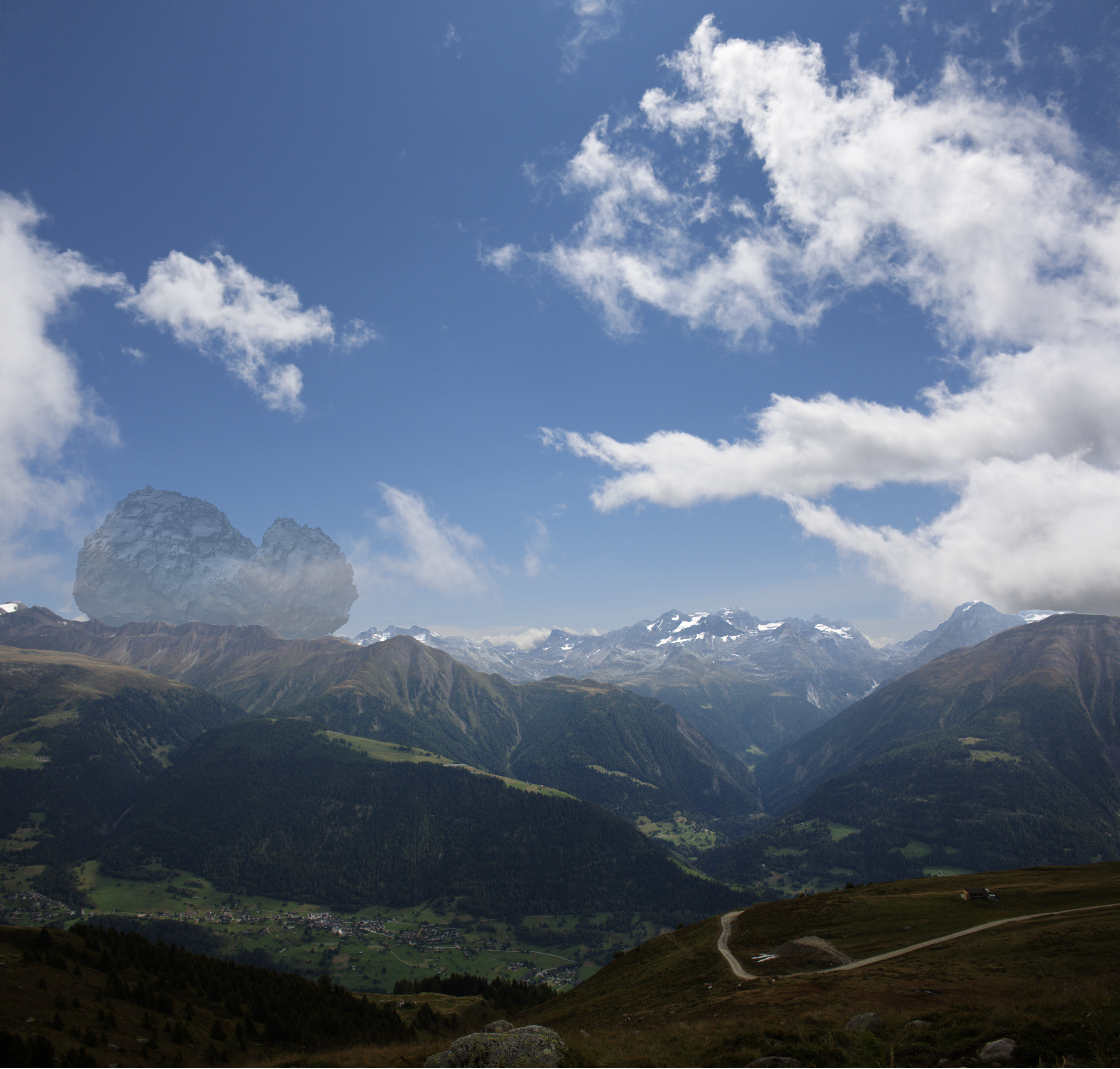
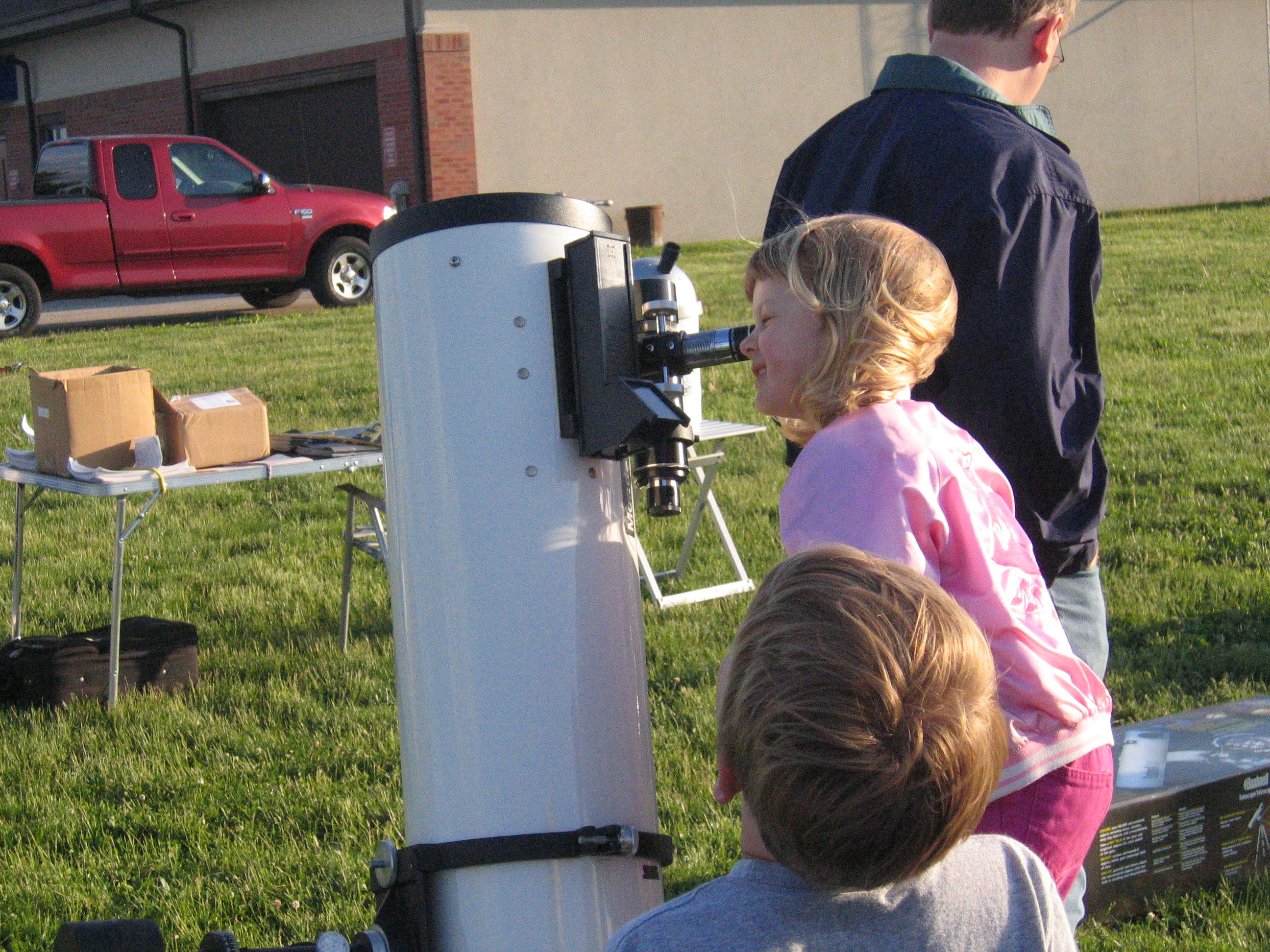


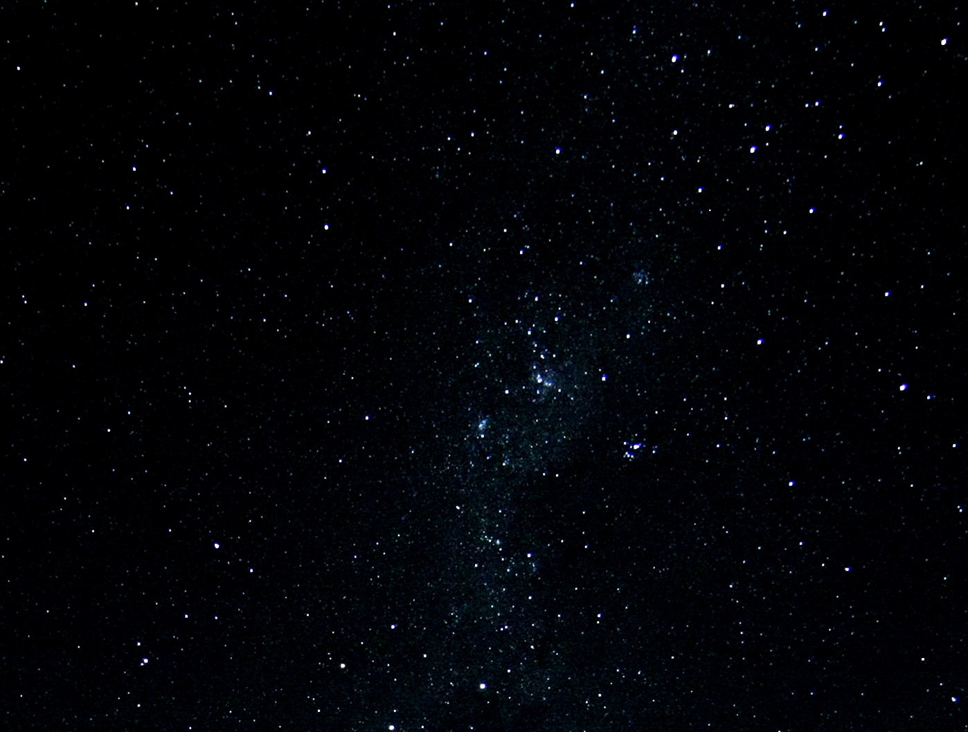
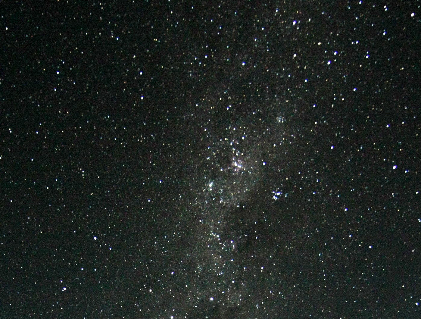

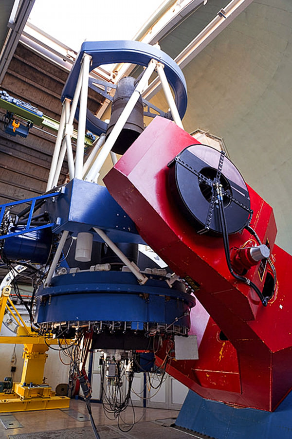
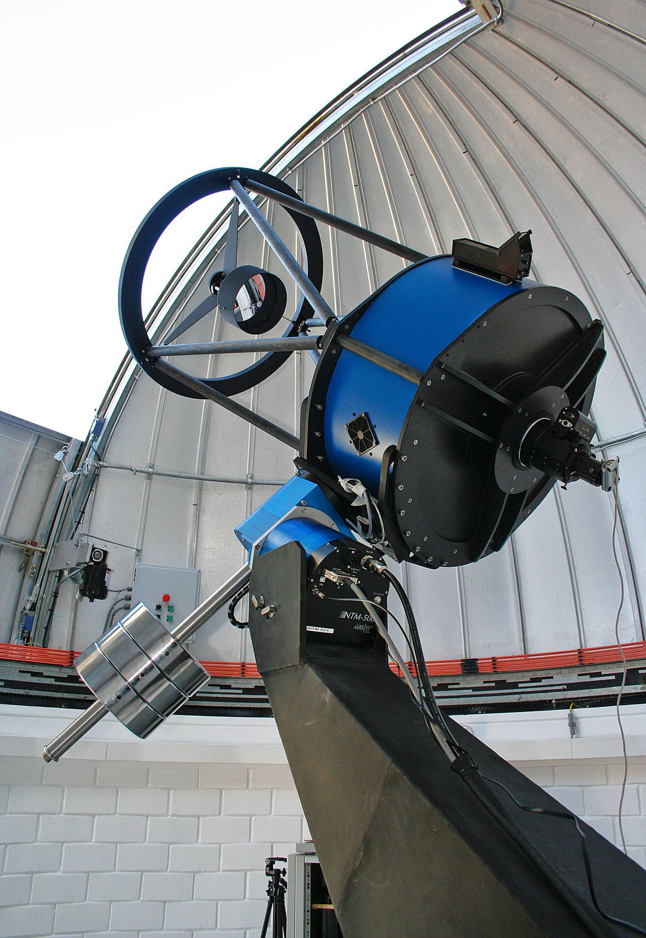
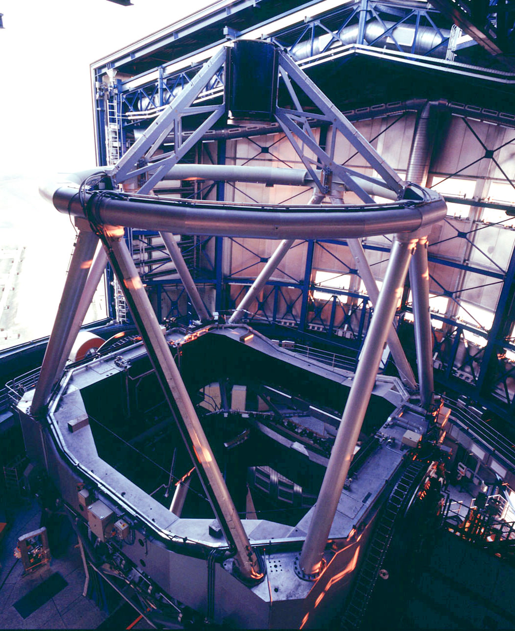


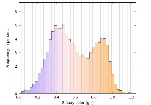
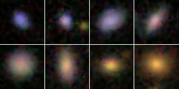
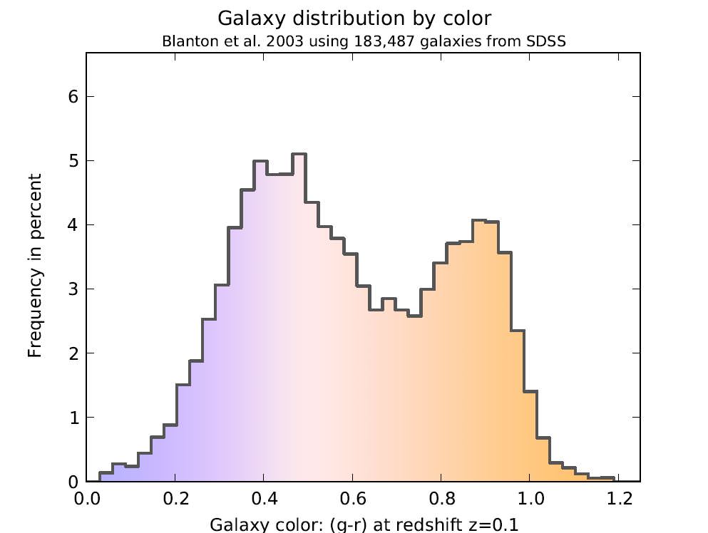


