If you’ve ever taken an introductory astronomy class, you’ve probably seen the Hertzsprung-Russell (HR) diagram. This graph maps out the life cycle of stars by plotting their temperature against their luminosity, and has been a “cheat sheet” for stellar astrophysics for over a century. But the universe is full of more than just stars, and a new paper, available in pre-print on arXiv from Gabriel Steward and Matthew Hedman of the University of Idaho, attempts to do for the density and mass of all objects what the HR diagram did for the lifecycle of stars - provide a coherent, visual map to represent them.
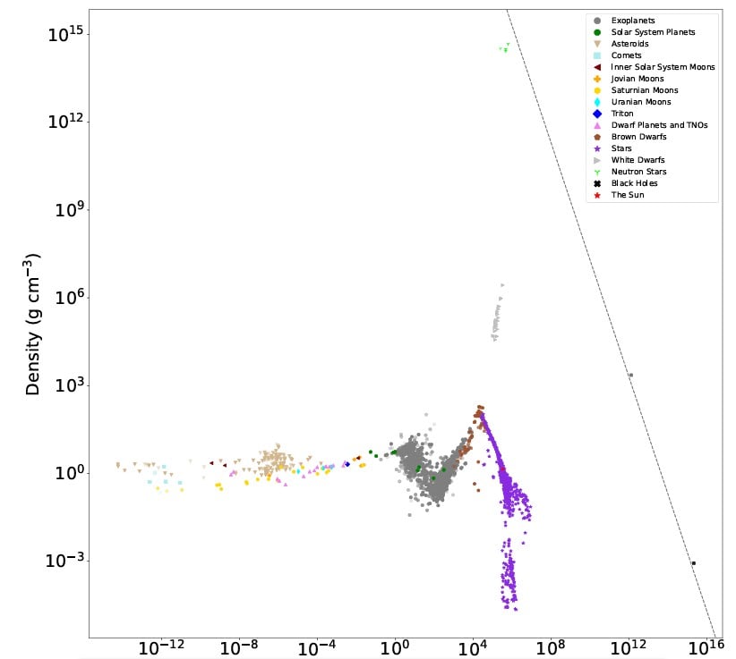
Their effort, which they call the Cohesive Object Sequence, is based on a plot of the density of over 2,000 astronomical objects against their mass. The sizes range from Itokawa, one of the small asteroids, to blue supergiant stars and covers a shocking 12 orders of magnitude. But, critically, they only mapped “cohesive objects”, which they define as any astronomical body that has a relatively well-defined surface resulting from the direct physical interactions of its components.
This rules out things like nebulae and galaxies, but, interestingly, includes black holes, as the authors argue that the event horizon acts as a singular, well-defined physical boundary, even though it's not made of traditional matter. Using data from 2,157 objects, the team made sure their graph was grounded firmly in reality, and the graph itself shows some interesting connections and inflection points that aren’t otherwise obvious in astronomical observing.
Fraser talks about the energy needed to start a star.Starting at the low end, asteroids and comets pretty linearly scale up their density with their mass, as gravity compresses their typically porous structures. However, the graph also shows there’s a very small transition point where the object starts looking less like a potato (i.e. “irregular”) and starts looking more spherical. That transition point is between Vesta, the largest known irregular object (4.3x10^-5 Earth masses), and Saturn’s moon Mimas, the smallest known spherical object (6.3x10^-6 Earth masses). The discrepancy between their sizes and their expected shapes comes from their material composition - Mimas is made almost entirely of water ice, which is relatively malleable and easily rounded, whereas Vesta, the “Queen of the asteroid belt,” is rocky and dense, but doesn’t have enough gravitational muscle to crush that rock into a sphere.
Scaling up into planetary masses, there are three distinct regions - terrestrial worlds, like Earth, volatile-rich worlds like the ice giants of our solar system (Uranus and Neptune), and gas giants like Saturn and Jupiter. The graph over the planetary masses follows an interesting pattern. Terrestrial planets follow a typical linear increase between size and weight. However, for volatile-rich planets, the more massive they get, the lower their density drops, inverting the trend in the graph up to that point. Then, right around 100 Earth masses, the sequence switches back to positive correlation for gas giants.
One of the interesting features about the graph is there is no clear distinction between super large gas giants and the smallest form of “star” - brown dwarfs. Despite being categorized differently by astronomers (since brown dwarfs can fuse deuterium, at least for a while), on a mass/density chart brown dwarfs are essentially indistinguishable from super-massive gas giants.
Fraser talks about how hot the Sun is - which plays a role in where it ends up on the graph.The linear trend upward between the values continues right up until it hits the mass required to ignite hydrogen fusion and the birth of a true star. This correlates to the “Kraft Break,” a pivotal moment in stellar physics where stars switch from being “convective,” where their plasma moves the heat out of the core, to “radiative,” where the heat from their internal engines radiates away as light. Past this point, the density/mass curve drops precipitously.
While the graph looks largely coherent for most of it, there are some notable outliers. White dwarfs sit with much higher density than a traditional star, and actually have a positive slope relationship between their density and mass. Neutron stars, as might be expected, are way high on the density axis while having about the same mass as more traditional stars. Black holes have much higher masses than anything else, but aren’t necessarily more dense - maybe because the event horizon isn’t really a physical field and the actual object is likely much smaller.
There are some holes in data fed into the graph - the authors admit that all of the lower mass objects were based on data from our solar system. So, while it's reasonable to expect other solar systems would have similar low-mass objects, and that they would be similar on the density/mass scale, at this point it is an assumption since we haven’t found any yet.
But perhaps the greatest contribution of this work is breaking down the silos that astronomers sometimes accidentally build in their discipline. Connecting asteroids all the way up to black holes on a single, coherent graph helps visualize the actual connections between all of these objects. And it helps serve as a powerful reminder that everything in the universe is relative.
Learn More:
G.M. Steward & M. Hedman - The Cohesive Object Sequence: The Mass-Density Distribution of Astronomical Objects from Asteroids to Stars
UT - Density of the Earth