When Science is Art: a New Map of Wind Patterns
Blah.
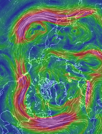
A new map of wind patterns is so visually stunning it’s easily mistaken for art.
This interactive visualization of wind patterns — modeled from the U.S. National Weather Service’s Global Forecast System database — provides nearly current weather conditions on the global scale. And it’s beautiful.
In an interactive form, this data set allows the user to move the globe around (simply drag with your mouse) and zoom in and out (use your scroll wheel). After a few seconds the colors appear in snaking lines, depicting wind patterns at varying speeds. Gentle breezes are thin lines of green, strong winds are light streaks of yellow, and the strongest current are thick lines of red and purple.
Adjustable parameters also allow the user to view the wind patterns at various heights in the atmosphere, from 100 meters (noted as 1000 hPa in the program) to 26,500 meters (10 hPa) above the Earth’s surface. Simply click on the word “earth” in the lower left-hand corner of the web browser.
At the surface the map is a mirage of blue and green — with fairly gentle wind patterns in green. Circling patterns over the oceans are cyclones. They rotate clockwise over the southern Indian ocean and counter-clockwise over the northern Pacific ocean. If you turn your eyes toward land, you can compare the light summer winds across Australia with the swirling gusts off the northeast coast of Japan.
But you can also graze the jet streams, where thick bands of purple and red dance among the less violent green and yellow streaks. The wavy polar jet stream is entering the U.S. near Seattle, dropping southward near the Rocky Mountains, and then turning northward again just beyond the Great Lakes. It creates a temperature boundary, where south of the jet stream is warm and north of the jet stream is cold.
Users can view seven different altitudes using eight different map projections. This surprising new look at our own world is stunning in its artistic and educative beauty.
Recent Posts
Dinkinesh's Moonlet is Only 2-3 Million Years Old
Last November, NASA's Lucy mission conducted a flyby of the asteroid Dinkinish, one of the…
The Universe Could Be Filled With Ultralight Black Holes That Can't Die
Steven Hawking famously calculated that black holes should evaporate, converting into particles and energy over…

Starlink on Mars? NASA Is Paying SpaceX to Look Into the Idea
NASA has given the go-ahead for SpaceX to work out a plan to adapt its…
Did You Hear Webb Found Life on an Exoplanet? Not so Fast…
The JWST is astronomers' best tool for probing exoplanet atmospheres. Its capable instruments can dissect…
Vera Rubin’s Primary Mirror Gets its First Reflective Coating
First light for the Vera Rubin Observatory (VRO) is quickly approaching and the telescope is…
Two Stars in a Binary System are Very Different. It's Because There Used to be Three
A beautiful nebula in the southern hemisphere with a binary star at it's center seems…