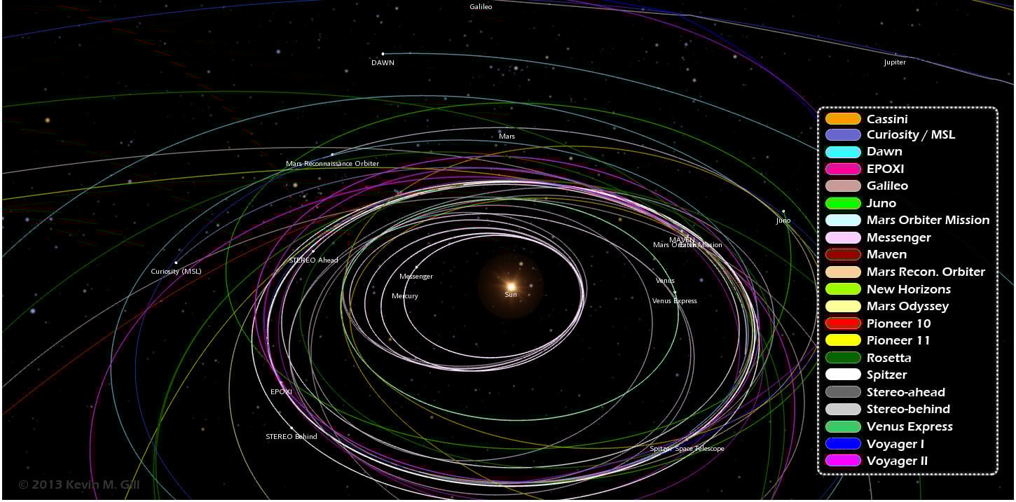
Want to know the orbital paths where different spacecraft have traveled and where they are now? A great new infographic put together by Kevin Gill is a visualization of where 21 different unmanned spacecraft have traveled through the Solar System. "The spacecraft data and planet orbital data is derived from
NASA/JPL Horizons ephemeris
," said Gill on G+. "The image was rendered using a modified version of
my Orbit Viewer WebGL application
and put into infographic form using Photoshop. Body and spacecraft positions are as of December 15, 2013."
By the way,
Kevin's orbit viewer
is really fun to play with!
See the full infographic below or on Kevin's website here:
Paths range from the earliest vector data available, typically just following launch, to either the latest data available or December 15, 2013, whichever is earlier.
"Originally intended as an animation, my browser was not too amused with the quantity of data being thrown at it," Kevin said via G+. "In the new year, given sufficient demand, I may optimize the modeling and animation algorithms and either produce the animation or release it as a distinct WebGL visualization."
We certainly look forward to that!
[caption id="attachment_107256" align="alignright" width="580"]
Three different views of our Solar System and the paths of unmanned spacecraft trajectories from their launches to Dec. 15, 2013. Credit: Kevin Gill. [/caption]