When Science is Art: a New Map of Wind Patterns
Blah.
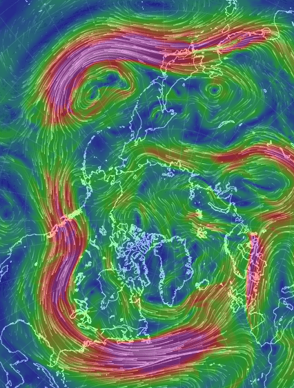
A new map of wind patterns is so visually stunning it’s easily mistaken for art.
This interactive visualization of wind patterns — modeled from the U.S. National Weather Service’s Global Forecast System database — provides nearly current weather conditions on the global scale. And it’s beautiful.
In an interactive form, this data set allows the user to move the globe around (simply drag with your mouse) and zoom in and out (use your scroll wheel). After a few seconds the colors appear in snaking lines, depicting wind patterns at varying speeds. Gentle breezes are thin lines of green, strong winds are light streaks of yellow, and the strongest current are thick lines of red and purple.
Adjustable parameters also allow the user to view the wind patterns at various heights in the atmosphere, from 100 meters (noted as 1000 hPa in the program) to 26,500 meters (10 hPa) above the Earth’s surface. Simply click on the word “earth” in the lower left-hand corner of the web browser.
At the surface the map is a mirage of blue and green — with fairly gentle wind patterns in green. Circling patterns over the oceans are cyclones. They rotate clockwise over the southern Indian ocean and counter-clockwise over the northern Pacific ocean. If you turn your eyes toward land, you can compare the light summer winds across Australia with the swirling gusts off the northeast coast of Japan.
But you can also graze the jet streams, where thick bands of purple and red dance among the less violent green and yellow streaks. The wavy polar jet stream is entering the U.S. near Seattle, dropping southward near the Rocky Mountains, and then turning northward again just beyond the Great Lakes. It creates a temperature boundary, where south of the jet stream is warm and north of the jet stream is cold.
Users can view seven different altitudes using eight different map projections. This surprising new look at our own world is stunning in its artistic and educative beauty.
Recent Posts
Update your Desktop Wallpaper with 25 New Images from Chandra
It’s not always possible to observe the night sky from the surface of the Earth.…
SpaceX Resumes Falcon 9 Rocket Launches After FAA Go-Ahead
SpaceX is flying again after the Federal Aviation Administration ruled that the company can resume…

Is This How You Get Hot Jupiters?
When we think of Jupiter-type planets, we usually picture massive cloud-covered worlds orbiting far from…
Now Uranus’ Moon Ariel Might Have an Ocean too
Venus is known for being really quite inhospitable with high surface temperatures and Mars is…
Why is JWST Having So Much Trouble with the TRAPPIST-1 System?
When the James Webb Space Telescope was launched it came with a fanfare expecting amazing…
Planetary Habitability Depends on its Star’s Magnetic Field
The extrasolar planet census recently passed a major milestone, with 5500 confirmed candidates in 4,243…