
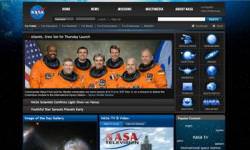
NASA unveiled a new look for its website over the weekend, and hopes that blogs, interactive features, and a customizable layout will especially appeal to 18-25 year olds.
A New York Times article reported that NASA is concerned that the social networking generation hasn’t shown enough interest in NASA, and the space agency hopes their new webpage will attract the MySpace crowd. This is the first major overhaul for NASA’s website since 2003, and NASA now hopes to compete with Space.com and CNN’s more chic presentations of space exploration. Numerous rollovers, links, and spectacular graphics can keep a visitor engaged for quite awhile, and readers can now Digg, del.icio.us or StumbleUpon stories that they like or want to share. The “Image of the Day” Gallery also benefited with a much-needed upgrade.
Critical Mass, the company that assisted NASA with the new design, says on their website that NASA’s site will now “inspire, involve and inform” and will unify over 3,500 different sites into a “cohesive information gateway.”
One past criticism of the different NASA webpages is that there was sometimes redundant or conflicting information. Critical Mass and their partner eTouch Systems claim the new site will fuel NASA’s efforts to “reconnect with the public and re-capture significance as one of the world’s most visionary and imaginative organizations.”
Still, Brian Dunbar, Internet Services Manager for NASA estimates that even before the overhaul, NASA’s website received approximately one million unique visitors each month. Not bad for an aging, old-fashioned, 50-year old.
Chime in with your thoughts about NASA’s revamped webpage on the BAUT Forum.
Original Source: New York Times
The site of Nasa is quite great and interesting and besides this informative,attractive,cool for viewing, nice colours and images are used and intelligent page building. 🙂
sunil
I was really unimpressed by the new-look site. Not because it looks bad or doesn’t work. Far from it, it is a very nicely designed website… but there are way too many gadgets and “fun stuff” to appeal to the younger crowd.
I just hope NASA.gov isn’t watering down the science in the aim of appealing to a larger audience. Balance is needed.