When it comes to carbon dioxide, just a little goes a long way to warming the planet. Unfortunately, we’ve been dumping vast amounts into the atmosphere, recently passing 400 parts per million. Let’s look at the science of the greenhouse effect, and how it’s impacting our global climate.
And the podcast is also available as a video, as Fraser and Pamela now record Astronomy Cast as part of a Google+ Hangout (usually recorded every Monday at 3 pm Eastern Time):
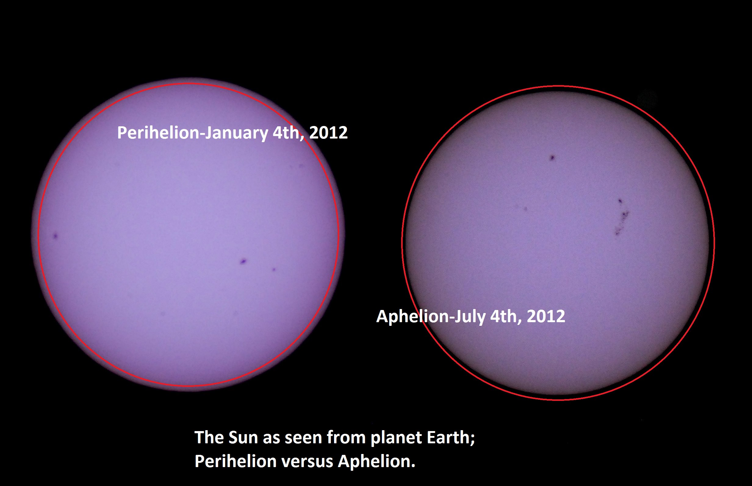
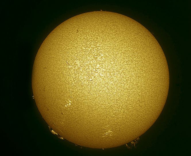
Solar apparent size- perihelion versus aphelion 2012.
This 4th of July weekend brings us one more reason to celebrate. On July 5th at approximately 11:00 AM EDT/15:00 UT, our fair planet Earth reaches aphelion, or its farthest point from the Sun at 1.0167 Astronomical Units (A.U.s) or 152,096,000 kilometres distant.
Though it may not seem it to northern hemisphere residents sizzling in the summer heat, we’re currently 3.3% farther from the Sun than our 147,098,290 kilometre (0.9833 A.U.) approach made in early January.
We thought it would be a fun project to capture this change. A common cry heard from denier circles as to scientific facts is “yeah, but have you ever SEEN it?” and in the case of the variation in distance between the Sun and the Earth from aphelion to perihelion, we can report that we have!
We typically observe the Sun in white light and hydrogen alpha using a standard rig and a Coronado Personal Solar Telescope on every clear day. We have two filtered rigs for white light- a glass Orion filter for our 8-inch Schmidt-Cassegrain, and a homemade Baader solar filter for our DSLR. We prefer the DSLR rig for ease of deployment. We’ve described in a previous post how to make a safe and effective solar observing rig using Baader solar film.
Our primary solar imaging rig. A Nikon D60 DSLR with a 400mm lens + a 2x teleconverter and Baader solar filter. Very easy to employ!
We’ve been imaging the Sun daily for a few years as part of our effort to make a home-brewed “solar rotation and activity movie” of the entire solar cycle. We recently realized that we’ve imaged Sol very near aphelion and perihelion on previous years with this same fixed rig, and decided to check and see if we caught the apparent size variation of our nearest star. And sure enough, comparing the sizes of the two disks revealed a tiny but consistent variation.
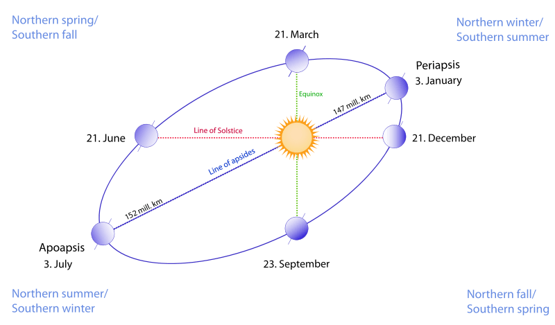
It’s a common misconception that the seasons are due to our distance from the Sun. The insolation due to the 23.4° tilt of the rotational axis of the Earth is the dominant driving factor behind the seasons. (Don’t they still teach this in grade school? You’d be surprised at the things I’ve heard!) In the current epoch, a January perihelion and a July aphelion results in milder climatic summers in the northern hemisphere and more severe summers in the southern. The current difference in solar isolation between hemispheres due to eccentricity of Earth’s orbit is 6.8%.
The orbit of the Earth also currently has one of the lowest eccentricities (how far it deviates for circular) of the planets at 0.0167, or 1.67%. Only Neptune (1%) and Venus (0.68%) are “more circular.”
The orbital eccentricity of the Earth also oscillates over a 413,000 year period between 5.8% (about the same as Saturn) down to 0.5%. We’re currently at the low end of the scale, just below the mean value of 2.8%.
Variation in eccentricity is also coupled with other factors, such as the change in axial obliquity the precession of the line of apsides and the equinoxes to result in what are known as Milankovitch cycles. These variations in extremes play a role in the riddle of climate over hundreds of thousands of years. Climate change deniers like to point out that there are large natural cycles in the records, and they’re right – but in the wrong direction. Note that looking solely at variations in the climate due to Milankovitch cycles, we should be in a cooling trend right now. Against this backdrop, the signal of anthropogenic climate forcing and global dimming of albedo (which also masks warming via cloud cover and reflectivity) becomes even more ominous.
Aphelion can presently fall between July 2nd at 20:00 UT (as it did last in 1960) and July 7th at 00:00 UT as it last did on 2007. The seemingly random variation is due to the position of the Earth with respect to the barycenter of the Earth-Moon system near the time of aphelion. The once every four year reset of the leap year (with the exception of the year 2000!) also plays a lesser role.
Perihelion and aphelion vs the solstices and equinoxes, an exaggerated view. (Wikimedia Commons image under a 3.0 Unported Attribution-Share Alike license. Author Gothika/Doudoudou).
I love observing the Sun any time of year, as its face is constantly changing from day-to-day. There’s also no worrying about light pollution in the solar observing world, though we’ve noticed turbulence aloft (in the form of bad seeing) is an issue later in the day, especially in the summertime. The rotational axis of the Sun is also tipped by about 7.25° relative to the ecliptic, and will present its north pole at maximum tilt towards us on September 8th. And yes, it does seem strange to think in terms of “the north pole of the Sun…”
We’re also approaching the solar maximum through the 2013-2014 time frame, another reason to break out those solar scopes. This current Solar Cycle #24 has been off to a sputtering start, with the Sun active one week, and quiet the next. The last 2009 minimum was the quietest in a century, and there’s speculation that Cycle #25 may be missing all together.
And yes, the Moon also varies in its apparent size throughout its orbit as well, as hyped during last month’s perigee or Super Moon. Keep those posts handy- we’ve got one more Super Moon to endure this month on July 22nd. The New Moon on July 8th at 7:15UT/3:15 AM EDT will occur just 30 hours after apogee, and will hence be the “smallest New Moon” of 2013, with a lot less fanfare. Observers worldwide also have a shot at catching the slender crescent Moon on the evening of July 9th. This lunation and the sighting of the crescent Moon also marks the start of the month of Ramadan on the Muslim calendar.
Be sure to observe the aphelion Sun (with proper protection of course!) It would be uber-cool to see a stitched together animation of the Sun “growing & shrinking” from aphelion to perihelion and back. We could also use a hip Internet-ready meme for the perihelion & aphelion Sun- perhaps a “MiniSol?” A recent pun from Dr Marco Langbroek laid claim to the moniker of “#SuperSun;” in time for next January’s perihelion;
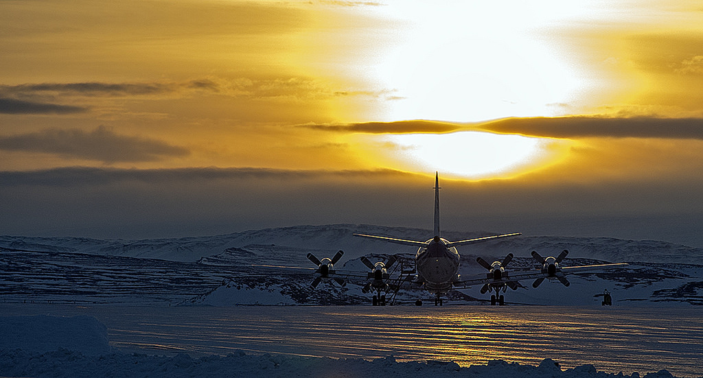
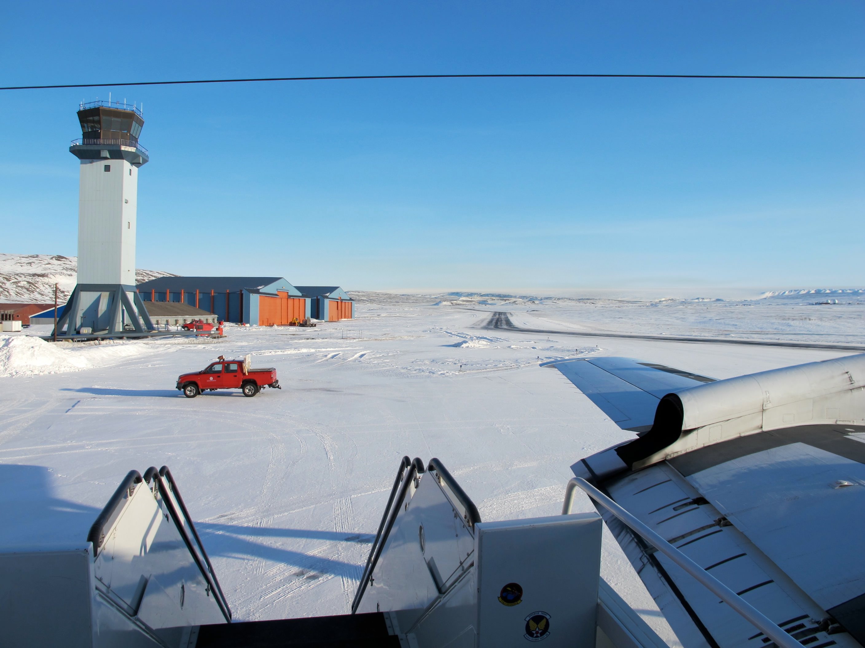
NASA P-3B waits outside the hangar at Thule Air Base with the Greenland Ice sheet in the background. The aircraft is set to begin the 2013 season of NASA’s Operation IceBridge mission to survey Earth's polar ice sheets in unprecedented three-dimensional detail. The plane just arrived from NASA Wallops Flight Facility in Virginia - see my P-3B photos below. Credit: NASA/Goddard/Michael Studinger
NASA’s Operation IceBridge has begun the 2013 research season of Ice Science flights in Greenland and the Arctic to survey the regions ice sheets and land and sea ice using a specially equipped P-3B research aircraft from NASA’s Wallops Flight Facility in Wallops Island, Va.
Operation IceBridge began in 2009 as part of NASA’s six-year long effort to conduct the largest airborne survey of Earth’s polar ice ever flown.
The goal is to obtain an unprecedented three-dimensional, multi-instrument view of the behavior of Greenland, Arctic and Antarctic ice sheets, ice shelves and sea ice which have been undergoing rapid and dramatic changes and reductions.
“We’re starting to see how the whole ice sheet is changing,” said Michael Studinger, IceBridge project scientist at NASA’s Goddard Space Flight Center in Greenbelt, Md. “Thinning at the margins is now propagating to the interior.”
The P-3 exiting the hanger pre-flight in Thule. Credit: NASA
The airborne campaign was started in order to maintain a continuous record of measurements in changes in polar ice after NASA’s Earth orbiting ICESat (Ice, Cloud and Land Elevation Satellite) probe stopped collecting data in 2009.
ICESat-2 won’t be launched until 2016, so NASA’s IceBridge project and yearly P-3 airborne campaigns will fill in the science data gap in the interval.
The P-3B Orion just arrived from NASA’s Wallops Flight Facility in Virginia where I visited it before departure – see my P-3B photos herein.
NASA IceBridge P-3B research aircraft prepares for departure from runway at NASA Wallops Flight Facility in Virginia to Thule Air Base in Greenland. Credit: Ken Kremer (kenkremer.com)
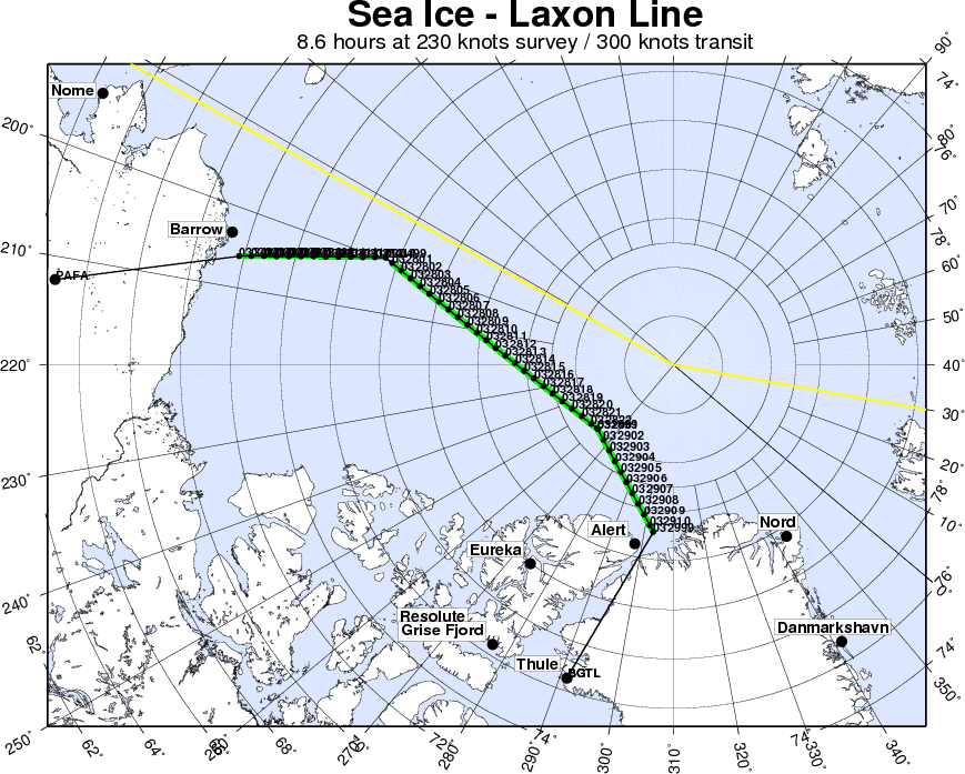
IceBridge is operating out of airfields in Thule and Kangerlussuaq, Greenland, and Fairbanks, Alaska.
The P-3B survey flights over Greenland and the Arctic will continue until May. They are conducted over Antarctica during October and November.
A sunny view of the ramp at Thule Air Base, Greenland, shortly after the NASA P-3B research aircraft arrived on Mar. 18, 2013. Credit: NASA / Jim Yungel
The measurements collected by IceBridge instruments will characterize the annual changes in thickness of sea ice, glaciers, and ice sheets. The data are used to help predict how climate change affects Earth’s polar ice and the resulting rise in sea-levels.
Researchers with the U.S. Army Corps of Engineers are collaborating with the IceBridge project to collect snow depth measurements near Barrow , Alaska. High school science teachers from the US, Denmark and Greenland will fly along on the P-3B survey flights to learn about polar science.
NASA Wallops has a wide ranging research and development mission and is home to the Virginia launch pad for the new Antares/Cygnus commercial ISS resupply rocket set for its maiden launch in mid April 2013; detailed in see my new story – here.
Sea ice in the southern Beaufort Sea. Credit: NASAIceBridge departing to Fairbanks to start their sea ice flights that will cover the Beauford and Chukchi seas – via the Laxon sea ice route for the transit. Credit: NASA
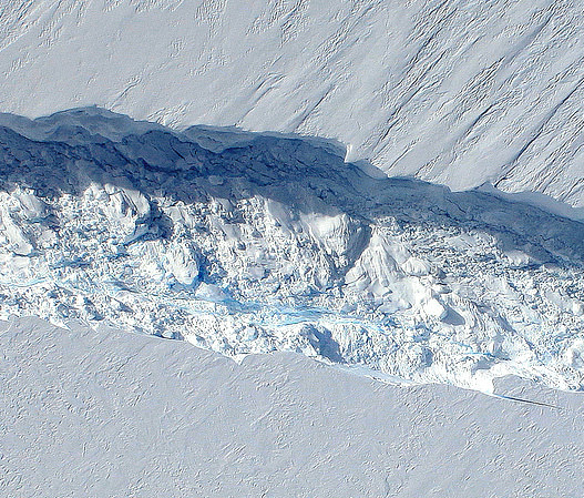
An “ice island” that calved from the Petermann Glacier in July is seen by NASA satellite (MODIS/Terra)
Remember that enormous slab of ice that broke off Greenland’s Petermann Glacier back in July? It’s now on its way out to sea, a little bit smaller than it was a couple of months ago — but not much. At around 10 miles long and 4.6 miles across (16.25 x 7.5 km) this ice island is actually a bit shorter than Manhattan, but is fully twice as wide.
The image above was acquired on September 14 by the Moderate Resolution Imaging Spectroradiometer (MODIS) aboard NASA’s Terra satellite.
Although the calving of this particular ice island isn’t thought to be a direct result of increasing global temperatures, climate change is thought to be a major factor in this year’s drop in Arctic sea ice extent, which is now below 4.00 million square kilometers (1.54 million square miles). Compared to September conditions in the 1980s and 1990s, this represents a 45% reduction in the area of the Arctic covered by sea ice.
Arctic sea ice extent data for June-July 2012 (NSIDC)
This year sea ice in the Arctic Ocean dropped below the previous all-time record, set in 2007. 2012 also marks the first time that there has been less than 4 million square kilometers (1.54 million square miles) of sea ice since satellite observations began in 1979.
The animation below, released today by the NOAA, shows the 2012 time-series of ice extent using data from the DMSP SSMI/S satellite sensor:
Image of Earth taken by ESA's Rosetta spacecraft in 2009
[/caption]
Researchers at the University of Maryland have discovered a way to identify and track sulfuric compounds in Earth’s marine environment, opening a path to either refute or support a decades-old hypothesis that our planet can be compared to a singular, self-regulating, living organism — a.k.a. the Gaia theory.
Proposed by scientists James Lovelock and Lynn Margulis in the 70s, the Gaia theory likens Earth to a self-supporting singular life form, similar to a cell. The theory claims that, rather than being merely a stage upon which life exists, life — in all forms — works to actively construct an Earthly environment in which it can thrive.
Although named after the Greek goddess of Earth, the Gaia theory is not so much about mythology or New Age mysticism as it is about biology, chemistry and geology — and how they all interact to make our world suitable for living things.
Once called the Gaia hypothesis, enough scientific cross-disciplinary support has since been discovered that it’s now commonly referred to as a theory.
Marine phytoplankton -- like these diatoms -- may produce sulfur compounds that can be transmitted into the air, affecting climate. (NOAA image)
One facet of the Gaia theory is that sulfur compounds would be created by microscopic marine organisms — such as phytoplankton and algae — and these compounds could be transmitted into the air, and eventually (in some form) to the land, thus helping to support a sulfur cycle.
Sulfur is a key element in both organic and inorganic compounds. The tenth most abundant element in the Universe, sulfur is crucial to climate regulation — as well as life as we know it.
In particular, two sulfur compounds — dimethylsulfoniopropionate and its atmospherically-oxidized version, dimethylsulfide — are considered to be likely candidates for the products created by marine life. It’s these two compounds that UMD researcher Harry Oduro, along with geochemist and professor James Farquhar and marine biologist Kathryn Van Alstyne (of Western Washington University) have discovered a way to track across multiple environments, from sea to air to land, allowing scientists to trace which isotopes are coming from what sources.
“What Harry did in this research was to devise a way to isolate and measure the sulfur isotopic composition of these two sulfur compounds,” said Farquhar. “This was a very difficult measurement to do right, and his measurements revealed an unexpected variability in an isotopic signal that appears to be related to the way the sulfur is metabolized.”
The team’s research can be used to measure how the organisms are producing the compounds, under which circumstances and how they are ultimately affecting their — and our — environment in the process.
“The ability to do this could help us answer important climate questions, and ultimately better predict climate changes,” said Farquhar. “And it may even help us to better trace connections between dimethylsulfide emissions and sulfate aerosols, ultimately testing a coupling in the Gaia hypothesis.”
Whether or not Earth can be called a singular — or possibly even sentient — living organism of which all organisms are contributing members thereof may still be up for debate, but it is fairly well-accepted that life can shape and alter its own environment (and in the case of humans, often for the worse.) Research like this can help science determine just how far-reaching those alterations may be.
The 820-foot-wide crack in Antarctica's Pine Island Glacier, seen from DC-8 during Operation IceBridge (Credit: NASA/DMS)
Data collected from a NASA ice-watching satellite reveal that the vast ice shelves extending from the shores of western Antarctica are being eaten away from underneath by ocean currents, which have been growing warmer even faster than the air above.
The animation above shows the circulation of ocean currents around the western Antarctic ice shelves. The shelf thickness is indicated by the color; red is thicker (greater than 550 meters), while blue is thinner (less than 200 meters).
Launched in January 2003, NASA’s ICESat (Ice, Cloud and land Elevation Satellite) studied the changing mass and thickness of Antarctica’s ice from its location in polar orbit. An international research team used over 4.5 million surface height measurements collected by ICESat’s GLAS (Geoscience Laser Altimeter System) instrument from Oct. 2005 to 2008. They concluded that 20 of the 54 shelves studied — nearly half — were losing thickness from underneath.
[/caption]
Most of the melting ice shelves are located in west Antarctica, where the flow of inland glaciers to the sea has also been accelerating — an effect that can be compounded by thinning ice shelves which, when grounded to the offshore seabed, serve as dams to hold glaciers back.
Melting of ice by ocean currents can occur even when air temperature remains cold, maintaining a steady process of ice loss — and eventually increased sea level rise.
“We can lose an awful lot of ice to the sea without ever having summers warm enough to make the snow on top of the glaciers melt,” said Hamish Pritchard of the British Antarctic Survey in Cambridge and the study’s lead author . “The oceans can do all the work from below.”
The study also found that Antarctica’s winds are shifting in response to climate change.
“This has affected the strength and direction of ocean currents,” Pritchard said. “As a result warm water is funnelled beneath the floating ice. These studies and our new results suggest Antarctica’s glaciers are responding rapidly to a changing climate.”
ICESat completed operations in 2010 and was decommissioned in August of that year. Its successor ICESat-2 is anticipated to launch in 2016.
The disintegrated Wilkins Ice Shelf in April 2009. (Chelys/EOSnap)
[/caption]
A paper published in the journal Science in August 1981 made several projections regarding future climate change and anthropogenic global warming based on manmade CO2 emissions. As it turns out, the authors’ projections have proven to be rather accurate — and their future is now our present.
The paper, written by a team of atmospheric physicists led by the now-controversial James Hansen at NASA’s Institute for Space Studies at Goddard Space Flight Center, was recently rediscovered by researchers Geert Jan van Oldenborgh and Rein Haarsma from the Royal Netherlands Meteorological Institute (KNMI). Taking a break from research due to illness, the scientists got a chance to look back through some older, overlooked publications.
“It turns out to be a very interesting read,” they noted in their blog on RealClimate.org.
Even though the paper was given 10 pages in Science, it covers a lot of advanced topics related to climate — indicating the level of knowledge known about climate science even at that time.
“The concepts and conclusions have not changed all that much,” van Oldenborgh and Haarsma note. “Hansen et al clearly indicate what was well known (all of which still stands today) and what was uncertain.”
Within the paper, several graphs note the growth of atmospheric carbon dioxide, both naturally occurring and manmade, and projected a future rise based on the continued use of fossil fuels by humans. Van Oldenborgh and Haarsma overlaid data gathered by NASA and KNMI in recent years and found that the projections made by Hansen et al. were pretty much spot-on.
If anything, the 1981 projections were “optimistic”.
Data from the GISS Land-Ocean Temperature Index fit rather closely with the 1981 projection (van Oldenborgh and Haarsma)
Hansen wrote in the original paper:
“The global temperature rose by 0.2ºC between the middle 1960’s and 1980, yielding a warming of 0.4ºC in the past century. This temperature increase is consistent with the calculated greenhouse effect due to measured increases of atmospheric carbon dioxide. Variations of volcanic aerosols and possibly solar luminosity appear to be primary causes of observed fluctuations about the mean rend of increasing temperature. It is shown that the anthropogenic carbon dioxide warming should emerge from the noise level of natural climate variability by the end of the century, and there is a high probability of warming in the 1980’s. Potential effects on climate in the 21st century include the creation of drought-prone regions in North America and central Asia as part of a shifting of climate zones, erosion of the West Antarctic ice sheet with a consequent worldwide rise in sea level, and opening of the fabled Northwest Passage.”
Now here we are in 2012, looking down the barrel of the global warming gun Hansen and team had reported was there 31 years earlier. In fact, we’ve already seen most of the predicted effects take place.
The retreat of Pedersen Glacier in Alaska. Left: summer 1917. Right: summer 2005. Source: The Glacier Photograph Collection, National Snow and Ice Data Center/World Data Center for Glaciology.
And that’s not the only prediction that seems to have uncannily come true.
“In light of historical evidence that it takes several decades to complete a major change in fuel use, this makes large climate change almost inevitable,” Hansen et al wrote in anticipation of the difficulties of a global shift away from dependence on carbon dioxide-emitting fossil fuels.
“CO2 effects on climate may make full exploitation of coal resources undesirable,” the paper concludes. “An appropriate strategy may be to encourage energy conservation and develop alternative energy sources, while using fossil fuels as necessary during the next few decades.”
As the “next few decades” are now, for us, coming to a close, where do we stand on the encouragement of energy conservation and development on alternative energy sources? Sadly the outlook is not as promising as it should be, not given our level of abilities to monitor the intricate complexities of our planet’s climate and to develop new technologies. True advancement will rely on our acceptance that a change is in fact necessary… a hurdle that is proving to be the most difficult one to clear.
Read van Oldenborgh and Haarsma’s blog post here, and see the full 1981 paper “Climate Impact of Increasing Carbon Dioxide” here. And for more news on our changing climate, visit NASA’s Global Climate Change site.
Tip of the anthropogenically-warmer hat to The Register.
Tornadoes in the Midwest US, March 2, 2012 Tornadoes swept the Midwest US on March 2, 2012. In this image, clouds are rendered using thermal infrared (heat) and visible imagery from the Geostationary Operational Environmental Satellite-East (GOES-East). Background land information is from the Moderate Resolution Imaging Spectroradiometer (MODIS). Image credit: NOAA-NASA GOES Project/NASA Earth Observatory.
[/caption]
The 2012 tornado season got off to a rousing start. Between February 28th and March 3rd, two deadly storm systems developed in the southern United States. The storms spawned numerous tornadoes that together killed at least 52 people. This kind of extreme tornado activity, so early in the year, has fueled fears that global warming will increase the severity and duration of the tornado season. But, scientific studies show that this is not necessarily to be expected.
Early tornadoes are not unheard of. For example, on February 29 in 1952, two tornadoes caused severe damage in the south-eastern US. But this year, the number of early tornadoes has been much higher. The National Oceanic and Atmospheric Administration reported that in January of 2012, the tornado total was 95, much higher than the 1991–2010 average of 35. And the five-day total for February 28 to March 3 could rank as the highest ever since record-keeping began in 1950, according to meteorologist Dr. Jeff Masters, co-founder of the Weather Underground. With such a record-breaking start, it is not surprising people worry that a more severe 2012 storm season is ahead, and that global warming is to blame.
Tornadoes form when warm and moist air from the Gulf of Mexico meets with very cold and dry air above, which was brought south from the arctic. The collision of these air masses, which have different densities, as well as speeds and directions of motion, forces them to want to switch places very rapidly. This creates updrafts of warm and wet air, which produce thunderstorms. And, as the updrafts climb through the atmosphere, they encounter fast- moving jet stream winds, which change speed and direction with altitude. These changes give the updraft a strong twisting motion that spawns tornadoes.
The severity of tornadoes is rated on the Fujita Scale, which examines how much damage is left after a tornado has passed: F0-F1 tornadoes produce minor damage and so are considered weak, F2-F3 tornadoes produce significant damage and are considered strong, and F4-F5 tornadoes produce severe damage and are considered violent. The problem with this ranking is that it is related to a human-based assessment of damage; you need something (buildings, vegetation, etc.) to be destroyed and someone to see the damage. So, a severe tornado that occurs somewhere where there is nothing to be destroyed would be classed as weak, and one that occurs where there is no-one to see the damage wouldn’t even be counted.
National Oceanic and Atmospheric Administration's VORTEX-99 team observed several tornadoes on May 3, 1999, in central Oklahoma. The tube-like funnel is attached at the top to a rotating cloud base and surrounded by a translucent dust cloud near the ground. Image credit: NOAA.
Still, tornado awareness and volunteer reporting programs, along with good record-keeping, have significantly improved our understanding of tornadoes and their frequency. Surprisingly, the Storm Prediction Center’s tornado database, which goes back to 1950, does not show an increasing trend in recent tornadoes. This finding is confirmed by Dr. Stanley Changnon from the University of Illinois at Urbana-Champaign, whose study of insurance industry records was published last year. Dr. Changnon’s work shows that tornado catastrophes and their losses peaked in the years between 1966 and 1973, but have shown no upward trend since that time. In fact, the number of the most damaging storms, those rated as F2 to F5 has actually decreased over the past 5 decades. So, it does not appear that global warming is increasing the number of tornadoes that occur.
This is actually not as surprising as it seems. While a local increase in temperature and humidity, whether caused by global warming or not, would be expected to create more thunderstorms, it is not clear that these thunderstorms would spawn tornadoes. The reason is that global warming does not increase temperatures the same everywhere. Warming at the poles is expected to exceed warming at more southern latitudes. This means that cold polar air will be much less colder than before and warm Gulf of Mexico air will only be slightly warmer. When these two air masses meet above the southern US, the temperature difference between them will not be so great and their drive to swap places will be much less intense. The result will be a significantly slower moving updraft of warm air that is not expected to produce as many extreme thunderstorms or spawn as many tornadoes.
So, global warming is not expected to increase the total frequency of tornado activity. However, warming global temperatures will mean an earlier spring and the potential for earlier tornadoes. In fact, the early tornado numbers we’ve seen so far this year may be a sign of a global warming-induced shift in the tornado season, according to Dr. Masters. If this is the case, the tornado season may start earlier, but it will also end earlier. As meteorologist Harold Brooks from the National Severe Storms Laboratory in Norman, Oklahoma, points out, this record start to the 2012 tornado season does not necessarily mean the rest of the season will be severe.
Sources:
Recap of deadly U.S. tornado outbreak February 28-March 3, 2012, M. Daniel, EarthSky Mar 5, 2012.
NASA Earth Observatory, March 5, 2012.
Temporal distribution of weather catastrophes in the USA, S.A. Changnon, Climatic Change 106 (2), 129-140, 2011, doi: 10.1007/s10584-010-9927-1.
Does Global Warming Influence Tornado Activity? Diffenbaugh et al., EOS 89 (53), 553-554, 2008.
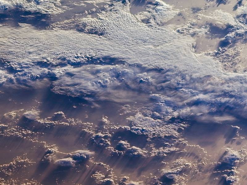
Clouds over the southern Indian Ocean, July 23, 2007. (NASA/JPL-Caltech)
[/caption]
Ok, maybe not the sky itself… but the clouds. According to recent research by climate scientists in New Zealand, global cloud heights have dropped.
Researchers at The University of Auckland have reported a decreasing trend in average global cloud heights from 2000 to 2010, based on data gathered by the Multi-angle Imaging SpectroRadiometer (MISR) on NASA’s Terra satellite. The change over the ten-year span was 30 to 40 meters (about 100 to 130 feet), and was mostly due to fewer clouds at higher altitudes.
It’s suspected that this may be indicative of some sort of atmospheric cooling mechanism in play that could help counteract global warming.
“This is the first time we have been able to accurately measure changes in global cloud height and, while the record is too short to be definitive, it provides just a hint that something quite important might be going on,” said lead researcher Professor Roger Davies.
A steady reduction in cloud heights could help the planet radiate heat into space, thus serving as a negative feedback in the global warming process. The exact cause of the drop in cloud altitude is not yet known, but it could reasonably be resulting from a change in circulation patterns that otherwise form high-altitude clouds.
Rendering of the Terra spacecraft. (NASA)
Cloud heights are just one of the many factors that affect climate, and until now have not been able to be measured globally over a long span of time.
“Clouds are one of the biggest uncertainties in our ability to predict future climate,” said Davies. “Cloud height is extremely difficult to model and therefore hasn’t been considered in models of future climate. For the first time we have been able to accurately measure the height of clouds on a global basis, and the challenge now will be to incorporate that information into climate models. It will provide a check on how well the models are doing, and may ultimately lead to better ones.”
While Terra data showed yearly variations in global cloud heights, the most extreme caused by El Niño and La Niña events in the Pacific, the overall trend for the years measured was a decrease.
Continuing research will be needed to determine future trends and how they may impact warming.
“If cloud heights come back up in the next ten years we would conclude that they are not slowing climate change,” Davies said. “But if they keep coming down it will be very significant.”
The team’s study was recently published in the journal Geophysical Research Letters.
Terra is a multi-national, multi-disciplinary mission involving partnerships with the aerospace agencies of Canada and Japan. An important part of NASA’s Science Mission, Terra is helping scientists around the world better understand and protect our home planet.
Our Sun on June 6, 2011. Credit: Credit: Cesar Cantu from the Chilidog Observatory in Monterrey, Mexico.
[/caption]
Are we headed into the 21st century version of the Maunder Minimum? Three researchers studying three different aspects of the Sun have all come up with the same conclusion: the Sun’s regular solar cycles could be shutting down or going into hibernation. A major decrease in solar activity is predicted to occur for the next solar cycle (cycle #25), and our current solar cycle (#24) could be the last typical one. “Three very different types of observations all pointing in the same direction is very compelling,” said Dr. Frank Hill from the National Solar Observatory, speaking at a press briefing today. “Cycle 24 may be the last normal one, and 25 may not even happen.”
Even though the Sun has been active recently as it heads towards solar maximum in 2013, there are three lines of evidence pointing to a solar cycle that may be going on hiatus. They are: a missing jet stream, slower activity near the poles of the sun and a weakening magnetic field, meaning fading sunspots. Hill, along with Dr. Richard Altrock from the Air Force Research Laboratory and Dr. Matt Penn from the National Solar Observatory independently studied the different aspects of the solar interior, the visible surface, and the corona and all concur that cycle 25, will be greatly reduced or may not happen at all.
Solar activity, including sunspot numbers, rises and falls on average about every 11 years – sometimes the cycles are as short as 9 years, other times it is as long as 13 years. The Sun’s magnetic poles reverse about every 22 years, so 11 years is half of that magnetic interval cycle.
"Butterfly diagram" shows the position of sunspots over 12 solar cycles. Sunspots emerge over a range of latitudes centered on migratory jet streams that follow a clear pattern, trending from higher latitudes to lower latitudes on the Sun. The active latitudes are associated with mobile zonal flows or "jet streams" that vary through the cycle. Credit: SWRI
The first line of evidence is a slowing of a plasma flow inside the Sun, an east/west flow of gases under the surface of the Sun detected via seismology with spacecraft like the Solar Dynamics Observatory (SDO)or SOHO and also with the Global Oscillation Network Group (GONG) observing stations, a system that measures pulsations on the solar surface to understand the internal structure of the sun. The flow of plasma normally indicates the onset of sunspot formation for the next solar cycle. While this river ebbs and flows during the cycle, the “torsional oscillations,” — which starts at mid-latitudes and migrates towards the equator — and normally begins forming for the next solar cycle has not yet been detected.
Latitude-time plots of jet streams under the Sun's surface show the surprising shutdown of the solar cycle mechanism. New jet streams typically form at about 50 degrees latitude (as in 1999 on this plot) and are associated with the following solar cycle 11 years later. New jet streams associated with a future 2018-2020 solar maximum were expected to form by 2008 but are not present even now, indicating a delayed or missing Cycle 25. Credit: SWRI
Hill said the above graphic is key for understanding the issue. “The flow for Cycle 25 should have appeared in 2008 or 2009 but it has not and we see no sign of it,” he said. “This indicates that the start of Cycle 25 may be delayed to 2021 or 2022, with a minimum great that what we just experienced, or may not happen at all.”
Plots of coronal brightness against solar latitude show a "rush to the poles" that reflects the formation of subsurface shear in the solar polar regions. The current "rush to the poles" is delayed and weak, reflecting the lack of new shear under the photosphere. Note the graph depicts both north and south hemispheres overlaid into one map of solar magnetic activity, and that the patterns correspond with the butterfly diagram above. Credit: SWRI
The second line of evidence is slowing of the “rush to the poles,” the rapid poleward march of magnetic activity observed in the Sun’s faint corona. Altrock said the activity in the solar corona follows same oscillation pattern described by Hill, and that they have been observing the pattern for about 40 years. The researchers now see a very weak and slow pattern in this movement.
“A key thing to understand is that those wonderful, delicate coronal features are actually powerful, robust magnetic structures rooted in the interior of the Sun,” Altrock said. “Changes we see in the corona reflect changes deep inside the Sun.”
In a well-known pattern, new solar activity emerges first at about 70 degrees latitude at the start of a cycle, then towards the equator as the cycle ages. At the same time, the new magnetic fields push remnants of the older cycle as far as 85 degrees poleward. “In previous solar cycles, solar maximum occurred when the rush to the poles reached an average latitude of 76 degrees,” Altrock said. “Cycle 24 started out late and slow and may not be strong enough to create a rush to the poles, indicating we’ll see a very weak solar maximum in 2013, if at all. It is not clear whether solar max as we know it.”
Altrock added that if the “rush” doesn’t occur, no one knows what will happen in the future because no one has modeled what takes place without this rush to the poles.
Average magnetic field strength in sunspot umbras has been steadily declining for over a decade. The trend includes sunspots from Cycles 22, 23, and (the current cycle) 24. Credit: SWRI
The third line of evidence is a long-term weakening trend in the strength of sunspots. Penn, along with his colleague William Livingston predict that by Cycle 25, magnetic fields erupting on the Sun will be so weak that few if any sunspots will be formed.
Using more than 13 years of sunspot data collected at the McMath-Pierce Telescope at Kitt Peak in Arizona, Penn and Livingston observed that the average field strength declined about 50 gauss per year during Cycle 23 and now in Cycle 24. They also observed that spot temperatures have risen exactly as expected for such changes in the magnetic field. If the trend continues, the field strength will drop below the 1,500 gauss threshold and spots will largely disappear as the magnetic field is no longer strong enough to overcome convective forces on the solar surface.
“Things are erupting on the sun,” Penn said, “but they don’t have the energy to create sunspots.”
But back in 1645-1715 was the period known as the Maunder Minimum, a 70-year period with virtually no sunspots. The Maunder Minimum coincided with the middle – and coldest part – of the Little Ice Age, during which Europe and North America experienced bitterly cold winters. It has not been proven whether there is a causal connection between low sunspot activity and cold winters. However lower earth temperatures have been observed during low sunspot activity. If the researchers are correct in their predictions, will we experience a similar downturn in temperatures?
Hill said that some researchers say that the Sun’s activity can also play a role in climate change, but in his opinion, the evidence is not clear-cut. Altrock commented he doesn’t want to stick his neck out about how the Sun’s declining activity could affect Earth’s climate, and Penn added that Cycle 25 may provide a good opportunity to find out if the activity on the Sun contributes to climate change on Earth.
Lead image thanks to César Cantú in Monterrey, Mexico at the Chilidog Observatory. See more at his website, Astronomía Y Astrofotografía.
You can follow Universe Today senior editor Nancy Atkinson on Twitter: @Nancy_A. Follow Universe Today for the latest space and astronomy news on Twitter @universetoday and on Facebook.


 and are associated with the following solar cycle 11 years later. New jet streams associated with a future 2018-2020 solar maximum were expected to form by 2008 but are not present even now, indicating a delayed or missing Cycle 25. Credit: SWRI")

 24. Credit: SWRI")