Why Doesn’t Earth Have More Water?

Water, water everywhere… Coleridge’s shipbound ancient mariners were plagued by a lack of water while surrounded by a sea of the stuff, and while 70% of Earth’s surface is indeed covered by water (of which 96% is salt water, hence not a drop to drink) there’s really not all that much — not when compared to the entire mass of the planet. Less than 1% of Earth is water, which seems odd to scientists because, based on conventional models of how the Solar System formed, there should have been a lot more water available in Earth’s neck of the woods when it was coming together. So the question has been floating around: why is Earth so dry?

According to a new study from the Space Telescope Science Institute in Baltimore, MD, the answer may lie in the snow.

The snow line, to be exact. The region within a planetary system beyond which temperatures are cold enough for water ice to exist, the snow line in our solar system is currently located in the middle of the main asteroid belt, between the orbits of Mars and Jupiter. Based on conventional models of how the Solar System developed, this boundary used to be closer in to the Sun, 4.5 billion years ago. But if that were indeed the case, then Earth should have accumulated much more ice (and therefore water) as it was forming, becoming a true “water world” with a water mass up to 40 percent… instead of a mere one.

As we can see today, that wasn’t the case.

Planets such as Uranus and Neptune that formed beyond the snow line are composed of tens of percents of water. But Earth doesn’t have much water, and that has always been a puzzle.”

– Rebecca Martin, Space Telescope Science Institute 

A study led astrophysicists Rebecca Martin and Mario Livio of the Space Telescope Science Institute took another look at how the snow line in our solar system must have evolved, and found that, in their models, Earth was never inside the line. Instead it stayed within a warmer, drier region inside of the snow line, and away from the ice.

“Unlike the standard accretion-disk model, the snow line in our analysis never migrates inside Earth’s orbit,” Livio said. “Instead, it remains farther from the Sun than the orbit of Earth, which explains why our Earth is a dry planet. In fact, our model predicts that the other innermost planets, Mercury, Venus, and Mars, are also relatively dry. ”

Read: Rethinking the Source of Earth’s Water

The standard model states that in the early days of a protoplanetary disk’s formation ionized material within it gradually falls toward the star, drawing the icy, turbulent snow line region inward. But this model depends upon the energy of an extremely hot star fully ionizing the disk — energy that a young star, like our Sun was, just didn’t have.

“We said, wait a second, disks around young stars are not fully ionized,” Livio said. “They’re not standard disks because there just isn’t enough heat and radiation to ionize the disk.”


“Astrophysicists have known for quite a while that disks around young stellar objects are NOT standard accretion disks (namely, ones that are ionized and turbulent throughout),” added Dr. Livio in an email to Universe Today. “Disk models with dead zones have been constructed by many people  for many years. For some reason, however, calculations of the evolution of the snow line largely continued to use the standard disk models.”

Without fully ionized disk, the material is not drawn inward. Instead it orbits the star, condensing gas and dust into a “dead zone”  that blocks outlying material from coming any closer. Gravity compresses the dead zone material, which heats up and dries out any ices that exist immediately outside of it. Based on the team’s research it was in this dry region that Earth formed.

The rest, as they say, is water under the bridge.

The team’s results have been accepted for publication in the journal Monthly Notices of the Royal Astronomical Society.

Read the release on the Hubble news site here, and see the full paper here.

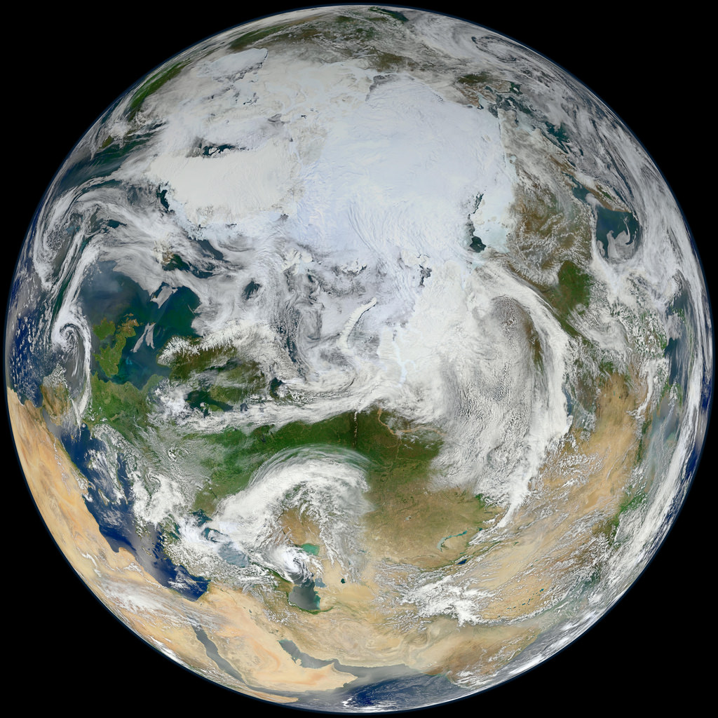
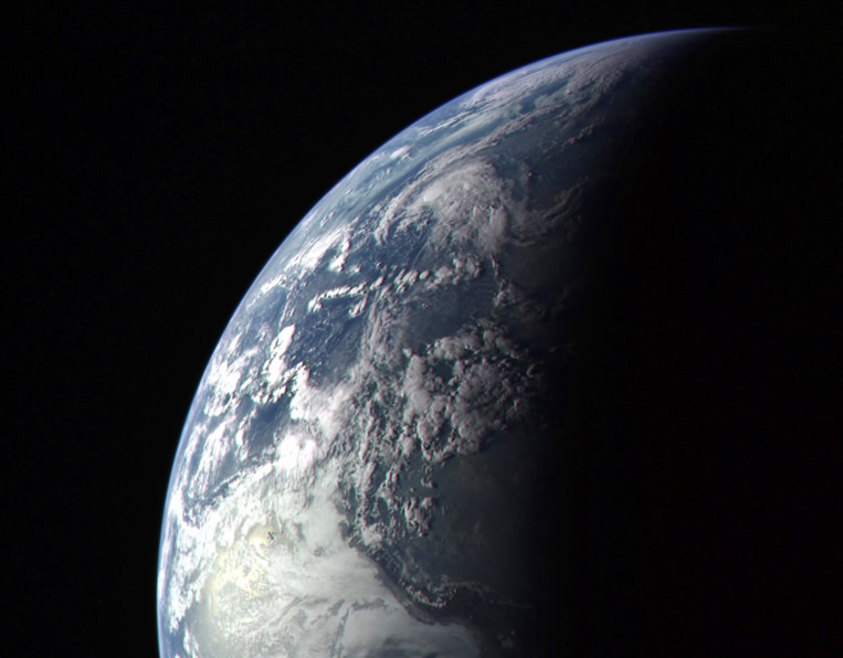
Lead image: Earth as seen by MESSENGER spacecraft before it left for Mercury in 2004. NASA/Johns Hopkins University Applied Physics Laboratory/Carnegie Institution of Washington. Disk model image: NASA, ESA, and A. Feild (STScI). Earth water volume image:  Howard Perlman, USGS; globe illustration by Jack Cook, Woods Hole Oceanographic Institution (©); Adam Nieman.

Wildfire Smoke is Visible Even at Night from Space

The Whitewater-Baldy fire is the largest wildfire in New Mexico’s history and has charred more than 465 square miles of the Gila National Forest since it started back on May 16, 2012 after several lightning strikes in the area. This wildfire produced so much smoke that it was visible even at night to the astronaut photographers on the International Space Station. This image was taken on June 2, 2012 by the crew of Expedition 31 on the ISS, with a Nikon D3S digital camera. A Russian spacecraft docked to the station is visible on the left side of the image.

Credit: NASA Earth Observatory website.

Powerful “Derecho” Storms as Seen from Space

The powerful windstorms that swept across the US last week was captured by several different satellites. This type of storm, called a derecho, moved from Illinois to the Mid-Atlantic states on June 29, and the movie from NOAA’s GOES-13 satellite shows the storms’ sudden expansion and speed. The storms left a more than 1,000-km (700-mile) trail of destruction across the Midwest and mid-Atlantic, cutting power to millions and killing thirteen people.

A derecho (pronounced “deh-REY-cho”) is not your average, ordinary local summer thunderstorm. These are widespread, long-lived but rare wind storms that are usually associated with a band of rapidly moving showers or thunderstorms. Damage from a derecho is usually in one direction along a relatively straight track. By definition an event is classified a derecho if the wind damage swath extends more than 400 km (240 miles) and includes wind gusts of at least 93 km/h (58 mph) or greater along most of its length.

These storms occur in the United States during the late spring and summer, with more than three quarters occurring between April and August.

The movie begins on June 28 at 15:15 UTC (11:15 a.m. EDT) and ends on June 30, 2012 at 16:01 UTC (12:01 p.m. EDT). In the animation, the derecho’s clouds appear as a line in the upper Midwest on June 29 at 14:32. By 16:02 UTC, they appear as a rounded area south of Lake Michigan. By 21:32, the area of the derecho’s clouds were near Lake Erie and over Ohio expanding as the system track southeast. By 06:30 UTC, the size appears to have almost doubled as the derecho moves over West Virginia, Maryland, Pennsylvania and Virginia. At 02:32 UTC on June 30 (10:32 p.m. EDT), the Derecho was over the mid-Atlantic bringing a 160 km (100 mile) line of severe storms and wind gusts as high as 144 km/h (90 mph) to the region.

“It is interesting how the process is a self-sustaining process that is fed by a combination of atmospheric factors that all have to be in place at the same time,” said Joe Witte, a meteorologist in Climate Change Communication at George Mason University, Va. and a consultant to NASA. “That is why they are relatively rare: not all the elements line up that often.”

NASA’s Aqua satellite flew over the derecho on June 29 and June 30, using the Atmospheric Infrared Sounder instrument (AIRS) onboard to capture infrared imagery of the event, as seen above.

“The AIRS infrared image shows the high near-surface atmospheric temperatures blanketing the South and Midwestern U.S., approaching 98 degrees Fahrenheit,” said Ed Olsen of the AIRS Team at NASA’s Jet Propulsion Laboratory.

The AIRS images for June 30 show areas of intense convection centered off the New Jersey coast and another, less intense, system over Iowa-Indiana-Ohio. The area off the New Jersey coast is no longer a rapidly moving linear front. The near-surface atmospheric temperatures over the South and Midwest had decreased by 10 to 15 Fahrenheit in most areas,” Olsen said.

NASA’s Suomi National Polar-orbiting Partnership satellite (NPP) captured night-time images on June 28 and June 30, that reflected the massive blackouts that occurred after the derecho swept through the mid-Atlantic states. You can see the comparison images here at NASA’s Earth Observatory website.

The mechanics of a derecho go like this: The downburst mentioned by Witte, above, occurs when cold air in the upper atmosphere is cooled more by the evaporation of some of the rain and melting of the frozen precipitation pushed up into the high levels of the towering cumulonimbus (thunderclouds). That cold air becomes much denser than the surrounding air and literally falls to the ground, accelerating like any other falling body.

“The huge blob of very cold air from the upper atmosphere has a higher forward wind speed since it is high in the atmosphere,” Witte said. “This gives the ‘blob’ great forward momentum. Add that speed to the falling speed and the result is a very powerful forward moving surface wind.”

The process of a derecho can become self-sustaining as hot and humid air is forced upward by the gust front and develops more (reinforcing) towering clouds. If there is a rear low level jet stream, there is nothing to stop the repeating process.

You can find out more information about derechos at this NOAA page.

Source: NASA

What are You Doing With Your Added Leap Second Today?

Everyone loves a long weekend, this weekend will be officially one second longer than usual. An extra second, or “leap” second, will be added at midnight UTC tonight, June 30, 2012, to account for the fact that it is taking Earth longer and longer to complete one full turn, or one a solar day. Granted, it the additional time is not very long, but the extra second will ensure that the atomic clocks we use to keep time will be in synch with Earth’s rotational period.

“The solar day is gradually getting longer because Earth’s rotation is slowing down ever so slightly,” says Daniel MacMillan of NASA’s Goddard Space Flight Center.

So, rather than changing from 23:59:59 on June 30 to 00:00:00 on July 1, the official time will get an extra second at 23:59:60.

About every one and a half years, one extra second is added to Universal Coordinated Time (UTC) and clocks around the world. Since 1972, a total of 24 seconds have been added. This means that the Earth has slowed down 24 seconds compared to atomic time since then.

However, this doesn’t mean that days are 24 seconds longer now, as only the days on which the leap seconds are inserted have 86,401 seconds instead of the usual 86,400 seconds.

This leap second accounts for the fact that the Earth’s rotation around its own axis, which determines the length of a day, slows down over time while the atomic clocks we use to measure time tick away at almost the same speed over millions of years.

NASA explains it this way:

Scientists know exactly how long it takes Earth to rotate because they have been making that measurement for decades using an extremely precise technique called Very Long Baseline Interferometry (VLBI). VLBI measurements are made daily by an international network of stations that team up to conduct observations at the same time and correlate the results. NASA Goddard provides essential coordination of these measurements, as well as processing and archiving the data collected. And NASA is helping to lead the development of the next generation of VLBI system through the agency’s Space Geodesy Project, led by Goddard.

From VLBI, scientists have learned that Earth is not the most reliable timekeeper. The planet’s rotation is slowing down overall because of tidal forces between Earth and the moon. Roughly every 100 years, the day gets about 1.4 milliseconds, or 1.4 thousandths of a second, longer. Granted, that’s about 100 or 200 times faster than the blink of an eye. But if you add up that small discrepancy every day for years and years, it can make a very big difference indeed.

“At the time of the dinosaurs, Earth completed one rotation in about 23 hours,” says MacMillan, who is a member of the VLBI team at NASA Goddard. “In the year 1820, a rotation took exactly 24 hours, or 86,400 standard seconds. Since 1820, the mean solar day has increased by about 2.5 milliseconds.”

By the 1950s, scientists had already realized that some scientific measurements and technologies demanded more precise timekeeping than Earth’s rotation could provide. So, in 1967, they officially changed the definition of a second. No longer was it based on the length of a day but on an extremely predictable measurement made of electromagnetic transitions in atoms of cesium. These “atomic clocks” based on cesium are accurate to one second in 1,400,000 years. Most people around the world rely on the time standard based on the cesium atom: Coordinated Universal Time (UTC).

Another time standard, called Universal Time 1 (UT1), is based on the rotation of Earth on its axis with respect to the sun. UT1 is officially computed from VLBI measurements, which rely on astronomical reference points and have a typical precision of 5 microseconds, or 5 millionths of a second, or better.

“These reference points are very distant astronomical objects called quasars, which are essentially motionless when viewed from Earth because they are located several billion light years away,” says Goddard’s Stephen Merkowitz, the Space Geodesy Project manager.

For VLBI observations, several stations around the world observe a selected quasar at the same time, with each station recording the arrival of the signal from the quasar; this is done for a series of quasars during a typical 24-hour session. These measurements are made with such exquisite accuracy that it’s actually possible to determine that the signal does not arrive at every station at exactly the same time. From the miniscule differences in arrival times, scientists can figure out the positions of the stations and Earth’s orientation in space, as well as calculating Earth’s rotation speed relative to the quasar positions.

Originally, leap seconds were added to provide a UTC time signal that could be used for navigation at sea. This motivation has become obsolete with the development of GPS (Global Positioning System) and other satellite navigation systems. These days, a leap second is inserted in UTC to keep it within 0.9 seconds of UT1.

Normally, the clock would move from 23:59:59 to 00:00:00 the next day. Instead, at 23:59:59 on June 30, UTC will move to 23:59:60, and then to 00:00:00 on July 1. In practice, this means that clocks in many systems will be turned off for one second.

Proposals have been made to abolish the leap second and let the two time standards drift apart. This is because of the cost of planning for leap seconds and the potential impact of adjusting or turning important systems on and off in synch. No decision will made about that, however, until 2015 at the earliest by the International Telecommunication Union, a specialized agency of the United Nations that addresses issues in information and communication technologies. If the two standards are allowed to go further and further out of synch, they will differ by about 25 minutes in 500 years.

In the meantime, leap seconds will continue to be added to the official UTC timekeeping. The 2012 leap second is the 35th leap second to be added and the first since 2008.

Lead image credit: Rick Ellis

Sources: NASA, TimeandDate.com

Smoking Wildfires Seen From Space

Wildfires continue to rage across the western United States, burning forests and property alike, and even the most remote have sent up enormous plumes of smoke that are plainly visible to astronauts aboard the Space Station.

The photo above was taken by an Expedition 31 crew member on June 27, showing thick smoke drifting northeast from the Fontenelle fire currently burning in Wyoming. More plumes can be seen to the north.

Utah’s Great Salt Lake can be seen at the bottom right of the image. Its two-tone coloration is due to different species of algae that live in the lake, which is split by the physical barrier of a railroad causeway.

You can watch a video of the wildfires in the west taken from the ISS here, and see more “fire and smoke” news and images from space here.

Image: NASA

Pacific Glory

An optical phenomenon known as a “glory” is seen over a cloud-covered Pacific Ocean in this image from NASA’s Aqua satellite, acquired on June 20, 2012. Although the colors may make it look like a rainbow, the process behind its formation is somewhat different.

As vortices spiral off the leeward side of Guadalupe Island, off the western coast of Baja California, a shimmering spectrum of colors highlights a glory just west of the island. Glories are created when light from the Sun reflects back toward an observer off water droplets within clouds or fog. They are often seen from airplanes as a bright ring of light encircling a silhouetted shadow of the aircraft below, but are also visible from the ground and, sometimes, even from space.

From the NASA Earth Observatory website:

Although glories may look similar to rainbows, the way light is scattered to produce them is different. Rainbows are formed by refraction and reflection; glories are formed by backward diffraction. The most vivid glories form when an observer looks down on thin clouds with droplets that are between 10 and 30 microns in diameter. The brightest and most colorful glories also form when droplets are roughly the same size.

From the ground or an airplane, glories appear as circular rings of color. The space shuttle Columbia observed a circular glory from space in 2003. In the image above, however, the glory does not appear circular. That’s because MODIS scans the Earth’s surface in swaths perpendicular to the path followed by the satellite. And since the swaths show horizontal cross sections through the rings of the glory, the glory here appears as two elongated bands of color that run parallel to the path of the satellite, rather than a full circle.

Glories always appear around the spot directly opposite the Sun, from the perspective of the viewer. This spot is called the anti-solar point. To visualize this, imagine a line connecting the Sun, a viewer, and the spot where the glory appears. In this case, the anti-solar point falls about halfway between the two colored lines of the glory.

Click here to download the full-size image.

NASA image courtesy Jeff Schmaltz, LANCE MODIS Rapid Response. Read more here.

Tropical Storm Debby Douses the Gulf

Satellite image of tropical storm "Debby" over the Gulf

The eastern Gulf of Mexico is getting lashed by tropical storm Debby, which whipped up tornado-spawning winds and dumped inches of rain across much of Florida, Mississippi, Alabama and southern Georgia over the weekend. NASA’s Aqua satellite acquired this image on June 23, just after the depression strengthened to full tropical storm status.

Born over the warm, moist air of the Gulf off the coast of Mississippi on Saturday afternoon, Debby quickly strengthened to storm status with sustained winds currently reported at over 60 mph. Slow-moving at a 6 mph crawl to the northeast, Debby continues to drench the Gulf state coasts with inches of rain — up to 10 to 20 inches projected for some areas. Major flooding has already become a problem and reports of tornadoes have been coming in since Sunday afternoon.

Debby will likely become a hurricane at some point, although her future path is still not entirely known.

Launched on May 4, 2002, NASA’s Aqua satellite specializes in keeping track of the movement of water around the planet in all its various forms. Find out more about the Aqua mission here.

Image: NASA/GSFC/Jeff Schmaltz/MODIS Land Rapid Response Team

Blue Marble 2012: The Arctic Edition

This latest portrait of Earth from NASA’s Suomi NPP satellite puts the icy Arctic in the center, showing the ice and clouds that cover our planet’s northern pole. The image you see here was created from data acquired during fifteen orbits of Earth.

In January of this year Suomi NPP images of Earth were used to create an amazing “Blue Marble” image that spread like wildfire across the internet, becoming one of the latest “definitive” images of our planet. Subsequent images have been released by the team at Goddard Space Flight Center, each revealing a different perspective of Earth.

See a full-sized version of the image above here.

NASA launched the National Polar-orbiting Operational Environmental Satellite System Preparatory Project (or NPP) on October 28, 2011 from Vandenberg Air Force Base. On Jan. 24, NPP was renamed Suomi National Polar-orbiting Partnership, or Suomi NPP, in honor of the late Verner E. Suomi. It’s the first satellite designed to collect data to improve short-term weather forecasts and increase understanding of long-term climate change.

Suomi NPP orbits the Earth about 14 times each day and observes nearly the entire surface of the planet.

Image credit: NASA/GSFC/Suomi NPP


Lightning From Space!

Photo of Earthly lightning seen from orbit by ESA astronaut Andre Kuipers

[/caption]

Here’s an amazing shot of a flash of lightning within storm clouds over west Africa, captured from orbit by ESA astronaut André Kuipers aboard the ISS.

Lightning is a common sight from Space Station, creating a constant light show for the astronaut and cosmonaut crew members. On average, lightning strikes the ground somewhere on Earth 100 times each second, and there are 5 to 10 times as many cloud-to-cloud flashes as there are ground strikes. That adds up to about 40 to 80 million flashes of lightning every day around the world! Considering that the ISS orbits Earth 16 times a day — and from quite a high viewpoint — it stands to reason that lightning is spotted quite often.

So although it may not be rare, lightning still makes for dramatic photos — especially to those of us here on the ground!

For more information on André and his ongoing long-duration PromISSe mission, visit the ESA site here.

Image credit: ESA/NASA

There’s a Hole in the Sky!

A vast hole in the cloud cover seen over the southern Pacific

[/caption]

Well, not the sky exactly, but definitely in the clouds!

This image, acquired by NASA’s Aqua satellite on June 5, shows an enormous oval hole in the clouds above the southern Pacific Ocean, approximately 500 miles (800 km) off the southwestern coast of Tasmania. The hole itself is several hundred miles across, and is the result of high pressure air in the upper atmosphere.

According to Rob Gutro of NASA’s Goddard Space Flight Center, “This is a good visible example of how upper-level atmospheric features affect the lower atmosphere, because the cloud hole is right under the center of a strong area of high pressure. High pressure forces air down to the surface blocking cloud formation. In addition, the altocumulus clouds are rotating counter-clockwise around the hole, which in the southern hemisphere indicates high pressure.”

The northwestern tip of Tasmania and King Island can be seen in the upper right of the image.

The Aqua mission is a part of the NASA-centered international Earth Observing System (EOS). Launched on May 4, 2002, Aqua has six Earth-observing instruments on board, collecting a variety of global data sets about the Earth’s water cycle. Read more about Aqua here.