
[/caption]
“You may think it’s a long way down the road to the chemist’s, but that’s just peanuts to space.” – Douglas Adams
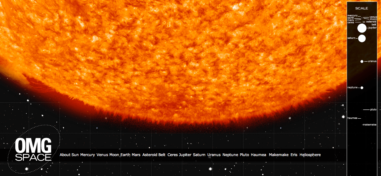
Standard classroom models and textbook illustrations of the Solar System, regardless of how pretty they are, all share one thing in common: they’re wrong. Ok, maybe not wrong, but definitely inaccurate… especially in regards to scale. And understandably so, as it’s nearly impossible to portray in a convenient manner the sheer amount of space there is between the planets and their relative sizes. Even if a model manages to show one or the other in a straightforward, linear fashion, it usually doesn’t show both.
This one does.
OMG Space is a web page made by Margot Trudell as graphic design thesis project at Toronto’s OCAD University. Displayed on the Visual.ly portfolio site, Margot’s expansive infographic shows the Sun, planets and some minor bodies to scale, both in terms of relative size and distance. By clicking on a planet’s name at the bottom of the page you’ll be whisked away toward it, giving a sense of how very far it really is between the many worlds that make up our own little Solar System.
And if that’s not enough, Margot has included a descriptive chart for each world that gives basic information on distance from the Sun, orbital period and moon count as well as details on visiting exploration missions — past, present and planned. These can be accessed by clicking on the respective worlds once you arrive.

“I created the infographics first and as I worked on them decided they needed more context, and the idea of creating a to scale version of our solar system came to mind,” Margot told Universe Today. “The project was initially intended to be all print, but knowing the real scale of our solar system I eventually came up with the idea of using the infiniteness of the web to my advantage.”
If you watch the scroll bar on the right side of the page (and I do suggest resizing the page to fill your screen as much as possible) you’ll also get a sense of how much space you’re traversing as you zip between worlds. And that’s just taking into consideration the average distances between each planet at opposition. In reality, they’re never lined up in a row like that!
If you’re so inclined you can also scroll up and down manually… if only to see how long it takes you to not get anywhere.
“My favourite thing to do on OMG Space’s website is go to Earth and then click on the link to the Moon,” Margot said. “The small distance you move yet the big gap you see… it gives you a whole new perspective on how far people traveled to get to the moon and back, and it shows how far the moon really is from Earth (I feel that it’s always portrayed as being almost right beside us) and makes you consider how powerful those rockets must have been to get us that far.
“It gives you a bit of that ‘OMG’ feeling that the project is named for.”
Yes, OMG indeed.
Infographics by Margot Trudell. See more of Margot’s work here.
Nice graphics, but her entry on the asteroid belt is very confusing. She writes:
403,914,251 km from the Sun
180,000,000 km in diameter
What? There is no sense in quoting distance accurate to the nearest km. Even if we knew the average distance of known objects to that accuracy (which we don’t) it would change with each new discovery. And I don’t know what that diameter even means. Much better to give approximate minimum and maximum distances from the Sun.
It’s accurate if all the planets were lined up in one dimension and staying still. Square the size of this graphic, and set the planets to move fast enough to leave their old positions every few minutes, and then you have an idea :v) .
“And that’s just taking into consideration the average distances between each planet at opposition. In reality, they’re never lined up in a row like that!” 🙂
It’s ok, unfinished, but ok.
First, why go through that much effort to show accurate scale then completely abandon that idea and pile up the last five entries on top of each other?
Second, the OMG logo, the planet names along the bottom and the map along the right side all disappear about two thirds of the way between Saturn and Uranus.
slight update: my first problem seems to be at least partially O.S. related. My original comment was based on a computer running 64-bit Windows 7, my older computer runs 32-bit Vista and only the last two entries overlap. My second problem still persists, though it happens just alittle after Uranus on my Vista computer.
That’s weird. I’m using Safari and Chrome on a Mac and don’t have either issue.
The Heliosphere entry crap out for me.
While there may be ‘technical’ inaccuracies, it’s still a pretty cool idea.
On the topic of classroom science books, I remember our science textbooks at my school had NOTHING to do with the Solar System, universe or Nasa. There was plenty of Earth, life, animals, greenhouse effect, technology etc. It was a catholic school. Sadly a lot of schools don’t learn about the planets because it’s seemed as being ‘too controversial’.
Sorry to hear that your science education was stunted by a catholic school. But that is what one gets from an organization that wants to control your thoughts and body, and the way you function in society. This is especially egregious if you are a female, because the catholic religion along with most religions treat women as second class citizens. The term “Barefoot and pregnant” comes to mind. The Human species is one half (approximately) female. And to not make use of this pool of talent in our society is foolish.
Wow this is really cool. Even though I am aware of the great dimensions of space, it’s still an eye opener to see it presented visually like this. Scrolling through the page manually really is a jawdropping experience. I tried scrolling from the earth to mars and gave up somehwere halfway…
A version 2 of this would be even cooler: with (amimated) orbits!
It is a good idea. The one infographic where you scroll yourself is more pedagogic, but tedious. (I’m sure you can find a few variants by googling, same as for comparing stars on youtube et cetera.)
xkcd is known for its out-of-the-box infographics. The one on the scale of the universe confirms the effort to travel to the Moon identified by Trudell. On a logarithmic scale it is the largest gap besides going from Kuiper to Oort objects. If our resources grows exponentially, as basic economical models have to assume (interest), it is a shame that we aren’t on Mars already!