The Week in Space Pictures was something new we launched last week and we’re trying to improve on it with this eye-catching info graphic. Let us know what you think!

Space and astronomy news
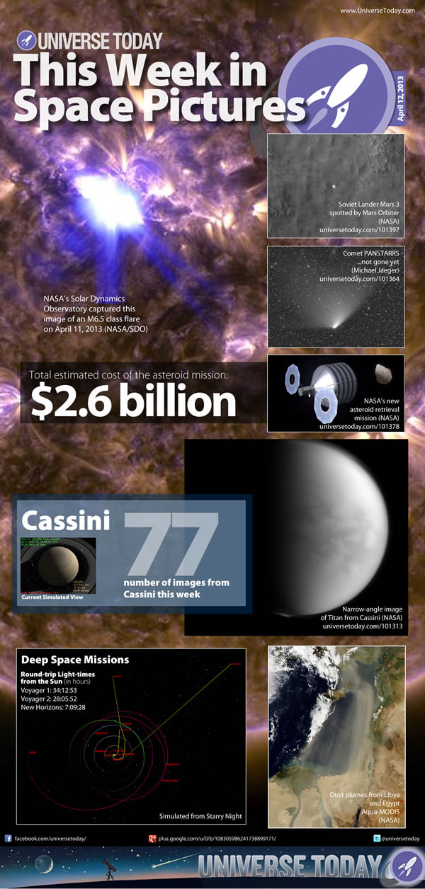
The Week in Space Pictures was something new we launched last week and we’re trying to improve on it with this eye-catching info graphic. Let us know what you think!
Comments are closed.
I love this! Very nice to look at. I wish there were links within the picture though. I’m on an Android tablet so maybe it does and just not functioning on my Acer 500??
This is really cool. I hope you guys keep making them.
I like the idea, but its all over the place. The title leaves me dry and at the same time i get what you doing. I like the facts around the pictures but it seem shy from what it could be! Honnest opinions for new lauch ideas makes them last.
A 14 year veteran with UT, i have seen your ideas and this needs “sand papering”.
Looks like a bedroom poster but also like a magazine page. It would make a good front page format for the website if each pane could be clicked on to see the full article, however it isn’t big enough to read outright on a 1920 x 1080 laptop screen, at least not with my 1950s vintage eyes.
Nice to have a summary. I know time is a precious commodity, but a landscape version, 1680X1050 or similar, would be neat for topical wallpaper.
I like the summary presented as an infographic, it’s a pleasant change from the typical roundup lists. A nice addition would be to make the various images links to the relevant article, but I’m not sure if that’s possible given the format.
Anyway, I think that you should continue using it.
It is an awesome idea but the title leaves me dry and at the same time i get what you doing
If for some reason a country were to return humans to the moon, a greeting party of telerobots from more advanced societies would film such an absurdity. The faster we perfect cislunar telepresence, the more quickly we will send humans to the rest of the universe.
https://www.facebook.com/media/set/?set=a.534610986591226.1073741833.117122635006732&type=1