Manhattan-Sized Ice Island Heads Out to Sea

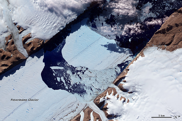
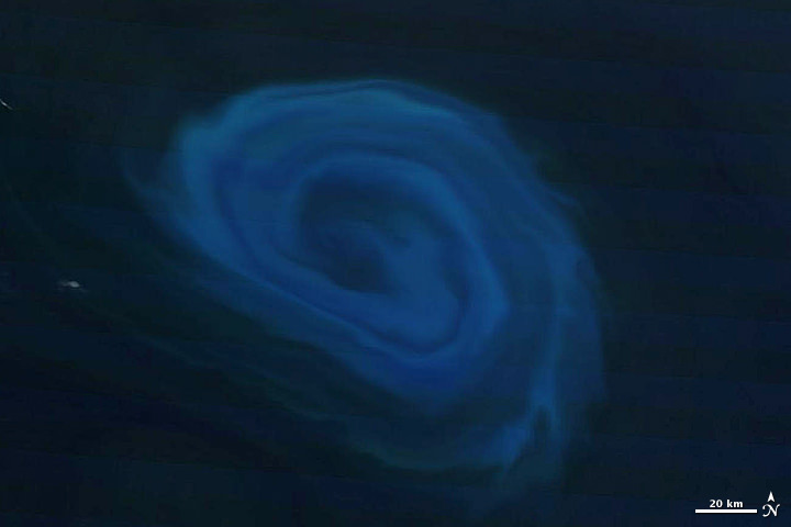
An “ice island” that calved from the Petermann Glacier in July is seen by NASA satellite (MODIS/Terra)

Remember that enormous slab of ice that broke off Greenland’s Petermann Glacier back in July? It’s now on its way out to sea, a little bit smaller than it was a couple of months ago — but not much. At around 10 miles long and 4.6 miles across (16.25 x 7.5 km) this ice island is actually a bit shorter than Manhattan, but is fully twice as wide.

The image above was acquired on September 14 by the Moderate Resolution Imaging Spectroradiometer (MODIS) aboard NASA’s Terra satellite.

Although the calving of this particular ice island isn’t thought to be a direct result of increasing global temperatures, climate change is thought to be a major factor in this year’s drop in Arctic sea ice extent, which is now below 4.00 million square kilometers (1.54 million square miles). Compared to September conditions in the 1980s and 1990s, this represents a 45% reduction in the area of the Arctic covered by sea ice.

Arctic sea ice extent data for June-July 2012 (NSIDC)

This year sea ice in the Arctic Ocean dropped below the previous all-time record, set in 2007. 2012 also marks the first time that there has been less than 4 million square kilometers (1.54 million square miles) of sea ice since satellite observations began in 1979.

The animation below, released today by the NOAA, shows the 2012 time-series of ice extent using data from the DMSP SSMI/S satellite sensor:

Read more here.

Greenland Glacier Calves Another Huge Ice Island

Petermann glacier, a 70 km (43 mile) long tongue of ice that flows into the Arctic Ocean in northwest Greenland, recently calved an “ice island” approximately 130 square kilometers (50 sq. miles) — about twice the area of Manhattan. The image above, acquired by NASA’s Terra satellite, shows the ice island as it drifts toward the ocean five days after breaking off the main glacier.

Petermann glacier has been known for birthing massive ice islands; previously in August 2010 an even larger island broke away from the glacier, measuring 251 square kilometers (97 sq. miles). That slab of ice eventually drifted into the northern Atlantic and was even visible from the Space Station a year later!

Read: Manhattan-Sized Ice Island Seen From Space

Although some of Greenland’s glaciers have been observed to be quickening their seaward pace as a result of global warming, this particular calving event — which occurred along a crack that appeared in 2001 satellite imagery — isn’t thought to be a direct result of climate but rather of ocean currents and isn’t expected to have any significant effect on the rate of Greenland’s ice loss as a whole. Still, satellite observation of such events provides valuable data for researchers monitoring the processes that are involved with rapidly accelerating Arctic ice loss.

And if you want an idea of what a slab of ice this large looks like up close, here’s a video taken by researchers on approach to a smaller chunk of the 2011 island:

NASA Earth Observatory image by Jesse Allen, using data from NASA/GSFC/METI/ERSDAC/JAROS, and U.S./Japan ASTER Science Team. (NASA/Terra)

Huge Wildfires Burn on Opposite Sides of the Planet

The latest views of Earth from NASA’s Aqua and Terra satellites are looking a bit hazy from wildfires burning in wilderness areas of the United States and Siberia.

The above image acquired July 18 from the Moderate Resolution Imaging Spectroradiometer, or MODIS, aboard the Terra satellite, shows a whopping 198 wildfires burning across Siberia. You can view more of this huge fire at NASA’s Earth Observatory website. The fires have charred an area of more than 83 square kilometers. Some of the fires were started by people who lost control of agricultural fires but some fires were started by lightning.

High Park Fire from NASA's Aqua MODIS
Another NASA earth-observing satellite, Aqua, has taken dramatic images of the High Park Fire just west of Fort Collins, Colorado and the Whitewater-Baldy Complex Fire in southwestern New Mexico. The High Park Fire has grown to more than 235 square kilometers, burning 180 structures and leading to the death of one person. It has become one of the most destructive and largest fires in Colorado history. Thankfully, the

Besides measuring the smoke plume and fire extent, much can be learned using satellite images of wildfires. Types of vegetation can affect the type and color of smoke emitted by the wildfire. Grassland fires tend to burn quickly and give off carbon-rich black smoke. Forest fires where moisture is higher give off thicker smoke; a combination of organic rich ash and water vapor, that ranges in color from brown to bright white.

Pyrocumulus cloud from High Park Fire, ColoradoOn the plus side for weather buffs, each of the fires have produced rare pyrocumulus, or fire clouds. Wildfires and volcanos can produce these dramatic clouds as intense heating causes the air to rise. As the rising air cools, water vapor in the ash cloud condenses just like a normal cloud. The ash particles provide nuclei for water to condense. Sometimes this moisture will fall back on the fire as rain. Dave Lipson, a meteorologist with the National Oceanic and Atmospheric Administration told the Denver Post that calm and clear weather along Colorado’s Front Range made the towering pyrocumulus cloud look especially menacing Tuesday. Tuesday afternoon, the lone fire cloud could be seen from 40 miles away from Denver.

Lead image caption: NASA image courtesy Jeff Schmaltz, LANCE MODIS Rapid Response. Instrument: Terra – MODIS

Second image caption: High Park Fire, Colorado from NASA’s Aqua MODIS

Third image caption: Looking north near Boulder, Colorado at the pyrocumulus cloud produced from the High Park Fire. Photo: John Williams

The Other End of an Eclipse

The Moon's shadow falling over the Pacific on May 20, 2012

[/caption]

As the annular eclipse on May 20 sent skywatchers around the globe gazing upwards to see the Sun get darkened by the Moon’s silhouette, NASA’s Terra satellite caught the other side of the event: the Moon’s shadow striking the Earth!

Cast across 240,000 miles of space, the lunar shadow darkened a circular swatch 300 km (185 miles) wide over the northern Pacific Ocean in this image, acquired by the Earth-observing Terra satellite’s Moderate Resolution Imaging Spectroradiometer (MODIS) at 20:30 UT on Sunday, May 20.

From the NASA Earth Observatory site:

Where the Moon passed in front of the Sun, Earth’s surface appeared black (left half of image). Around the margins of the shadow, our planet’s surface appeared yellowish brown. The shadow cast by an eclipse consists of two parts, the completely shadowed umbra and the partially shadowed penumbra.

The eclipse was first visible over eastern Asia and moved across the globe, later becoming visible on the west coast of the US. Known as an annular eclipse, even in totality there was a bright ring of Sun visible around the Moon — a result of the Moon’s elliptical orbit. The effect was dramatic, and was captured in some amazing photos from viewers around the world (as well as by a few above the world!)

Looking at Earth during the Annular Solar Eclipse of May 20, 2012, photographed by Don Pettit from the International Space Station at 23:36 GMT. (NASA)

Although there were a few images being circulated online of the “eclipse” that were not actual photos, be assured that these are the real deal.

And the next eclipse event? That will occur on November 13 of this year, when a total eclipse will be visible from Australia, the South Pacific and South America. Watch an animation of the Nov. 13 eclipse visibility here.

Top image: NASA/Jeff Schmaltz, LANCE MODIS Rapid Response.

The Sky Is Falling, Scientists Report

Clouds over the southern Indian Ocean, July 23, 2007. (NASA/JPL-Caltech)

[/caption]

Ok, maybe not the sky itself… but the clouds. According to recent research by climate scientists in New Zealand, global cloud heights have dropped.

Researchers at The University of Auckland have reported a decreasing trend in average global cloud heights from 2000 to 2010, based on data gathered by the Multi-angle Imaging SpectroRadiometer (MISR) on NASA’s Terra satellite. The change over the ten-year span was 30 to 40 meters (about 100 to 130 feet), and was mostly due to fewer clouds at higher altitudes.

It’s suspected that this may be indicative of some sort of atmospheric cooling mechanism in play that could help counteract global warming.

“This is the first time we have been able to accurately measure changes in global cloud height and, while the record is too short to be definitive, it provides just a hint that something quite important might be going on,” said lead researcher Professor Roger Davies.

A steady reduction in cloud heights could help the planet radiate heat into space, thus serving as a negative feedback in the global warming process. The exact cause of the drop in cloud altitude is not yet known, but it could reasonably be resulting from a change in circulation patterns that otherwise form high-altitude clouds.

Rendering of the Terra spacecraft. (NASA)

Cloud heights are just one of the many factors that affect climate, and until now have not been able to be measured globally over a long span of  time.

“Clouds are one of the biggest uncertainties in our ability to predict future climate,” said Davies. “Cloud height is extremely difficult to model and therefore hasn’t been considered in models of future climate. For the first time we have been able to accurately measure the height of clouds on a global basis, and the challenge now will be to incorporate that information into climate models. It will provide a check on how well the models are doing, and may ultimately lead to better ones.”

While Terra data showed yearly variations in global cloud heights, the most extreme caused by El Niño and La Niña events in the Pacific, the overall trend for the years measured was a decrease.

Continuing research will be needed to determine future trends and how they may impact warming.

“If cloud heights come back up in the next ten years we would conclude that they are not slowing climate change,” Davies said. “But if they keep coming down it will be very significant.”

The team’s study was recently published in the journal Geophysical Research Letters.

Terra is a multi-national, multi-disciplinary mission involving partnerships with the aerospace agencies of Canada and Japan. An important part of NASA’s Science Mission, Terra is helping scientists around the world better understand and protect our home planet.

Read more on the NASA/JPL news release here.

A Swirling Oasis of Life

A 150-km (93-mile) - wide eddy in the southern Indian Ocean. (NASA/Terra-MODIS)

[/caption]

A serpentine eddy swirls in the southern Indian Ocean several hundred kilometers off the coast of South Africa in this natural-color image, acquired by NASA’s Terra satellite on December 26, 2011.

The blue color is created by blooms of phytoplankton, fertilized by the nutrient-rich deep water drawn up by the 150-km-wide eddy.

The counter-clockwise anticyclonic structure of the eddy may resemble a hurricane or typhoon, but unlike those violent storms eddies bring nourishment rather than destruction.

“Eddies are the internal weather of the sea,” said Dennis McGillicuddy, an oceanographer at the Woods Hole Oceanographic Institution in Massachusetts.

And also unlike atmospheric storms, ocean eddies can last for months, even up to a year. The largest ones can contain up to 1,200 cubic miles (5,000 cubic kilometers) of water.

The nutrient-drawing power of eddies can supply the relatively barren waters of the open ocean with nutrients, creating “oases in the oceanic desert,” according to McGillicuddy.

Read more about the WHOI study of eddies here.

The eddy imaged here likely peeled off from the Agulhas Current, which flows along the southeastern coast of Africa and around the tip of South Africa. Agulhas eddies tend to be among the largest in the world.

The image below shows the eddy in context with the surrounding area:

Eddy off the coast of South Africa. December 26, 2011. (NASA/Terra-MODIS)

MODIS (or Moderate Resolution Imaging Spectroradiometer) is a key instrument aboard NASA’s Terra (EOS AM) satellite. Terra MODIS views the entire Earth’s surface every 1 to 2 days, acquiring data in 36 spectral bands. These data improve our understanding of global dynamics and processes occurring on the land, in the ocean, and in the lower atmosphere.

Read more on NASA’s Earth Observatory site here.

NASA Earth Observatory image created by Jesse Allen, using data obtained from the Land Atmosphere Near real-time Capability for EOS (LANCE).