The James Webb Space Telescope (JWST) continues to both dazzle and amaze with its latest image, this time of Galaxy IC 5332, also known as PGC 71775, which is an intermediate spiral galaxy located approximately 30 million light years away. This comes after JWST released its first images at its full power, which includes the Carina Nebula, Stephan’s Quintet, Southern Ring Nebula, and SMACS 0723, the last of which was the deepest and sharpest image of the distant universe to date.
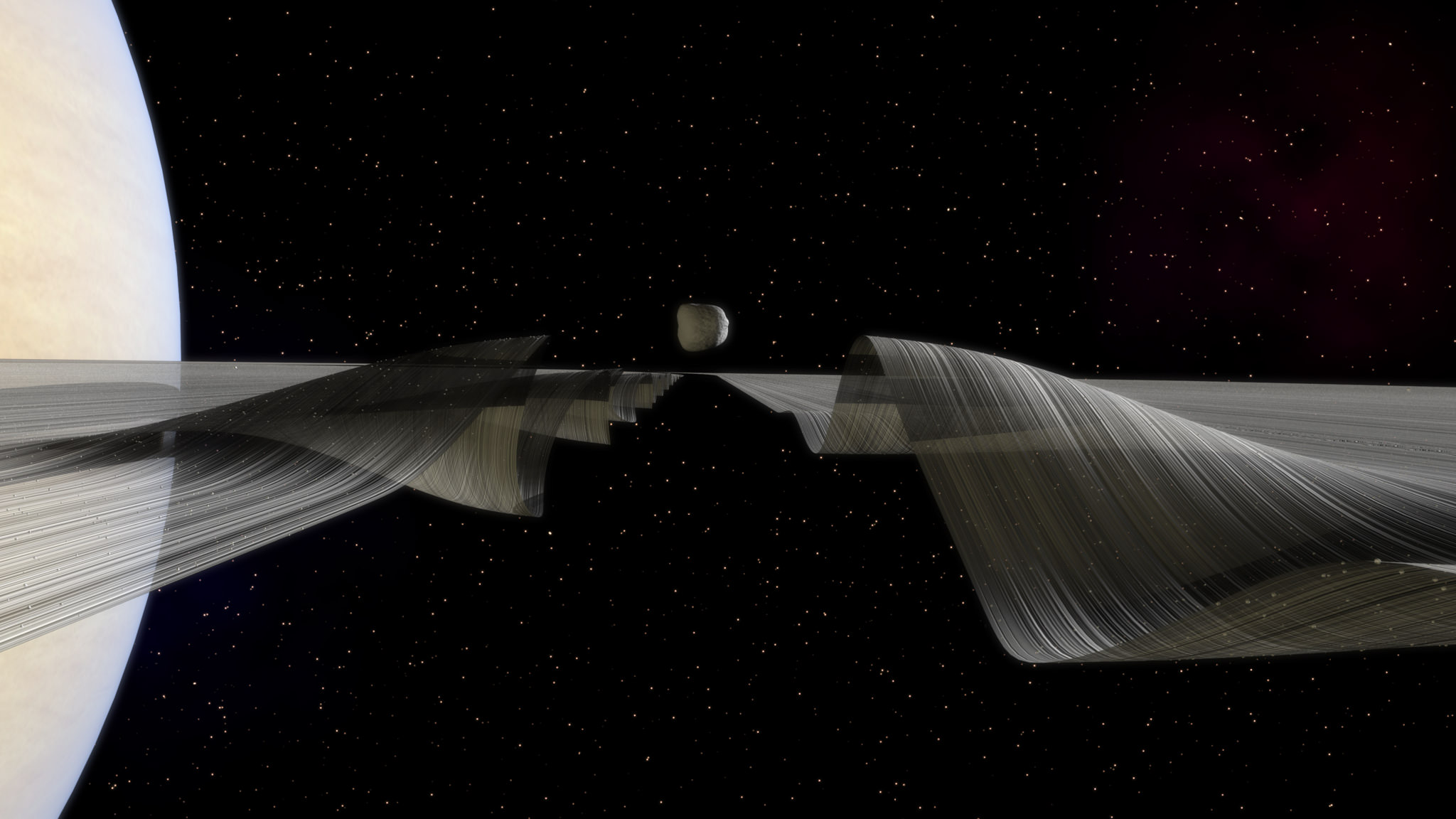
"Daphnis & Waves Along the Keeler Gap" by Kevin Gill. Credit: Kevin Gill/Flickr
Fans of astronomy are no doubt familiar with the work of Kevin Gill. In the past, he has brought us visualizations of what the Earth would look like if it had a system of rings, what a “Living Mars” would look like – i.e. if it was covered in oceans and lush vegetation – and an artistic rendition of the places we’ve been in our Solar System.
In his latest work, which once again merges the artistic and astronomical, Gill has created a series of images that show Saturn’s moon of Daphnis, and the effect it has on Saturn’s Keeler Gap. Through these images – titled “Daphnis in the Keeler Gap” and “Daphnis and Waves Along the Keeler Gap” – we get to see an artistic rendition of how one of Saturn’s moons interacts with its beautiful ring system.
As one of Saturn’s smallest moons – measuring just 8 km (~5 mi) in diameter – the existence of Daphnis had been previously inferred by astronomers based on the gravitational ripples that were observed on the outer edge of the Keeler Gap. This 42 km (26 mi) wide gap, which lies in Saturn’s A Ring and is approximately 250 km from the its outer edge, is kept clear by Daphnis’ orbit around the planet.
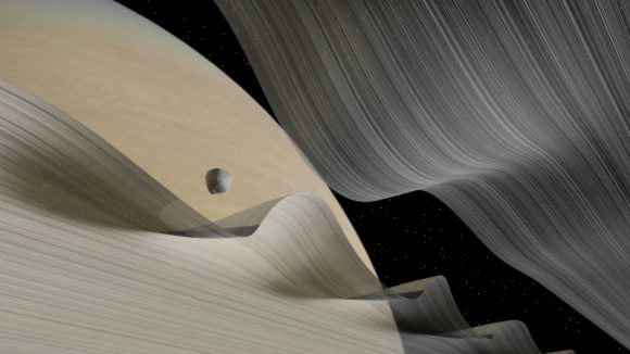
Gill’s rendition of a low-angled look at Saturn’s moon of Daphnis moving through the Keeler Gap. Credit: Kevin GIll/
In 2005, the Cassini space probe finally confirmed the existence of this tiny moon. After analyzing images provided by the probe, the Cassini Imaging Science Team concluded that Daphnis’ path and orbit induce a wavy pattern in the edge of the gap. These waves reach a distance of 1.5 km (0.93 mi) above the ring, due to Daphnis being slightly inclined to the ring’s plane.
However, all the images taken by Cassini showed this effect from a great distance. In order to help people appreciate what it must look like close-up, Gill decided to create the visuals you see here. From his images, the passage of Daphnis is shown to give the A Ring a rippled, wavy appearance. In addition, one can see how Daphnis is inclined slightly above the plane of the A Ring, causing the waves to reach upward.
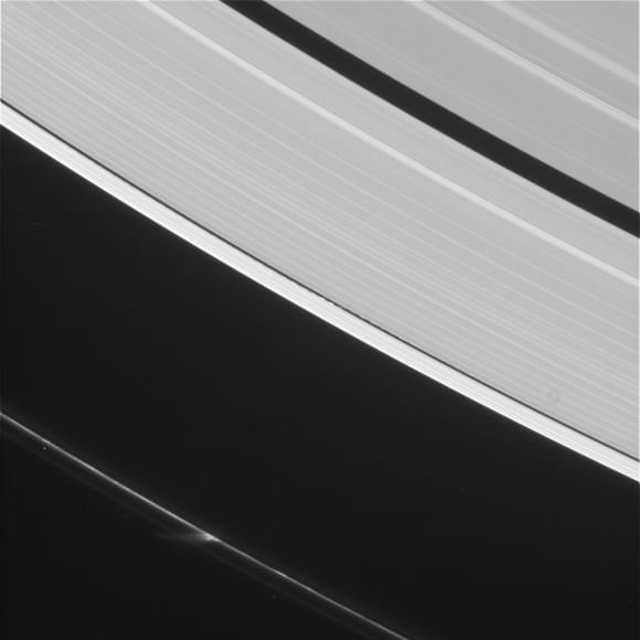
As Kevin Gill told Universe Today via email, these images were the largely inspired by the most recent images of Saturn’s rings that were provided by Cassini space probe, which returned to an equatorial orbit a few months ago after spending two years in high-inclination orbits:
“These are inspired by a general interest in the moon-ring interactions and some recent Cassini views of Daphnis on the 15th (shown below). This is one of the many aspects of the Saturn system that I imagine would be absolutely breathtaking if you could see it in person and ended up being rather simple to model in Maya.”
A part of the Small Magellanic Cloud galaxy is dazzling in this new view from NASA's Great Observatories. The Small Magellanic Cloud, or SMC, is a small galaxy about 200,000 light-years way that orbits our own Milky Way spiral galaxy. Credit: NASA.
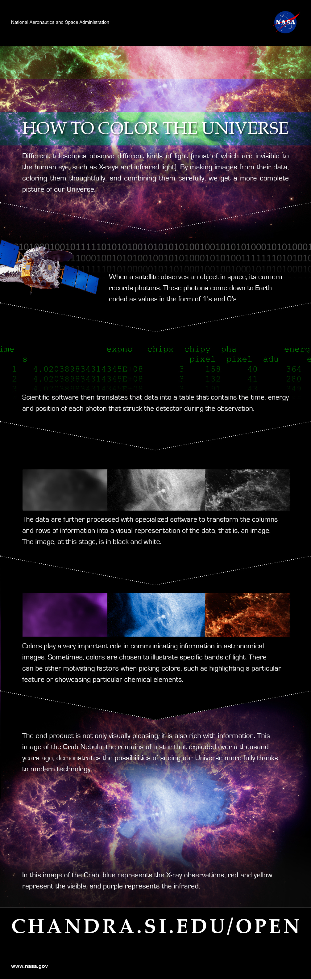
For your daily space zing, check out an infographic recently highlighted on the Chandra X-ray Observatory’s Google+ page. Called “How to Color the Universe” (see it below), it explains why the colors we see from space telescope pictures are added in after the data is gathered.
In a nutshell, the information is recorded by the telescope in photons, which is sent down to Earth in binary code (1s and 0s). Software renders these numbers into images, then astronomers pick the colors to highlight what to show in the data.
“Colors play a very important role in communication information in astronomical images,” the infographic states. “Sometimes, colors are chosen to illustrate specific bands of light. There can be other motivating factors when picking colors, such as highlighting a particular feature or showcasing particular chemical elements.”
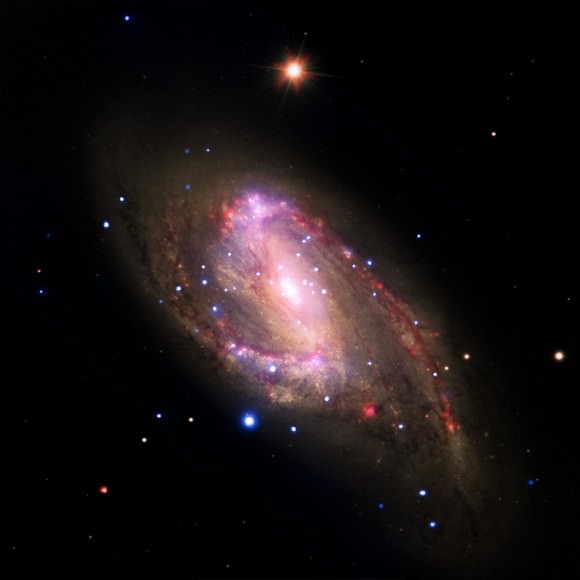
This multiwavelength image of the galaxy NGC 3627 contains X-rays from Chandra (blue), infrared data from Spitzer (red), and optical data from Hubble and the Very Large Telescope (yellow). Astronomers conducted a survey of 62 galaxies, which included NGC 3627, to study the supermassive black holes at their centers. Among this sample, 37 galaxies with X-ray sources are supermassive black hole candidates, and seven were not previously known. Confirming previous Chandra results, this study finds the fraction of galaxies hosting supermassive black holes is much higher than in optical searches for black holes that are relatively inactive.
It’s natural right now to think that astronomers are adding data where none exist, but Chandra’s public affairs employees (Kim Arcand and Megan Watzke) wrote a Huffington Post piece in September addressing this, too.
“Often, scientists choose colors to represent certain scientific phenomena such as structures that appear in one wavelength and not another. This might be why the planet is pink or the galaxy green. Or they might want to show where different elements like iron or magnesium are found in an object, and they can demonstrate this by assigning the sliver of light for each in different colors,” they wrote.
“In other instances, colors are picked to make an image the most pleasing or beautiful. In some of these instances, cries of the images being faked can erupt. But they are not fake, no matter what colors are used. We can’t see these data without scientific tools and processing. The color in these images enhances the data but does not alter them.”
The Week in Space Pictures was something new we launched last week and we’re trying to improve on it with this eye-catching info graphic. Let us know what you think!