How Big is the Universe?

Hubble infrared image showing CL J1449+0856, the most distant mature cluster of galaxies found. Color data was added from ESO’s Very Large Telescope and the NAOJ’s Subaru Telescope. Credit: NASA, ESA, R. Gobat (Laboratoire AIM-Paris-Saclay, CEA/DSM-CNRS–)

The Universe is big, but how big is it? That all depends on whether the Universe is finite or infinite. Even the word “big” is tough to get clear. Are we talking about the size of the Universe we can see, or the Universe’s actual size right now?

The Universe is big, but how big is it? And what the heck kind of question is that? Are elephants big? Trucks? Dinosaurs? Cheese? Is cheese big? How big is cheese? How big is big?

The word “big” is tough to get clear. Are we talking about the size of the Universe we can see, or the Universe’s actual size right now? This becomes even more complicated when we are trying to work under assumptions of either the Universe is finite or the Universe is infinite.

One difficulty with talking about the size, is that the Universe is expanding. Light takes time to travel from distant galaxies, and while that light travels, the Universe continues to expand. So our problem with talking about how big it is, is that there is no single meaning to distance when it comes to the universe. For this reason, astronomers usually don’t worry about the distance to galaxies at all, and instead focus on redshift, which is measured by z. The bigger the z, the more redshift, and the more distant the galaxy.

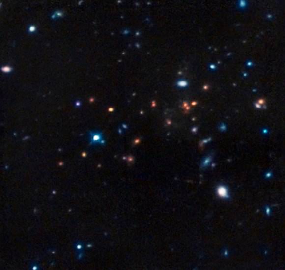
As an example, consider one of the most distant galaxies we’ve observed, which has a redshift of 7.5. Using this, we can determine distance by calculating how long the light has traveled to reach us. With a redshift of 7.5, that comes out to be about 13 billion years. You might think that means it’s 13 billion light years away, but 13 billion years ago the universe was smaller, so it was actually closer at the time the light left that galaxy. Using this, if you calculate that distance, it was only a short 3.4 billion light years away.

Now the galaxy is much farther than that. After the light left the galaxy, the galaxy continued to move away from us. It is now about 29 billion light years away. Which is definitely more than 13, and quite a bit more than its original 3.4.

Usually it is this big distance that people mean when they ask for the size of the universe. This is known as the co-moving distance. Of course, we can only see so far. So, how far can we see? The most distant light we are able to observe is from the cosmic microwave background, which has a redshift of about z = 1,000.

This means the co-moving distance of the cosmic background is about 46 billion light years. Sticking us at the center of a massive sphere, the currently observable universe has a diameter of about 92 billion light years. Even with this observed distance, we know that it extends much further than that. If what we could see was all there is, we would see galaxies tend to gravitate towards us, which we don’t observe.

Multiverse Theory
Artist concept of the multiverse. Credit: Florida State University

In fact we don’t see any kind of galaxy clumping to a particular point at all. So as far as we know the universe could extend forever. It could be even stranger than that. Despite some media controversy, if the BICEP2 detection of early inflation is correct, it is likely the Universe undergoes a type of inflation with the intimidating moniker of “eternal inflation”. If it is the case, our observable universe is merely one bubble within an endless sea of other bubble universes. This is otherwise referred to as… the multiverse.

So, in the immortal words of Douglas Adams, “Space,” it says, “is big. Really big. You just won’t believe how vastly, hugely, mindbogglingly big it is. I mean, you may think it’s a long way down the road to the chemist’s, but that’s just peanuts to space”

What do you think? Does the Universe go on for ever? Tell us in the comments below. And if you like what you see, come check out our Patreon page and find out how you can get these videos early while helping us bring you more great content!

How Big Are Sunspots?

Sunspots from today and from 65 years ago, with planet sizes for comparison.

[/caption]

The short answer? Really big. The long answer? Really, really big.

The image above shows sunspot regions in comparison with the sizes of Earth and Jupiter, demonstrating the sheer enormity of these solar features.

Sunspots are regions where the Sun’s internal magnetic fields rise up through its surface layers, preventing convection from taking place and creating cooler, optically darker areas. They often occur in pairs or clusters, with individual spots corresponding to the opposite polar ends of magnetic lines.

(Read “What Are Sunspots?”)

The image on the left was acquired by NASA’s Solar Dynamics Observatory on May 11, 2012, showing Active Region 11476. The one on the right comes courtesy of the Carnegie Institution of Washington, and shows the largest sunspot ever captured on film, AR 14886. It was nearly the diameter of Jupiter — 88,846 miles (142,984 km)!

“The largest sunspots tend to occur after solar maximum and the larger sunspots tend to last longer as well,” writes SDO project scientist Dean Pesnell on the SDO is GO blog. “As we move through solar maximum in the northern hemisphere and look to the south to pick up the slack there should be plenty of sunspots to watch rotate by SDO.”

Sunspots are associated with solar flares and CMEs, which can send solar storms our way and negatively affect satellite operation and impact communications and sensitive electronics here on Earth. As we approach the peak of the current solar maximum cycle, it’s important to keep an eye — or a Solar Dynamics Observatory! — on the increasing activity of our home star.

(Image credit: NASA/SDO and the Carnegie Institution)

OMG Space

OMG Space attempts to portray the scale sizes and distances in the Solar System

[/caption]

“You may think it’s a long way down the road to the chemist’s, but that’s just peanuts to space.” – Douglas Adams

Standard classroom models and textbook illustrations of the Solar System, regardless of how pretty they are, all share one thing in common: they’re wrong. Ok, maybe not wrong, but definitely inaccurate… especially in regards to scale. And understandably so, as it’s nearly impossible to portray in a convenient manner the sheer amount of space there is between the planets and their relative sizes. Even if a model manages to show one or the other in a straightforward, linear fashion, it usually doesn’t show both.

This one does.

OMG Space is a web page made by Margot Trudell as graphic design thesis project at Toronto’s OCAD University. Displayed on the Visual.ly portfolio site, Margot’s expansive infographic shows the Sun, planets and some minor bodies to scale, both in terms of relative size and distance. By clicking on a planet’s name at the bottom of the page you’ll be whisked away toward it, giving a sense of how very far it really is between the many worlds that make up our own little Solar System.

And if that’s not enough, Margot has included a descriptive chart for each world that gives basic information on distance from the Sun, orbital period and moon count as well as details on visiting exploration missions — past, present and planned. These can be accessed by clicking on the respective worlds once you arrive.

Each planet has an infographic associated with it, showing physical characteristics and exploration timelines. (M. Trudell)

“I created the infographics first and as I worked on them decided they needed more context, and the idea of creating a to scale version of our solar system came to mind,” Margot told Universe Today. “The project was initially intended to be all print, but knowing the real scale of our solar system I eventually came up with the idea of using the infiniteness of the web to my advantage.”

If you watch the scroll bar on the right side of the page (and I do suggest resizing the page to fill your screen as much as possible) you’ll also get a sense of how much space you’re traversing as you zip between worlds. And that’s just taking into consideration the average distances between each planet at opposition. In reality, they’re never lined up in a row like that!

If you’re so inclined you can also scroll up and down manually… if only to see how long it takes you to not get anywhere.

“My favourite thing to do on OMG Space’s website is go to Earth and then click on the link to the Moon,” Margot said. “The small distance you move yet the big gap you see… it gives you a whole new perspective on how far people traveled to get to the moon and back, and it shows how far the moon really is from Earth (I feel that it’s always portrayed as being almost right beside us) and makes you consider how powerful those rockets must have been to get us that far.

“It gives you a bit of that ‘OMG’ feeling that the project is named for.”

Yes, OMG indeed.

Infographics by Margot Trudell. See more of Margot’s work here.