Is the Solar System Really a Vortex?

Is this really how the Solar System works? (Rendering by DjSadhu)

The short answer? No. Not in the way that a popular animated gif insinuates, at least.

If you’re even a casual space fan you may have seen a viral gif animation showing our solar system traveling through space, the motions of the planets tracing corkscrew “vortex” paths around a line-driving Sun. While it’s definitely intriguing to watch (in that mesmerizingly-repetitive gif fashion) and rendered with a talented flair for design, there are two fundamental problems with it. One: it’s not entirely correct, scientifically, and two: its creator’s intention is to illustrate a decidedly un-scientific point of view about the Solar System and the Universe as a whole.

For the long answer, I now offer up the stage to astrophysicist Rhys Taylor, who recently posted an in-depth article describing why the planets do yet move… just not like that.

Reposted with permission from Rhys Taylor’s blog, Physicists (Formerly) of the Caribbean:

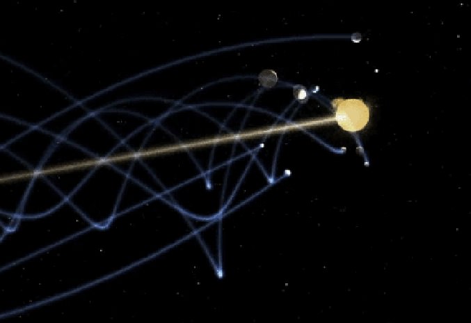
There’s this annoying space GIF roaming the internet causing trouble. Perhaps you’ve seen it. No ? Well, here it is.

Solar system "vortex" gif (by DjSadhu)
Solar system “vortex” gif (by DjSadhu)

What it purports to show is the motion of the Solar System through space. But the accuracy of this has been utterly derided as an affront to scientific dignity. Which is a shame, because the video version is really quite nicely done, with good camera movement and a catchy soundtrack. The principle antagonist is notorious “Bad Astronomer” Phil Plait, who wrote a convincing and virulent attack on the video. I decided to investigate for myself.

Like many people, I was at first glance really quite impressed with the video, and didn’t have any major objections to it. Obviously the orbits and size of the planets are not to scale (and I think their orbital speeds have be altered too), but that’s just to make them visible. Fair enough. But then I read Phil Plait’s analysis, and it seems that things are much, much worse than that. Says Plait :

“Sadhu shows the Sun leading the planets, ahead of them as it goes around the galaxy… This is not just misleading, it’s completely wrong.”

He clarifies :

Sometimes the planets really are ahead of the Sun as we orbit in the Milky Way, and sometimes trail behind it (depending on where they are in their orbit around the Sun).” [my italics]

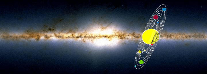
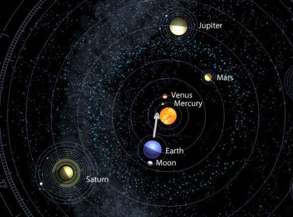
The orbits of the major planets of the solar system all lie in a narrow plane (like being in economy class! hahaha… sorry), which is tilted at about 60 degrees to the disc of stars that forms the Milky Way. Like this:

Credit : Science Minus Details

We’ll return to the tilt in a moment. But first, if the Sun was really leading the planets, then the thing is completely ludicrous (and this is quite a major part of Plait’s argument). Yet I’m not so sure the viral gif does show the Sun leading the planets. Having read through the author’s website, I can’t find any evidence that he suggests this. In fact, some of other videos on his website clearly show that this isn’t the case:

It seems to me that the appearance of the Sun leading the planets in the gif is just the result of a projection effect – i.e. that things can look different from different angles. On the other hand, Plait read the source material for Sadhu’s model, so maybe there’s something in there that’s more explicit. I’ve glanced at it, but couldn’t find anything stating this precisely. Actually I couldn’t find a whole lot that was even vaguely coherent, but we’ll return to this later. For now, just keep in mind that Sadhu is using an alternative model, even though that may not always be evident.

What the gif definitely does not show is the fact that the orbits of the planets are tilted at about 60 degrees to the direction of the Sun’s motion. Says Plait :

“In the helical model, he shows the planets as orbiting around the Sun perpendicular to the motion of the Sun around the galaxy; “face-on”, if you like.This is wrong. Because the orbits of the planets are tipped by 60°, not 90°, they can sometimes be ahead and sometimes behind the Sun. That right there, and all by itself, shows this helical depiction is incorrect.”

There can be no mistaking that Sadhu’s video shows the orbits with the wrong tilt. But is that so critical? Well actually no, not really. Fact is that if you include the tilt, you still see the planets making a “spiral” pattern (technically it’s a helix) as they move through space. The overall appearance just isn’t that massively different compared to a 90-degree tilt.

Solar system model by Rhys Taylor (Click to play)

So what’s the big deal? What does the author claim in this internet sensation that’s so outrageous? Well, not much. That particular video/gif are actually fairly inoffensive, to my mind. The most basic notion that the planets trace helical paths through space is perfectly correct. What honestly surprises me is that this is so incredibly popular on the internet. If you weren’t aware that the Sun orbits the center of the galaxy — which, since the planets orbit it, necessitates that they trace out helical paths — then the education system has seriously failed. But do not despair! This can be remedied very, very easily.

But we’re not done yet. There’s a sting in the tail, and it’s a big one. The gif doesn’t show it, but the video version ends with the worrying remarks that:

“Rotational motion and vortex motion are completely different things.”*
“Life spirals.” [Picture of leaves]
“Life is vortex, not just rotation.” [Picture of developing ferns, then a flower, the Milky Way, the DNA double helix, etc.]
“The Solar System is part of life. Think about this while racing through space.”

*Yes, they are. Plait notes: “They’re different in more than just name; they’re actually very different physical motions with different properties—you can get helical motion without the particles in it interacting, like in the solar system, but in a vortex the particles interact through drag and friction.” Basically, claiming that the Solar System is a vortex is simply wrong. Sadhu appears not to have checked the word “vortex” in a dictionary.

I could forgive even these rather hippyish sentiments, if they were no more than that. Alas, they’re symptomatic of a much larger problem. Plait’s merciless attack is full of sound and fury, but it’s also signifying something. Reading more of the author’s website, it turns out he is actively promoting quackery. It’s on a par with the excellent Space Mirror Mystery* (the idea that everything further away than about 150 million km is just a reflection in a giant mirror), but less funny.

*I was delighted to find that this website is back online. Seriously, read it. It’s epic.

From Sadhu’s website:

“In this diagram it seems the Solar System travel to the left. When the Earth is also traveling[sic] to the left (for half a year) it must go faster than the Sun. Then in the second half of the year, it travels in a ‘relative opposite direction’ so it must go slower than the Sun. Then, after completing one orbit, it must increase speed to overtake the Sun in half a year. And this would go for all the planets. Just like any point you draw on a frisbee will not have a constant speed, neither will any planet.”

Apparently he thinks this is a problem. Worryingly, it suggests that he didn’t show the 60-degree orbital tilt not for mere simplicity, but because he doesn’t believe it’s possible. Which — if true — is utter madness, pure and simple. There’s absolutely no reason the planetary speeds have to be constant as they move around the galaxy — the massive gravitational pull of the Sun is keeping them firmly in its orbit, regardless of how those orbits are inclined.

“Secondly, most planets are visible throughout the entire year. In a ‘flat’ model, every single planet would hide behind the Sun at least once a year. They don’t. Now the heliocentric model isn’t entirely flat, but mostly.”

Fine. The heliocentric model isn’t flat, which perfectly explains why planets aren’t eclipsed by the Sun once per year. What need to state this ? Is he really saying that this is a problem in a heliocentric model…? SERIOUSLY?

“Fact of the matter is that if the helical model is correct and our Solar System is a traveling[sic] vortex, it will change how we feel about our journey. For me personally the heliocentric model feels like a useless marry[sic]-go-round: after one year we are back to square one. The helical model feels much more like progress, growth, a journey through space in which we never ever come back to our starting point. We are NOT in a big marry[sic]-go-round. We are on a journey.”

Planets trace a helical path in space because our Solar System is orbiting the center of the galaxy. Big bloody deal. It’s that simple. You don’t need a wacky alternative model of the Solar System for this – it’s happening anyway! As for going on a journey though – well no, not really. Every other star is also orbiting the center of the galaxy, so no, we’re not actually getting anywhere relative to other star systems.

Then there are some pointless ravings about the Mayan calendar.

He also links the following video. Skip to about 2 minutes in:

This has the bizarre quote that :

“The planets do not come back on to their [own] path[s]. They don’t. If they did, we most likely would have the same set of information over and over and over… like a broken record. And we’d probably get bored. It would be like Groundhog Year.”

Then he links a video claiming that the Fibonacci sequence is the fingerprint of God.

None of which changes the fact that his first video/gif has only minor inaccuracies, but at this point I can’t help feeling that this was more by luck than judgement.

Then there’s his second video. This one is more objectively just plain wrong. He shows the Sun tracing out a corkscrew pattern as it orbits the galaxy, which makes no sense. The Sun simply goes around the center of the galaxy (and up and down a little bit) — nothing else. It’s not orbiting anything else at the same time. For it to trace a helix is just nonsense. He seems to have an almost unique case of helix madness.

What of the source material — the alternative model Sadhu uses? Garbage. Utter garbage. I find it difficult to read more than a sentence or two, because it’s verging on incomprehensible. As in almost at the level of TimeCube.

“Three types of time may be recognized:
– An absolute time that is universal and has neither a known starting point nor an end point; not even limited to a measurable parameter.
– For living organisms there is a time for birth and a moment for death. The interval is the life span. This time may be measured with parameters like seconds, minutes, days and so on. Mechanical devices may measure fractions and to some extant reliable. In every case some kind of energy source or gear system is involved.
-–When one is engaged with some work involvement in another activity may be impossible or result to be unnatural. In such cases personal values decide what course to take up and say “no time” to the other work, however important that may be. This time is highly subjective.”

Later:
“The constellations at the background are sufficient evidence to deny the heliocentric orbits for planets. The Sun at 500 light seconds distance, when visible within a cone of 30° maintaining a background of one constellation, say for example Aries, (Hamel at 68ly) the SOLSTICES and EQUINOXES through Zodiac Earth maintains in the opposite constellation at midnight, namely Libra. After six months to maintain heliocentric orbit, the mid day of today should become midnight and the midnight should become midday. This has not taken place!

Well of course it hasn’t — it’s complete gibberish ! Plait may well be right that somewhere in this mess is a model wherein the Sun leads the planets, but I don’t have the time or sheer mental fortitude to read the whole thing. I will note, though, that there’s a paragraph where the author rubbishes the conventional explanation for the ozone hole — and God help us all if that goes viral. That, not petty disputes about whether the orbits of planets are tilted by 60 or 90 degrees, is why such quackery deserves to be shot down without mercy.

“My feeling is that if your take-home message was only that the Solar System moves through space, and the planets trace out pretty spirally paths, then all is well and no harm done. But if it’s leading you to question the heliocentric model, then we’re all buggered.”

–Rhys Taylor, astrophysicist

In conclusion then, the first video and gif of the Solar System as a “vortex” are not really all that bad. Unfortunately, the inaccuracies are not due to some minor over-simplifications, but are symptoms of a some very deep-seated misunderstandings. My feeling is that if your take-home message was only that the Solar System moves through space, and the planets trace out pretty spirally paths, then all is well and no harm done. But if it’s leading you to question the heliocentric model, then we’re all buggered.

___________________

Thanks to Rhys Taylor for the guest post of his entertaining and informative article — at the very least, you got to watch “The Galaxy Song” again! Read more from Rhys (and check out some really nice infographics too) on his blog here.

Do You Need Some Space?

Much to learn about Pluto's surface we have. (Screenshot)

Of course you do! (Who doesn’t?) And so here’s a wonderful tour of our Solar System to provide you with just the type of space you need.


A 3D animation project by Australian video artist Shane Gehlert, I Need Some Space takes us from low-Earth orbit to the Moon and Sun and then through the lineup of planets in the Solar System, using images and models from NASA to accurately depict their unique appearances. Along the way we’ll get some basic info on the planets, select moons, and a few of the various spacecraft that have visited (or are visiting) each world. Set to an intriguing string score by The Zephyr Quartet (of which Shane’s sister Belinda is a member) I Need Some Space is a mesmerizing 6-minute voyage for any space fan — myself very included.

I particularly like the “ghostly” look of Pluto, reminding us that we still have another year and a half before New Horizons reveals its true appearance to us.

Enjoy! (As with most videos, full-screening and HD-ing are strongly suggested.)

Video © Shane Gehlert/BlueDog Films. HT to FastCoCreate.

Here’s the Latest Kepler Orrery Video: the Orbits of the Planets Go ‘Round and ‘Round

If you’ve ever wanted to know what 3,538 exoplanets look like spinning around their stars, here you go!

This is the third and latest installment of the mesmerizing Kepler Orrery videos by Daniel Fabrycky from the Kepler science team. It shows the relative sizes of the orbits and planets in the multi-transiting planetary systems discovered by Kepler up to November 2013 (according to the Kepler site, 3,538 candidates so far.) According to Daniel “the colors simply go by order from the star (the most colorful is the 7-planet system KOI-351). The terrestrial planets of the Solar System are shown in gray.”

Not that our Solar System is boring, of course, but well, ya know… there are an awful lot of planets out there.

Check out Daniel’s previous version here.

An Illustrative Explanation Of Our Solar System

The Solar System: Our Home in Space (screenshot) © Philipp Dettmer Information Design

The Solar System: it’s our home in space, the neighborhood that we all grew up in and where — unless we figure out a way to get somewhere else — all of our kids and grandkids and great-great-great-great-times-infinity-great-grandkids will grow up too. That is, of course, until the Sun swells up and roasts Earth and all the other inner planets to a dry crunchy crisp before going into a multi-billion year retirement as a white dwarf.

But until then it’s a pretty nice place to call home, if I may say so myself.

Edu-film designer Philipp Dettmer and his team have put together a wonderful little animation explaining the basic structure of the Solar System using bright, colorful graphics and simple shapes to illustrate the key points of our cosmic neighborhood. It won’t teach you everything you’ll ever need to know about the planets and it’s not advisable to use it as a navigation guide, but it is fun to watch and well-constructed, with nice animation by Stephan Rether and narration by Steve Taylor.

Check out the full video below:

“Through information design, concepts can be made easy and accessible when presented in a short, understandable edu-film or perhaps an infographic. Whether explaining the vastness of the universe or the tiniest building blocks of life – all information can be presented in a way that everyone understands. Regardless of prior knowledge.”
– Philipp Dettmer

(And come on, admit it… you learned something new from this!)

Credit: Philipp Dettmer Information Design. HT to Colin Lecher at Salon.

Cassini Captures Saturn’s Darkest Rings

Long-exposure Cassini NAC image of Saturn's D ring system (NASA/JPL-Caltech/SSI)

The closest to the planet itself, the hazy arcs of Saturn’s D ring may lack the reflective brilliance and sharply-defined edges of the other main rings, but they nevertheless possess their own ethereal beauty and mysteries. Here, the Cassini spacecraft has managed to capture the soft bands of the D ring in a long-exposure image acquired on April 2, 2013 — so long an exposure, in fact, that background stars seen through the rings appear as long vertical streaks, a testament to the ring’s dimness as well as the spacecraft’s continuing movement.

Beginning 8,768 km (5,448 miles) above the tops of Saturn’s clouds, the D ring is the innermost and thinnest segment of Saturn’s main ring system. Nearly transparent, the D ring extends about 7,500 km (4,660 miles) before transitioning to the considerably brighter C ring, which is over twice as wide.

The innermost portion of the C ring can be seen above along the left side. Saturn’s shadow blankets the lower right corner.

The cause of the alternating light-and-dark bands observed within the D ring isn’t yet known, but they may be the result of an impact by a comet or large meteor that set up recurring waves of material.

The view was acquired at a distance of approximately 510,000 kilometers (317,000 miles) from Saturn and at a phase angle of 147 degrees. Image scale is 2 miles (3 kilometers) per pixel.

Source: NASA/JPL Cassini mission site.

How Many Planets are in the Solar System?

How Many Planets Are in the Solar System?

I’m just going to warn you, this is a controversial topic. Some people get pretty grumpy when you ask: how many planets are in the Solar System? Is it eight, ten, or more?

I promise you this, though, we’re never going back to nine planets… ever.

When many of us grew up, there were nine planets in the Solar System. It was like a fixed point in our brains.

As kids, memorizing this list was an early right of passage of nerd pride: Mercury, Venus, Earth, Mars, Jupiter, Saturn, Uranus, Neptune and Pluto.

But then in 2005, Mike Brown discovered Eris, an icy object thought to be about the same size as Pluto, out beyond its orbit.

That would bring the total number of planets to ten. Right? There’s no turning back, textbooks would need to be changed.
In order to settle the dispute, the International Astronomical Union met in 2006, and argued for, and against Pluto’s planethood. Some astronomers advocated widening the number of planets to twelve, including Pluto, its moon Charon, the Asteroid Ceres, and the newly discovered Eris.

In the end, they changed the definition of what makes a planet, and sadly, Pluto doesn’t make the cut:

Here are the new requirements of planethood status:

  1. A planet has to orbit the Sun. Okay fine, Pluto does that.
  2. A planet needs enough gravity to pull itself into a sphere. Okay, spherical. Pluto’s fine there too.
  3. A planet needs to have cleared out its orbit of other objects. Uh oh, Pluto hasn’t done that.

For example, planet Earth accounts for a million times the rest of the material in its orbit, while Pluto is just a fraction of the icy objects in its realm.

The final decision was to demote Pluto from planet to dwarf planet.

But don’t despair, Pluto is in good company.

Ceres. Image credit: NASA
There’s Ceres, the first asteroid ever discovered, and the smallest of the dwarf planets. The surface of Ceres is made of ice and rock, and it might even have a liquid ocean under its surface. NASA’s Dawn mission is flying there right now to give us close up pictures for the first time.

Haumea, named after the Hawaiian goddess of fertility, is about a third the mass of Pluto, and has just enough gravity to pull itself into an ellipsoid, or egg shape. Even though it’s smaller, it’s got moons of its own.

Makemake. Credit: NASA
Makemake, a much larger Kuiper belt object, has a diameter about two-thirds the size of Pluto. It was discovered in 2005 by Mike Brown and his team. So far, Makemake doesn’t seem to have any moons.

Eris is the most massive known dwarf planet, and the one that helped turn our definition of a planet upside-down. It’s 27% more massive than Pluto and the ninth most massive body that orbits the Sun. It even has a moon: Dysnomia.

Pluto. Credit: ESO
Pluto. Credit: ESO
And of course, Pluto. The founding member of the dwarf family.

Want an easy way to remember the eight planets, in order? Just remember this mnemonic: my very excellent mother just served us noodles.

For all you currently writing angry tweets to Mike Brown, hold on a sec. Changing Pluto’s categorization is an important step that really needed to happen.

The more we discover about our Universe, the more we realize just how strange and wonderful it is. When Pluto was discovered 80 years ago, we never could have expected the variety of objects in the Solar System. Categorizing Pluto as a dwarf planet helps us better describe our celestial home.

So, our Solar System now has eight planets, and five dwarf planets.

Bright Planetary Conjunctions Liven Up This Week’s Evening Sky

Three bright planets gather in the northwestern sky this week. This map shows the sky 30 minutes after sunset from the middle latitudes. Stellarium

Planning a barbecue this weekend? You may want to top it off with a look at three bright planets shuttling about the western sky at dusk. Jupiter, Venus and Mercury gather for nearly a week of delightful alignments including three separate conjunctions staring right now. Mercury and Venus pair up on Friday; Mercury and Jupiter on Sunday and Venus and Jupiter on Monday. All three form a series of ever-changing triangular arrangements as the nights go by.

Three bright planets will highlight the northwestern sky this week and early next. Mercury is shown in pink and Jupiter in yellow. Stellarium
Three bright planets will highlight the northwestern sky this week and early next. Mercury is shown in pink and Jupiter in yellow. Time is 30 minutes after sunset facing northwest. They’ll be closest together – less than 3 degrees apart – on the night of the 26th. Stellarium

Brightest of the bunch is Venus followed by Jupiter and then Mercury. The key to seeing them all is a clear sky and unobstructed view of the west-northwest horizon. Best time for viewing is a half hour to 45 minutes after sunset. Although the diagrams make the planets look like largish disks, difference in size is a device to show their brightness. Bigger means brighter.

Mercury gradually climbs higher in the coming days, Venus will remain in nearly the same spot and Jupiter slowly drops off toward the horizon. Seeing three planets bunch up isn’t rare, but it is unusual – all the more reason to go for a look if your skies are clear. Alignments like this occur because all 8 planets lie in essentially the same flat plane. As we look across the solar system, sometimes near planets and far planets lie along the same line of sight and appear side-by-side in the sky. They may look close to each other but of course they’re millions of miles apart.

Positions of the planets on May 27. The arrow shows our point of view from Earth. Notice that the line of sight through all three takes our gaze near the sun. That's why they're only visible shortly after sunset in a bright sky. Click image to see a cool, interaction planet display. Credit: dd.dynamicdiagrams.com
Positions of the planets on May 27. The arrow shows the point of view from Earth. Notice that the line of sight through all three takes our gaze near the sun. That’s why they’re only visible shortly after sunset in a bright sky. Click image to see a cool, interactive planet display. Credit: dd.dynamicdiagrams.com

This week Venus is 154 million miles (248 million km) from Earth, Mercury 113 million (182 million km) and Jupiter a distant 562 million (904 million km). The planet position diagram above will give you a sense of their current arrangement in space.

Whenever you go planet-seeking in bright twilight, I always recommend bringing along a pair of binoculars. They penetrate haze and make finding these bright little dots much easier. Enjoy the show!

Book Review: Your Ticket to the Universe

Your Ticket to the Universe: A Guide to Exploring the Cosmos (Available April 2)
Your Ticket to the Universe is full of images and graphics of astronomical wonders.

Every once in a while an astronomy book comes out that combines stunning high-definition images from the world’s most advanced telescopes, comprehensive descriptions of cosmic objects that are both approachable and easy to understand (but not overly simplistic) and a gorgeous layout that makes every page spread visually exciting and enjoyable.

This is one of those books.

Your Ticket to the Universe: A Guide to Exploring the Cosmos is a wonderful astronomy book by Kimberly K. Arcand and Megan Watzke, media coordinator and press officer for NASA’s Chandra X-ray Observatory, respectively. Published by Smithsonian Books, it features 240 pages of gorgeous glossy images from space exploration missions, from the “backyard” of our own Solar System to the more exotic environments found throughout the Galaxy… and even beyond to the very edges of the visible Universe itself.

Find out how you can win a copy of this book here!

As members of the Chandra team, headquartered at the Smithsonian Astrophysical Observatory in Cambridge, Massachusetts, Kim and Megan have long had firsthand experience with incredible astronomical images — they previously designed and coordinated the internationally-acclaimed From Earth to the Universe and From Earth to the Solar System photo installation projects, which helped set up presentations of space exploration images in public locations around the world.

Your Ticket to the Universe features images from some of the most recent missions - like MSL!
Your Ticket to the Universe even features images from some of the most recent missions – like MSL!

Your Ticket to the Universe takes such impressive images — from telescopes and observatories like Hubble, Spitzer, SDO, Chandra, Cassini, GOES, VLT, and many others, as well as from talented photographers on Earth and in orbit aboard the ISS — and puts them right into your hands, along with in-depth descriptions that are comprehensive yet accessible to even the most casual fans of space exploration.

This is my favorite kind of astronomy book. Although I look at images like the ones in Your Ticket to the Universe online every day, there’s something special about having them physically in front of you in print — and well-written text that can be understood by everyone is crucial, in my opinion, as it means a book may very well become an inspiration to a whole new generation of scientists and explorers.

“The sky belongs to everyone. That’s the premise of this guidebook to the Universe. You don’t need a medical degree to know when you’re sick or a doctorate in literature to appreciate a novel. In the same spirit, even those of us who don’t have advanced degrees in astronomy can gain access to all the wonder and experience that the Universe has to offer.”

Kim K. Arcand holds a copy of her book during a presentation at the Skyscrapers Astronomical Society of Rhode Island
Author Kimberly K. Arcand holds a copy of her book during a presentation at the Skyscrapers Astronomical Society of Rhode Island

I’ve had the pleasure of meeting co-author Kimberly Arcand on several occasions — I attended high school with her husband — and her knowledge about astronomy imaging as well as her ability to present it in an understandable way is truly impressive, to say the least. She’s quite an enthusiastic ambassador for space exploration, and Your Ticket to the Universe only serves to further demonstrate that.

I highly recommend it for anyone who finds our Universe fascinating.

Your Ticket to the Universe will be available online starting April 2 at Smithsonian Books, or you can pre-order a copy at Barnes & Noble or on Amazon.com. Don’t explore the cosmos without it!

A Valentine From Voyager

Venus, Earth, Jupiter, Saturn, Uranus and Neptune as seen by Voyager 1 on Valentine's Day in 1990

On February 14, 1990, after nearly 13 years of travel through the outer Solar System, NASA’s Voyager 1 spacecraft crossed the orbit of Pluto and turned its camera around, capturing photos of the planets as seen from that vast distance. It was a family portrait taken from over 4.4 billion kilometers away — the ultimate space Valentine.

Who says astronomy isn’t romantic?

Full mosaic of Voyager 1 images taken on Feb. 14, 1990 (NASA/JPL)

“That’s here. That’s home. That’s us. On it everyone you love, everyone you know, everyone you ever heard of, every human being who ever was, lived out their lives… There is perhaps no better demonstration of the folly of human conceits than this distant image of our tiny world.”

– Carl Sagan

VoyagerValentine
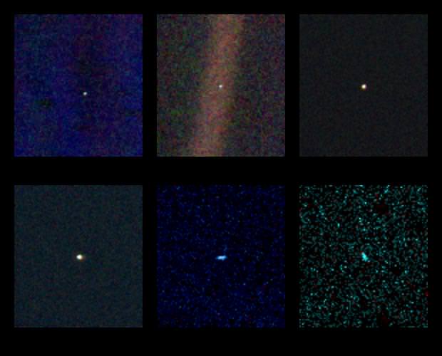
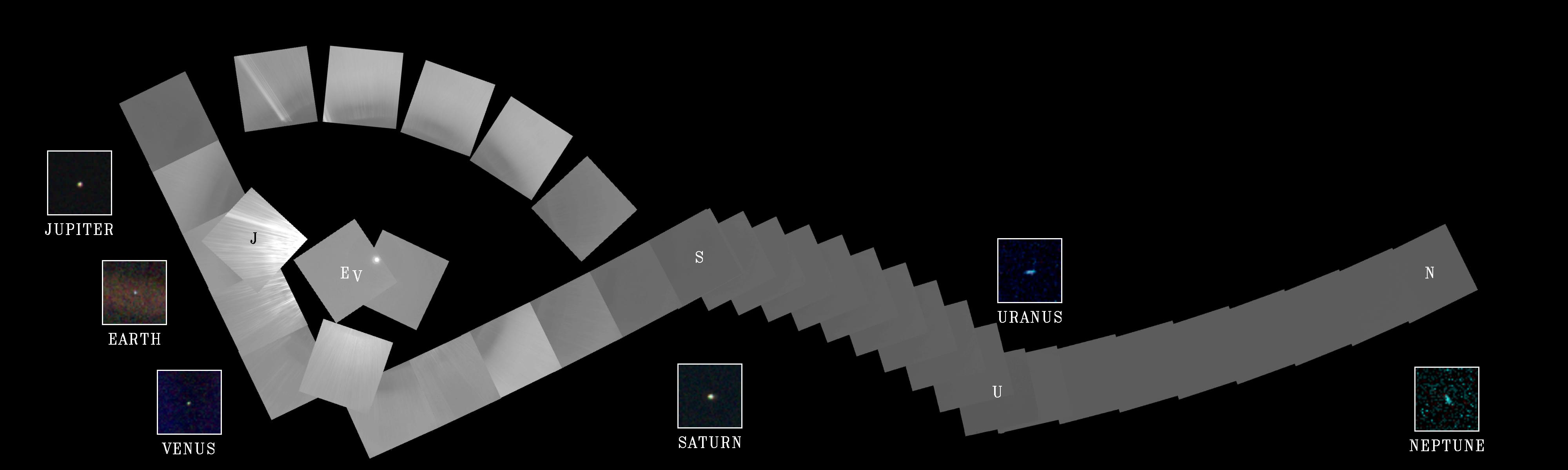
It was the unique perspective above provided by Voyager 1 that inspired Carl Sagan to first coin the phrase “Pale Blue Dot” in reference to our planet. And it’s true… from the edges of the solar system Earth is just a pale blue dot in a black sky, a bright speck just like all the other planets. It’s a sobering and somewhat chilling image of our world… but also inspiring, as the Voyager 1 and 2 spacecraft are now the farthest human-made objects in existence — and getting farther every second. They still faithfully transmit data back to us even now, over 35 years since their launches, from 18.5 and 15.2 billion kilometers away.

The Voyagers sure know the value of a long-term relationship.

See more news from the Voyager mission here.

New South Pole Marker Honors Planets, Pluto, and Armstrong

The new geographic South Pole marker that stands at 90º S latitude. (Credit: Jeffrey Donenfeld)

Because the Amundsen-Scott South Pole Station sits atop a layer of moving ice almost 2 miles thick, the location of the marker for the Earth’s geographic South Pole needs to be relocated regularly. Tradition has this done on New Year’s Day, and so this past January 1 saw the unveiling of the newest South Pole marker: a beautiful brass-and-copper design created by Station machinist Derek Aboltins.

pole-marker-top-closeup-1The top of the marker has seven small discs that represent the planets in the positions they would be in on Jan. 1, 2013, as well as two larger discs representing the setting Sun and Moon. Next to the Moon disc are the engraved words “Accomplishment & Modesty,” a nod to the first man on the Moon.

“This was a reference to honor Neil Armstrong, as he passed away when I was making this section with the moon,” Aboltins said.

And for folks who might think the planet count on the new marker is one too few, a surprise has been tucked away on the reverse side.

“For those of you who still think Pluto should be a planet, you’ll find it included underneath, just to keep everyone happy,” Aboltins said. “Bring back Pluto, I say!”

And so, on the underside of the marker along with the signatures of South Pole Station researchers and workers, is one more disc — just for the distant “demoted” dwarf planet.

pole-marker-underside

Underside of the South Pole marker (Credit: Jeffrey Donenfeld)

“For those of you who still think Pluto should be a planet, you’ll find it included underneath, just to keep everyone happy!”

– Derek Aboltins, designer and machinist

(See high resolution versions of these images here.)

The marker was placed during a ceremony on the ice on Jan. 1, during which time the previous flag marker was removed and put into its new position.

8375171352_5f2b446640_b

(Photo credit: Jeffrey Donenfeld)

According to The Antarctic Sun:

“Almost all hands were present for the ceremony, including station manager Bill Coughran, winter site manager Weeks Heist, and National Science Foundation representative Vladimir Papitashvili. The weather was sunny and a warm at just below minus 14 degrees Fahrenheit.”

(Even though it’s mid-summer in Antarctica, “warm” is clearly a relative term!)

Read more about this and other Antarctic news on The Antarctic Sun site, and see more photos from Antarctica by Jeffrey Donenfeld here.

_____________________

Named for explorers Roald Amundsen and Robert F. Scott, who attained the South Pole in 1911 and 1912, the Amundsen-Scott South Pole Station stands at an elevation of 2,835 meters (9,306 feet) on Antarctica’s ice sheet, which is about 2,700 meters (9,000 feet) thick at that location. The station drifts with the ice sheet at about 10 meters (33 feet) each year. Research is conducted at the station in the fields of astronomy, astrophysics, glaciology, geophysics and seismology, ocean and climate systems, biology, and medicine.